Table of contents:
5 Types of Dashboards for CS Team Success
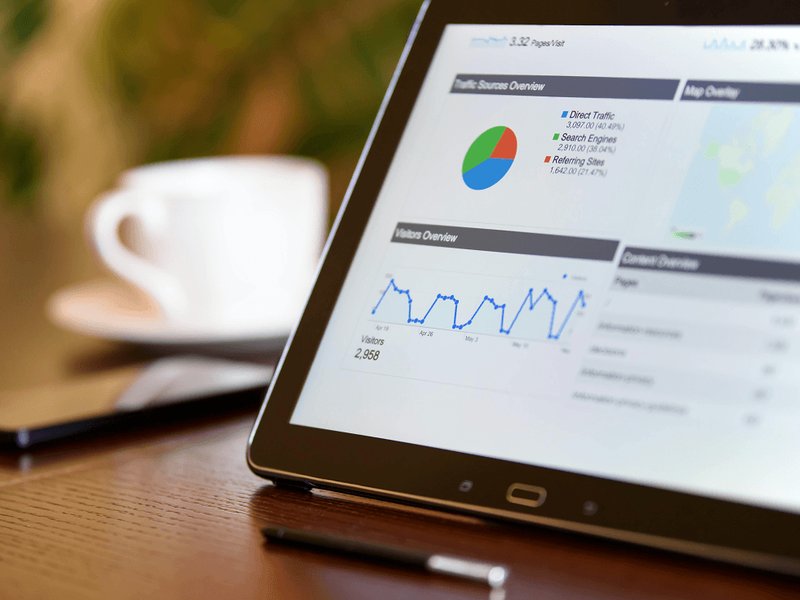
Recently, we shared the 15 most important customer service KPIs. The next step toward a more data-driven approach to customer service is to visualize these KPIs on a customer service dashboard.
Organizing, analyzing, and sharing data on a customer service KPI dashboard gives everyone an overview of how the team is performing, keeping everyone abreast what they’re doing well and where they must improve. The following five customer service dashboards display and track the most important KPIs for empowering your team to make the decisions that will drive customer satisfaction improvement.
How to Improve Customer Service with 5 Important Dashboards
Statistically, data-driven companies are more successful than companies that rely on intuition.
When customer service departments choose to visualize their KPIs on customer service dashboards, they distill complex data into a visual format that makes it easy for employees to understand—and act on. After choosing to visualize their data on a dashboard for customer service, most organizations notice improved performance. These dashboards provide easier access to information—and the motivation employees need to provide consistently great service.
The following five customer support dashboards are an excellent way to keep track of performance while improving efficiency and customer satisfaction across all of the company’s support channels. The main goal of these customer service dashboards is to safeguard and improve the efficient and satisfactory handling of customer concerns, complaints, and other inquiries by tracking the most important KPIs in a real-time visual format that everyone can access and understand.
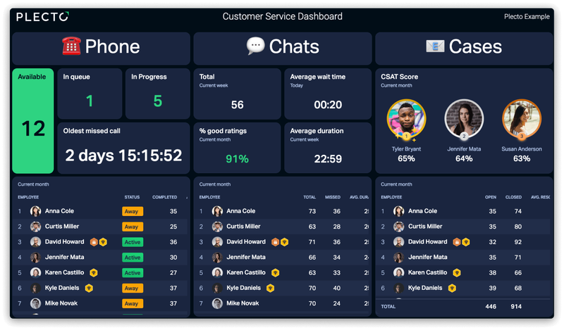
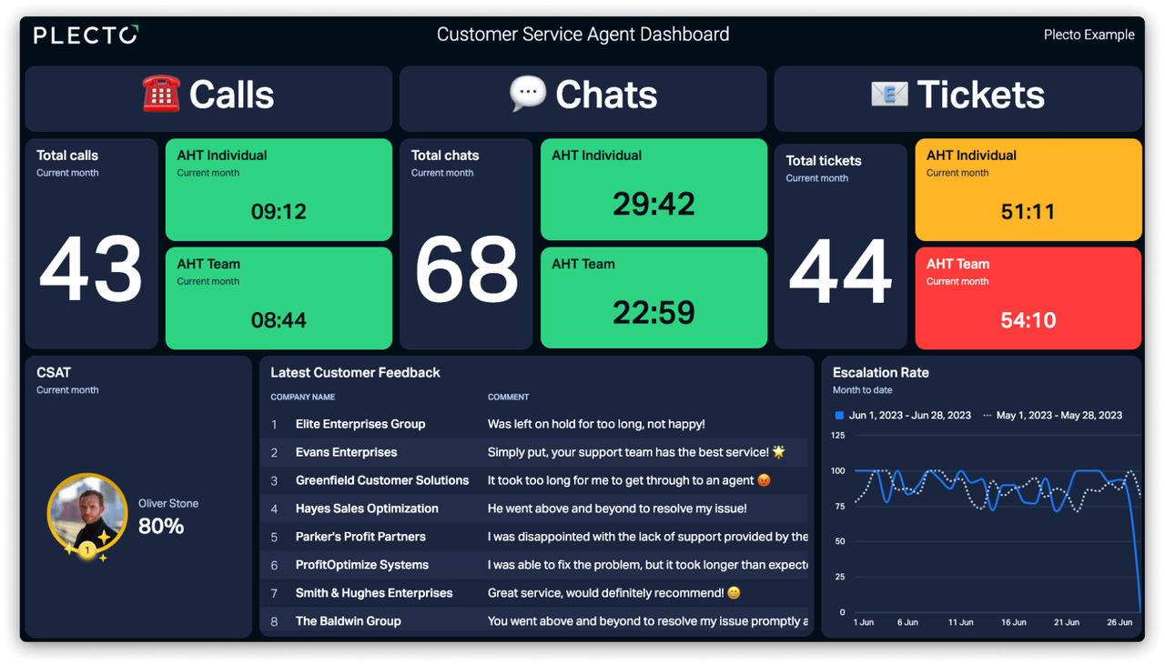
1. The Customer Satisfaction Dashboard
Customer service teams exist to ensure customer satisfaction, so this is probably the most obvious of the customer service dashboards on the list. Its main objective is to monitor customer satisfaction and provide real-time feedback on how well the team is meeting customers’ expectations.
The crown jewel of this dashboard is the average customer satisfaction score (CSAT). Since most of today’s customer support is omnichannel, it often makes sense to segment this KPI by support channel. This dashboard can also be personalized to allow each rep to track how their scores are performing against the department overall. This can also help managers identify employees who could benefit from more coaching or training.
In addition to CSAT, the KPIs most often seen on customer satisfaction dashboards include things like:
- Average wait time
- Average first response time
- Abandoned calls
- Average customer effort score
- Net promoter score
The main goal of a customer satisfaction dashboard is to visualize the KPIs that have the biggest impact on customer satisfaction ratings.
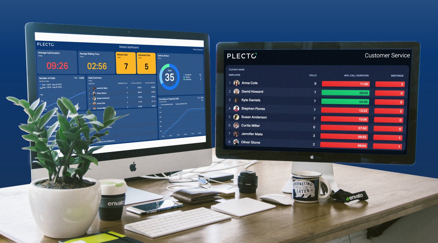
2. The Department Overview Dashboard
The KPIs included in this customer service dashboard might overlap with the customer satisfaction dashboard, but the goal of the department overview dashboard is to give the team a real-time overview of the department’s most important metrics. These usually include internal targets that don’t directly measure the impact of the employees’ efforts but which can contribute to high levels of customer satisfaction.
The KPIs often seen on the department overview dashboard include things like:
- First contact resolution
- Average time to resolution
- Average first response time
- Average call duration
- Support tickets by status
- Handover rate
- CSAT
These metrics can be varied to highlight areas in particular need of attention. Many departments choose to display this dashboard on flatscreens where it’s visible to everyone.
3. Individual Performance Dashboards
While department-level dashboards are crucial in data-driven customer service organizations, it’s just as important to track individual performance. Visualizing key metrics for each employee provides continuous feedback on how their efforts are impacting the team’s performance. It’s also a terrific way for employees to monitor personal KPIs that might not be relevant to the broader team—for example, focus areas determined during coaching sessions.
Most of the KPIs on this dashboard will mirror those on the two previously mentioned dashboards.
Common individual performance metrics include things like:
- Average number of inquiries handled per day/week
- Average time to resolution
- Average call duration
- First contact resolution
- Handover rate
- CSAT
Some organizations choose to pair these metrics with a leaderboard to help each employee see how they rank against their peers while sparking a little friendly competition that benefits everyone. In addition, individual performance dashboards can provide valuable insights to help drive one-to-one coaching sessions.
4. The Omnichannel Support Dashboard
With 67% of consumers regularly using three or more channels to engage with a single company, it’s imperative to understand how well your department is servicing customers across all of its support channels. As the name suggests, an omnichannel support dashboard visualizes KPIs by channel to help everyone keep an overview of each channel. This can help pivot staff away from low-volume channels to high-volume channels as needed.
Common KPIs for an omnichannel support dashboard include:
- Average first response time
- Average time to resolution
- Open/closed tickets
- CSAT
While it might look like these KPIs repeat the three previous customer service dashboards, the important distinction is that they’re broken out by channel. This dashboard is meant to track the same KPIs for each channel to help the department react quickly to negative trends and staffing gaps.
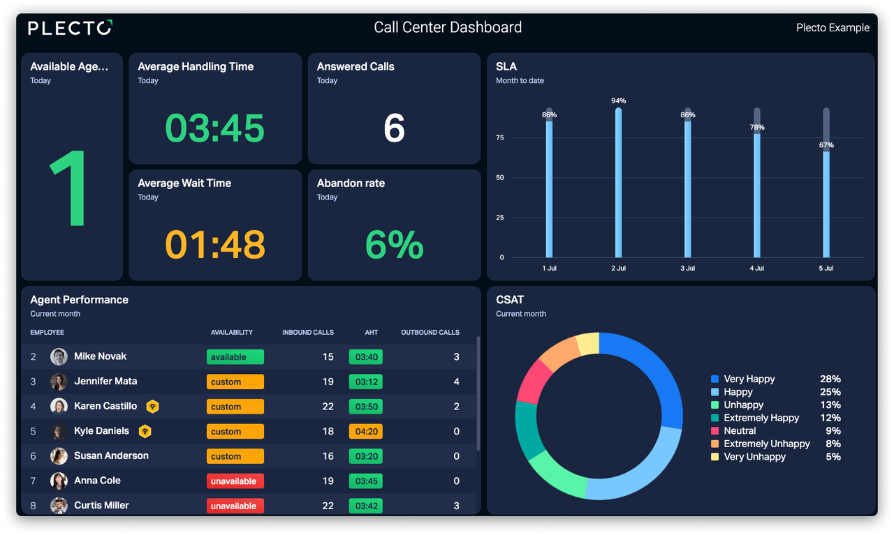
5. The Service Level Agreement (SLA) Dashboard
Companies are increasingly turning to SLAs to provide customer service benchmarks. Whether they’re shared with customers or just internally, SLAs help customer service teams track whether the service they’re providing meets the company’s standards. Common customer service SLAs guarantee things like response and resolution times.
SLA dashboards usually show things like:
- Average scores per SLA metric
- Number of SLA violations
- Success rates as a percentage
An SLA dashboard visualizes these metrics to give customer service teams real-time feedback on how they’re performing against these benchmarks.
Still Interested in How To Improve Customer Satisfaction With Dashboards?
You’re in the right place! Plecto enables you to get up and running quickly with customer service dashboards that visualize KPIs and make them accessible to everyone on your team.
In addition, Plecto integrates with many popular CRM and support systems to help track key metrics related to the most important customer service activities.
Sign up for a free demo, and see how Plecto can help your company leverage customer service dashboards to share actionable insights and deliver next-level customer service.
Start your 14-day
free Plecto trial today.
SAGE CRAWFORD
Content Manager