Power up the performance of your energy business with powerful, real-time KPI dashboards for your employees.
Who looks at it
Employees working in sales, support and customer retention.
Focus area
Customer-facing operations.
Purpose
Maximizing profit and revenue.
What integrations are used


As the number of energy providers on the market increases, so does the need for suppliers to deliver great service to their customers at affordable rates.
This is exactly where Plecto steps in!
Plecto supports tons of energy support and sales teams stay on top of their customer-facing operations through data-driven insights. Here, you can build customizable performance dashboards for your teams who are interacting with your customers daily.
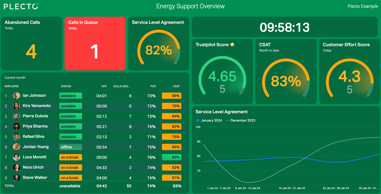
This dashboard is used by the first-line support of an energy provider's customer service team. Here, the support team knows exactly how they are performing vis-à-vis their critical KPIs such as AHT, calls waiting, and SLA. It also breaks down performance by individual agent, for increased accountability.
Built for agent visibility, this dashboard is most effective when displayed on TVs around the contact center. This way, team members are able to provide proactive customer service and act on any incidents immediately.
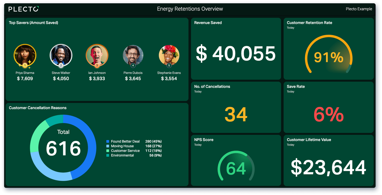
Find yourself getting new customers only for that new business to be eaten away by customers canceling? As it's become easier than ever to switch providers, energy firms are paying increasing attention to how to retain their existing customers.
Rather than focusing on doom and gloom metrics, this dashboard displays positive KPIs that employees have more control over, focusing on how much business is being saved by the Retentions team and celebrating the employees that are doing it best.
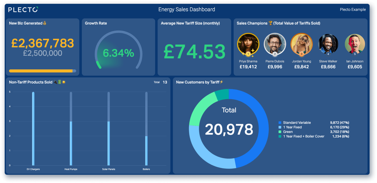
Nowadays, energy providers can offer so much more than simply the choice between a fixed and variable rate. Factor in eco-friendly tariffs, cover and a whole range of different product types and the modern energy company has so many different streams to generate revenue.
This dashboard is used by sales teams in an energy company to stay on top of the tariffs and products that are selling the most. In this example, a donut chart is used to identify the different tariffs, while a column is displayed to showcase the other products that are selling.
Improve productivity, align on your KPIs and maximize the motivation of your agency.
Performance dashboards tailor-made for the fast-paced, high-activity world of telecommunications sales and customer relations.
Adopt an actionable, data-driven approach to your agency with real-time insurance dashboards.