dashboards_1 articles
4 Things That Slowly (But Surely) Mess Up Your Data
Is your dashboard lighting up while sales stay flat? Your data might be "correct" but completely misleading. Discover 4 silent factors that are messing up your business decisions before you notice.
Most popular

How Real-Time Dashboards (Like Plecto) Supercharge Carpentry KPIs
Boost your carpentry shop's margins with real-time KPI tracking. Learn how Plecto integrates with your favorite apps to prevent labor overruns and maximize profit.

Why Data Visualization Matters: Science, Business, and Strategy
Why is data visualization so important? Explore the scientific, business, and strategic benefits of visualizing data—from faster brain processing to better employee coaching.

Boost Accuracy and Motivation: The Power of Plecto Dashboards for HVAC Commissions
Plecto dashboards help HVAC managers automate complex commission tracking, increasing data accuracy, transparency, and technician motivation.
How Does Visual Management Empower Sales Teams in 2026?
Seeing is achieving! Explore the best practices for sales visual management and learn how tools like Kanban boards and real-time dashboards empower your team to win.
Dashboards vs. Reports: Key Differences Explained
Dashboards and reports are two crucial features for understanding your business data. Learn here about their differences and similarities, and how to leverage both for maximal eff…

How to Create a TV Dashboard for Salesforce (Updated 2026)
Salesforce holds your data, but can your team see it? Discover how to turn Salesforce records into high-impact TV dashboards that drive 24/7 accountability and sales motivation.
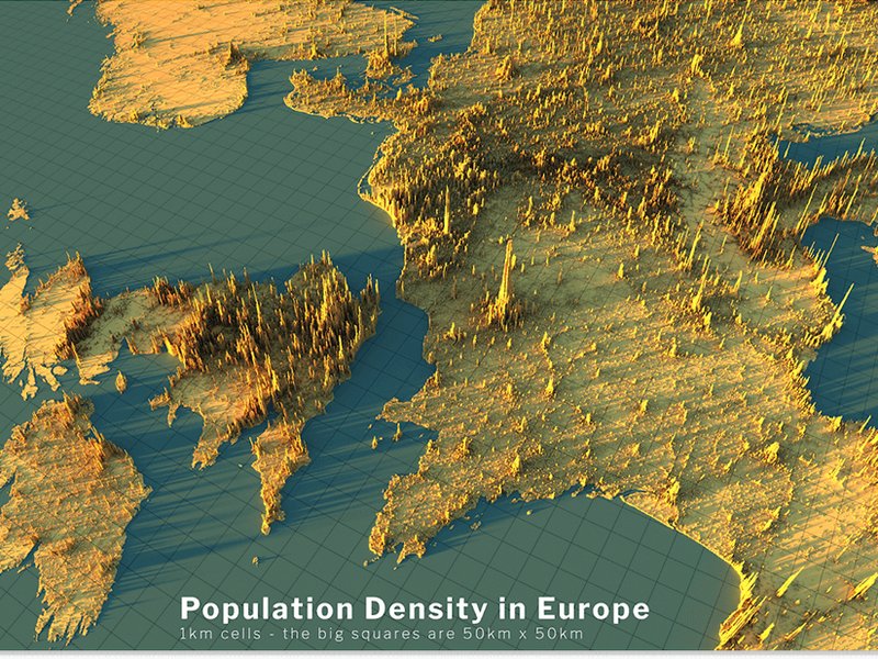
5 Examples of the Best Data Visualizations
What makes a data visualization truly "great"? Explore 5 world-class examples—from 3D terrain maps to interactive federal budgets—that turn complex data into visual masterpieces.