dashboards_1 articles
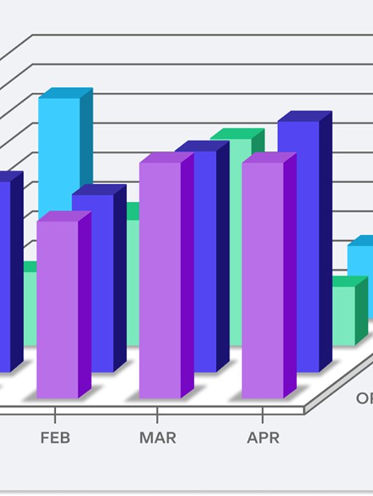
6 Examples of Bad Data Visualizations
We break down six examples of poor-quality data visualizations, looking at what makes them bad and how they can be improved for clearer, more effective data storytelling.
Most popular

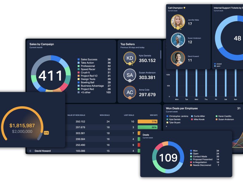
How to Create a Plecto TV Dashboard for HubSpot (Updated 2026)
HubSpot is a world-class CRM, but it can't sit on your office walls. Discover how to turn your HubSpot data into high-impact TV dashboards that drive team motivation and 24/7 accountability.

6 of the Biggest Data Visualization Trends of 2025
Explore 6 top data visualization trends of 2025—including real-time dashboards, AI-driven insights, and mobile-first design—that enhance business competitiveness and decision-making.

Using Plecto Dashboards in HVAC: Insights from Fox Plumbing
Plecto is an essential tool for home service businesses seeking efficiency and growth. Learn some insights about Plecto with Fox Plumbing's story!

How to Visualize Data for Actionable Insights in 2026
Did you know 90% of information sent to the brain is visual? Master the art of data visualization to uncover hidden trends, empower your team, and drive smarter business decisions.

Top 10 Dashboard Solutions for Businesses: A Comprehensive Guide
Discover the top 10 dashboard solutions for businesses in this guide, featuring key features, pricing, and strengths to help you choose the perfect platform for your data needs.

Performance Tracking 101: A Guide for Enhancing Employee Productivity
Performance tracking is essential for engaging your employees. Celebrate their success, give them what they need, and boost productivity. Find out how.
The 15 Golden Rules of Dashboard Design
Transform your data into action. Discover the 15 golden rules of dashboard design to align your team, visualize KPIs, and boost performance at a single glance.