Table of contents:
What is the Goal of Building a Dashboard?
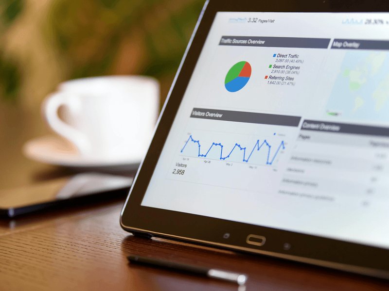
Whatever role or industry you’re in, chances are you’re dealing with masses of data across different systems on a daily basis. But just how do you go about making sense of all this data? The answer lies in successful dashboard design.
Effective dashboard design gives you so much more than just displaying data. It provides you with performance insights, engages your employees and keeps the entire team aligned and in the loop regarding performance.
The beauty of dashboard creation is that anyone can do it! You don't need to be a designer or data specialist to build one. So, if you are looking to get started, then you have come to the right place. We’ve put together 15 golden rules to ensure you build a top-performing dashboard in no time at all. Read on to get the full lowdown.
1. Agree On Your Goals and KPIs 📈
Hold it right there! We know it can be tempting to dive straight in but there is one big factor to consider before creating your first dashboard: agreeing on what you want to achieve.
At this stage, you don’t necessarily need to know the full nitty-gritty of some of your measurements. However, be sure to take time out with your colleagues to identify what KPIs you want to measure, and what targets should be set.
2. Know What Data You Want to Connect 🔌
Dashboards give you the power to centralize data from multiple systems onto one screen. A dashboard consolidates this data and gives you one single source of truth. This is what really takes dashboards a step further than a regular spreadsheet.
For the most seamless experience, it’s vital that you connect your company data to your dashboard, whether this is sales data, customer data or your financials.
For example, a customer service team may be using a different system to store their customer data, another system to pick up the phone and another to manage emails and chats.
3. Keep it Simple 👍
When it comes to building your dashboard, less is often more. That’s why your dashboard should be designed in such a way that data can be understood at first glance.
It’s a common question to ask how many different KPIs to include on a dashboard. In reality, there is no magic number and it really depends on what you are trying to visualize.
Just always bear in mind that your dashboard is designed for people and not a computer. And remember, you can build as many dashboards as you like, so if in doubt, leave it out!
4. …But Also Make it Exciting! 🤩
That said, it’s also important to make your dashboard engaging and exciting. Use a range of widgets, colors and gamification to make your dashboard the hub of activity in your office.
With Plecto you can customize your dashboard background, and even add GIFs, images, and your own text!
5. Display KPIs That Drive Action 🏃♂️
At Plecto, we’re big believers in data being something for everyone, not just analysts. That’s why we believe that your dashboard needs to contain KPIs that employees can influence.
Seeing real-time data empowers employees to make faster decisions and critically evaluate problems in the current situation. This is important because if employees are constantly exposed to KPIs that they have no control over, they will have no motivation to change them.
Unsure about what we mean by this? Let’s take the example of sales. Some KPIs that sales reps are in control of include win rate, number of meetings, and closed deals.
Start your 14-day
free Plecto trial today.
6. Divide Your KPIs Into Three Categories
If you think your dashboard is cluttered, try dividing up your KPIs into three categories where you can build three separate dashboards. Here is a helpful way to divide them up:
- Activity KPI is the type of KPI that measures the total number of finished activities in a specific time. For example: Number of Calls and Number of Booked Meetings that help you identify leading indicators.
- Quality KPI is the type of KPI that measures the quality of your business performance. For example: Win Rate and Net Promoter Score (NPS).
- Result KPI is the type of KPI that measures your final result in meeting a pre-defined goal. For example, Number of Won Deals versus target, Meetings Booked versus target. These also help you identify lacking indicators.
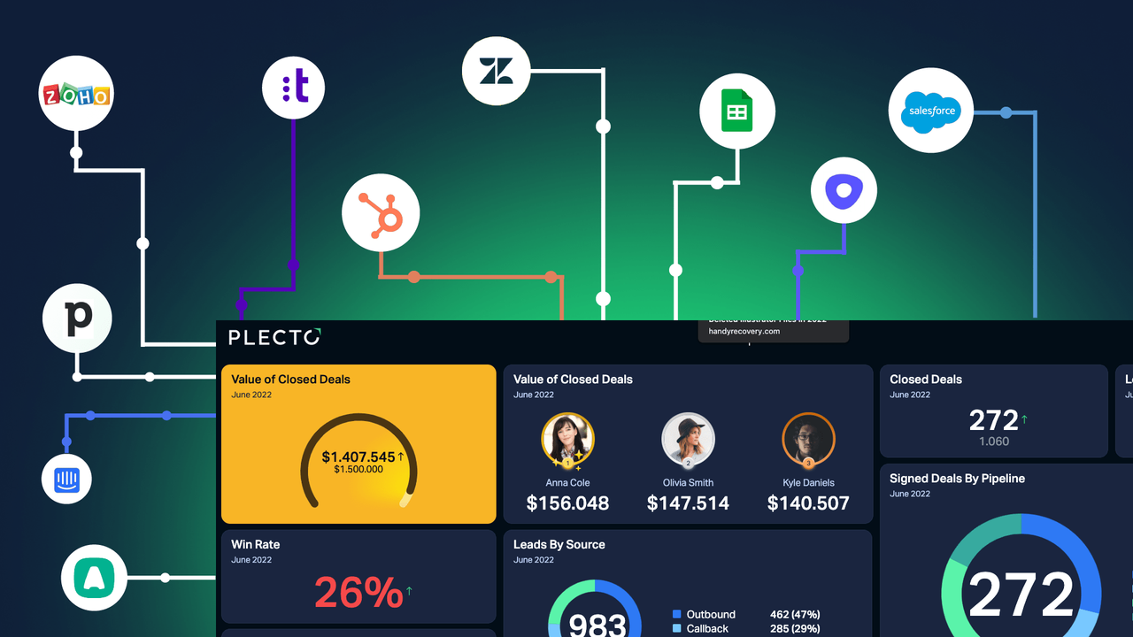
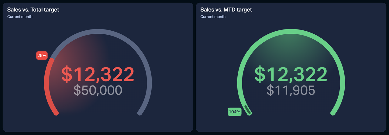
7. Use Colors to Improve Understanding 🚥
Adding colors to your dashboards doesn’t only make them visually appealing but also makes your team better understand their performance. In fact, studies show that colors enhance a person’s visual memory.
On a Plecto dashboard, you can add three different colors: red, yellow, and green. Using conditional colors enables you to show different stages of reaching a goal: red when you are off target, yellow for when you still have work to do, and green for when you are on track to reaching your goal!
8. Set Targets… and Make Them Dynamic! 🎯
Want to set ambitious targets but not too big that they demotivate your team? Using dynamic targets may be just what you are looking for.
At Plecto, dynamic targets are a target that is based on a calculation that updates whenever there is new data. It is useful for telling you how far away you are from reaching your goal.
For example, picture that you have a goal of reaching $75k in sales by the end of the month. Let’s say that after two weeks you have generated $40k in sales. Here, while you are on track, you are still quite a way off from achieving your target and your KPI will display in red. If this is the case, it is likely to have a negative impact on your team’s motivation.
In contrast, a dynamic target motivates your team by showing them they are on the right track to reaching the goal, even if they are still a way off in real terms. By using dynamic targets, a widget changes color based on how far away you are from your goal. If you are far away from it, it will be red and once you get on track it will turn green.
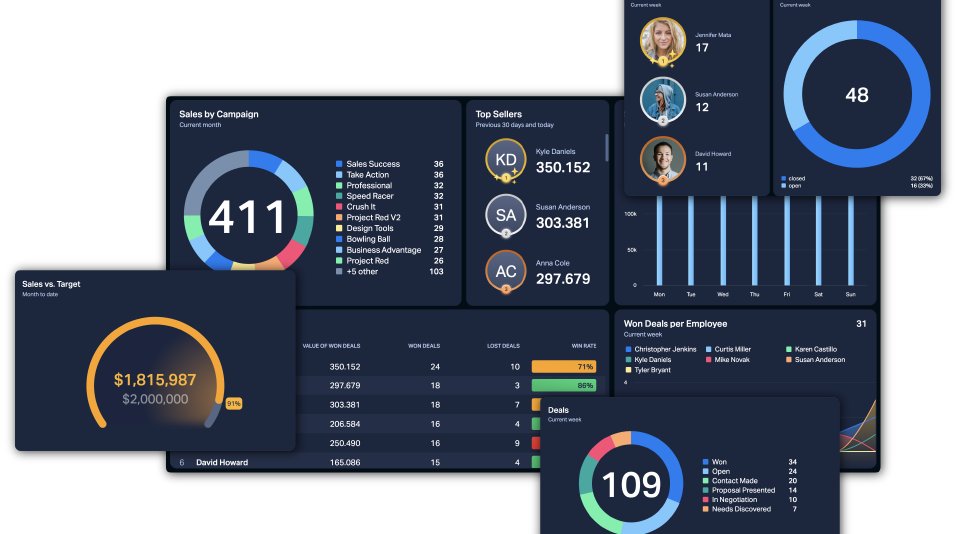
9. Pick the Right Visualizations
Effective dashboard visualization should make your data easier to understand. For this reason, it’s paramount that you choose the widget that best highlights the trends in your data. Here is the list of the different widget designs available in Plecto:
- Number Box
- Speedometer
- Table
- Timeline
- Line and area charts
- Column chart
- Donut chart
- Leaderboard
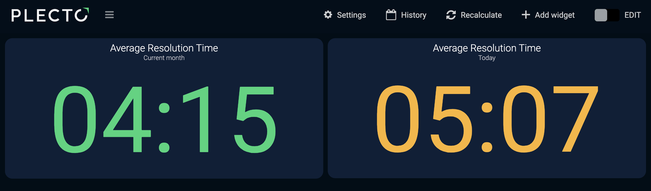
- Countdown
- Clock
- Text
- Image
Different data is better visualized through different visualizations. So, if you need to see how a trend changes over time, then go for a line chart. Meanwhile, if you need to show categorical data, then the donut chart is always a solid choice.
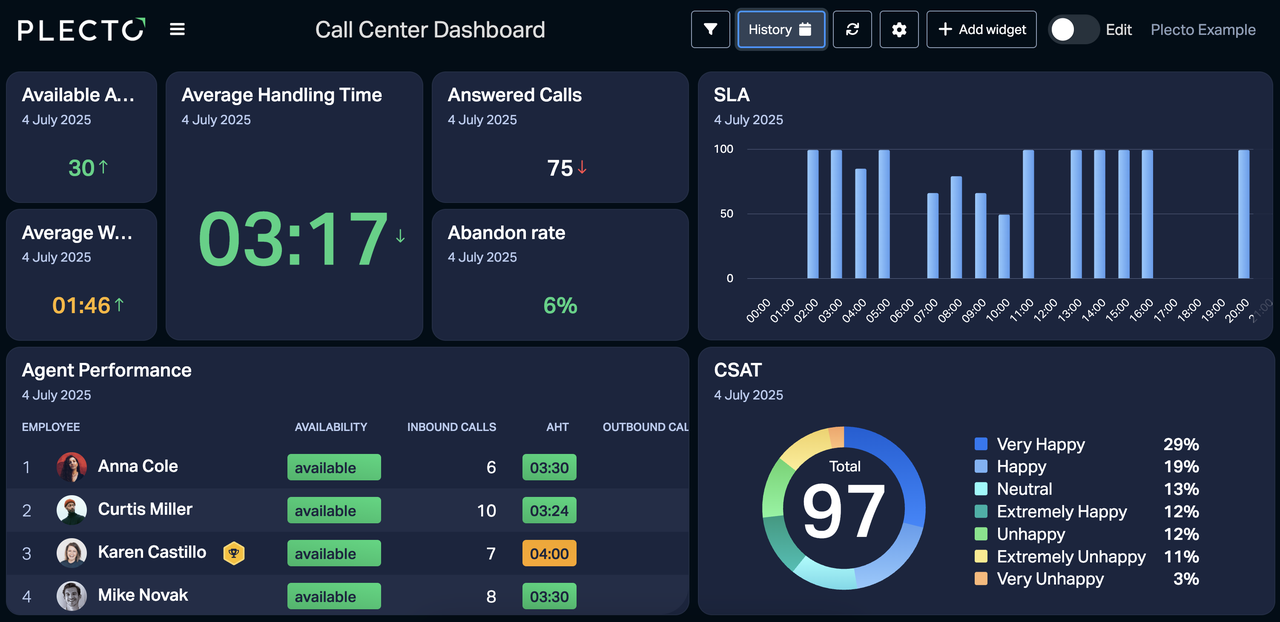
10. Keep Tables to a Minimum
Speaking of different visualization types, using tables is an easy and practical way to display your data. That being said, try to stick to only having one on your dashboard. A table widget requires a lot of space in order to be able to see everything properly, so we recommend that it takes half of a dashboard or a whole dashboard.
11. Take Advantage of Size and Position
If you’ve followed our advice, then you’ve built your dashboard containing only the most important KPIs. Even so, there’s a chance that some KPIs may be more crucial than others.
That’s why a hidden trick is to make the most of sizing and positioning. As a best practice, make the most important KPIs bigger so that they are noticed first. When it comes to positioning, put the most essential KPI on the top left corner of your dashboard.
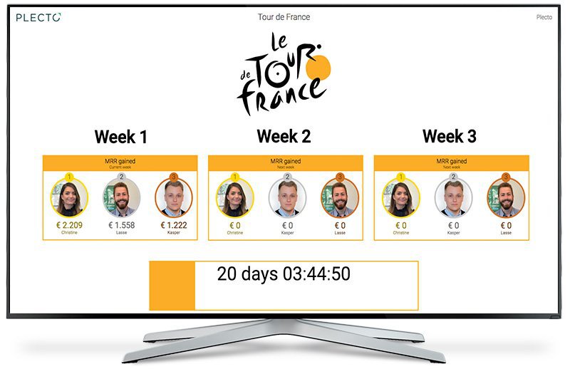
12. Incorporate Gamification for Motivation
Have you tried gamification amongst your employees yet? Gamification sparks a healthy sense of competition and excitement into everyday workplace activities. With Plecto, you can get gamification directly directly on your dashboards through pop-up notifications and achievements.

13. Display on TVs for Maximum Engagement
You spent all this time building your dashboard, now it’s important that people actually see it! By displaying on TVs across the office, you can create slideshows of your dashboards for your entire workplace, so that everyone can stay aligned on each other’s progress and celebrate successes together. Likewise, it’s also a great way to identify which KPIs need to be improved.
Displaying your dashboards on TV screens across the office increases employees’ accountability for their performance and motivates them to achieve their results.
Plecto’s dashboards can be displayed on any TV with an internet connection and it’s super straightforward and simple.

14. Regularly Update Your Dashboards
Don’t think of a built dashboard as something that is set in stone forever. Instead, regularly ask your team members for feedback. Are we missing a metric? Is there a KPI on the dashboard that we don’t need? These are the sorts of questions that you should be asking and making adjustments accordingly.
15. Personalize Your Dashboards
To increase employees’ connection to their work, you can use their names and pictures to be displayed alongside their results. Personalization not only empowers the top performers, but can be used as inspiration for other team members, who still need to reach their targets. Seeing
No doubt, seeing results you will be able to motivate your team and reach goals faster than expected!
At Plecto, we’ve taken personalization a step further with our Dynamic Dashboards. Here, you can create one dashboard that can then automatically tailor the data based on the person who’s viewing it.
3 Mistakes to Avoid When Designing Dashboards
Not Being Aware of the 5-Second Rule
The 5-second rule refers to the maximum period of time it should take to find the information you are looking for. Of course, thoroughly digging into your performance will take longer than this; however this amount of time should be enough to give you the the general overview.
If it is taking you a long time to actually find what you are looking for, then this is an indication that your dashboard is not intuitive enough.
Not Adding Targets
Your dashboard should not just be about showcasing your current performance, but also display how much progress you are making towards where you want to be.
Be sure to always set targets that are ambitious but attainable. This way, your team will be more focused and aligned in what they are working towards.
Measuring Too Much Data
As we’ve mentioned, your layout should be crisp and concise to get the most effective insight into your data.
Build Your High-Performing Dashboard with Plecto
Wow, we’ve talked a lot – now it’s over to you! Take us for a spin with a free demo, and get started with building your own high-performance dashboard.
Start your 14-day
free Plecto trial today.
MATT EVANS
Content Manager