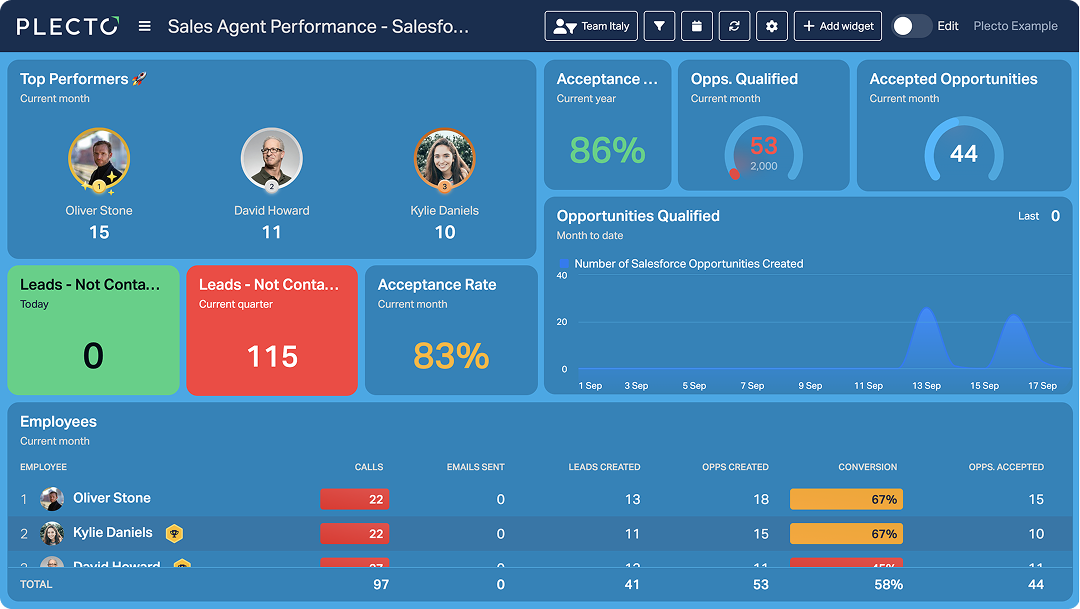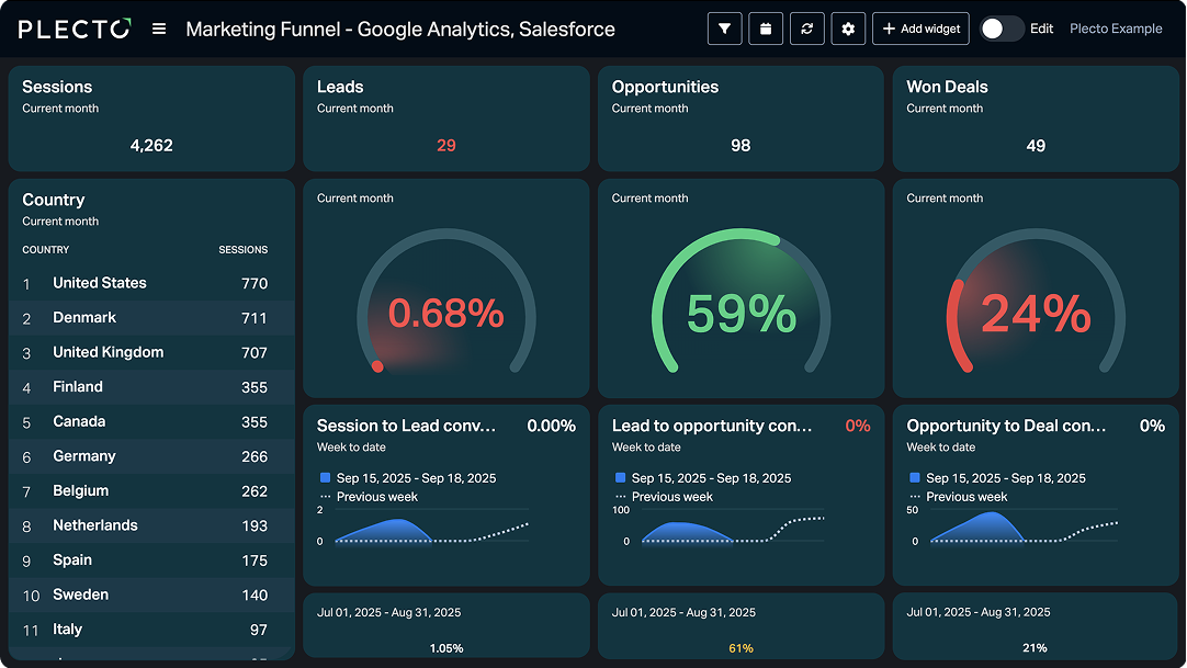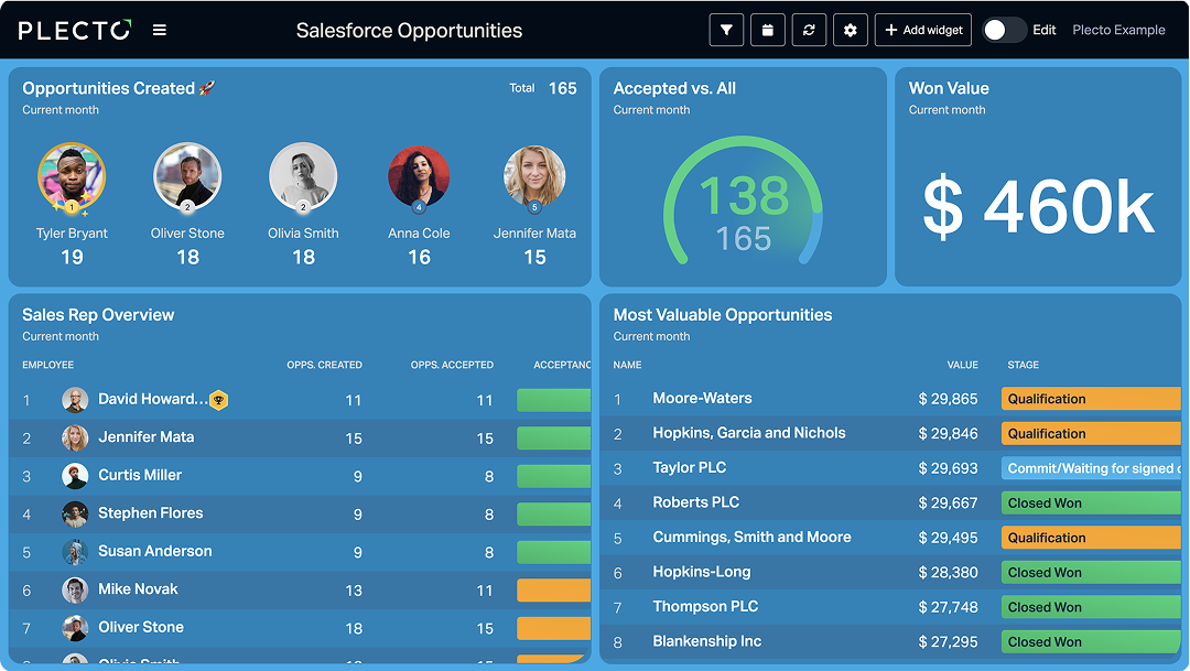
Visualize all your sales performance in one place
Use Plecto’s Salesforce integration with custom objects to power unlimited real-time dashboards for KPIs and pipeline.
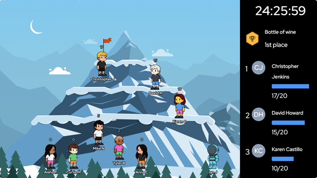
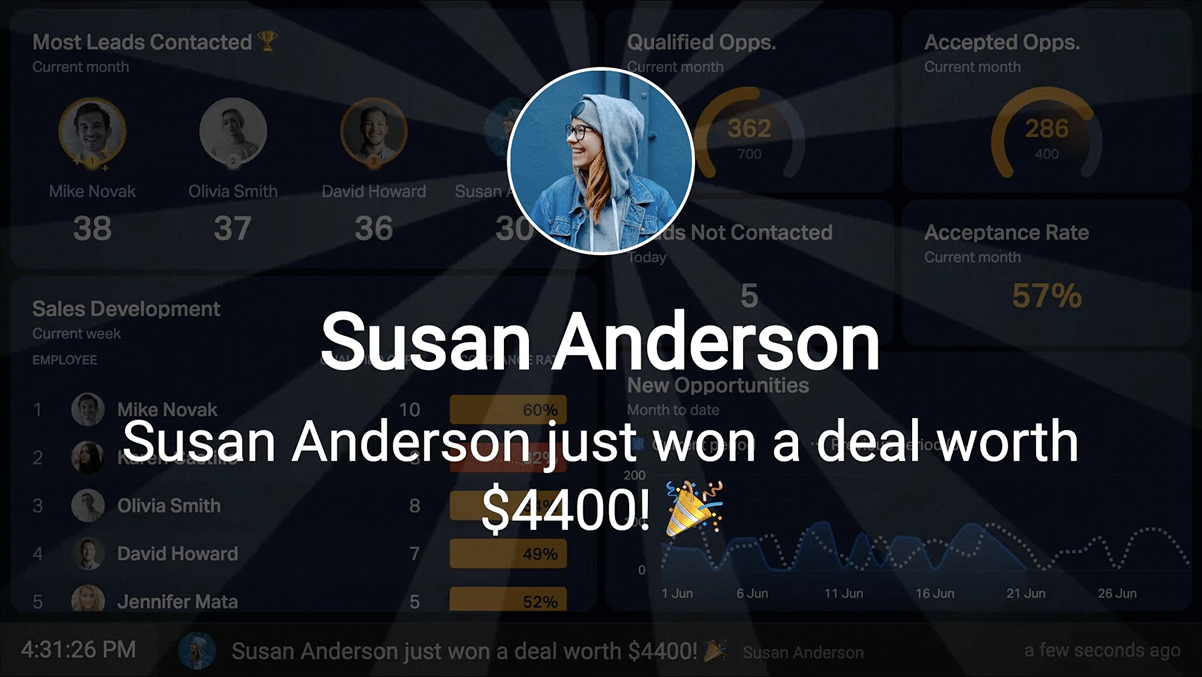
Your Salesforce KPIs + Plecto's gamification = a motivated team!
Gamify Salesforce to energize reps. Run contests and trigger real-time alerts for goals, milestones, and new deals.
State-of-the-art streaming for Salesforce Chat
Track Salesforce Chat SLAs in real time. Queues and longest wait are visible on live dashboards.
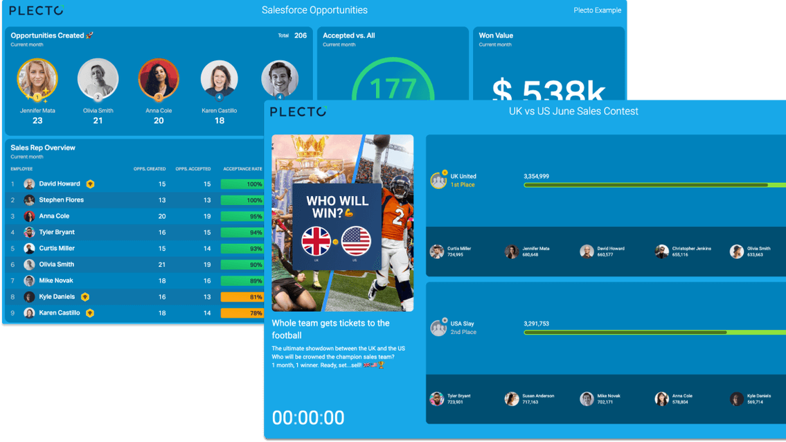
Ready-made dashboards, KPIs and widgets
Launch Salesforce dashboards fast with plug-and-play KPIs and a ready-made Plecto Store template.
Combine with your other systems
Go beyond Salesforce: connect 150+ integrations – telephony, finance, projects – into one Plecto dashboard.
Invest in your employees' development
Use Plecto to streamline professional development — coaching, training, and feedback all in one place.