
Blog
Dashboard Design
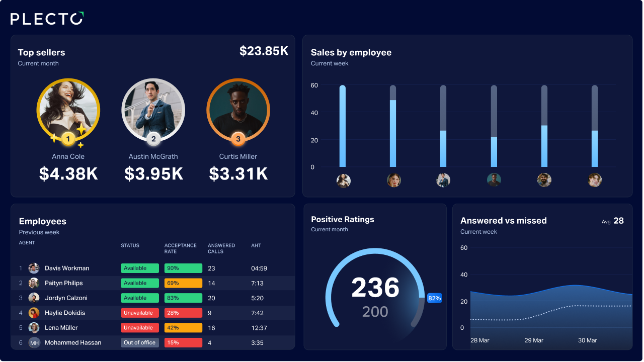
Why Your CRM Should Be the Single Source of Truth for Revenue (and How to Get It There)
Data not aligning across the office? Read on to discover how to use CRM dashboards as a single truth source across your teams.

Everything You Need to Know About CPG Order Fulfillment
Don't let CPG orders go unseen. Learn about key challenges in fulfilling them—and how live data visualization delivers results for your business.
4 Things That Slowly (But Surely) Mess Up Your Data
Is your dashboard lighting up while sales stay flat? Your data might be "correct" but completely misleading. Discover 4 silent factors that are messing up your business decisions before you notice.

Why Data Visualization Matters: Science, Business, and Strategy
Why is data visualization so important? Explore the scientific, business, and strategic benefits of visualizing data—from faster brain processing to better employee coaching.

Unlock Your Database: How to Visualize SQL Data for Better Decisions
Don't let your data sit hidden in a database. Learn how to connect SQL sources to Plecto's real-time dashboards to boost team transparency, accountability, and performance.

7 Powerful Databox Alternatives for 2026
Upgrade your dashboard today. Discover 7 powerful Databox alternatives that drive team motivation and performance with real-time insights, sales contests, and AI-driven analytics.

7 Powerful Geckoboard Alternatives for 2026
Scaling beyond Geckoboard? Discover the 7 best Geckoboard alternatives for 2026, from Plecto’s gamification to Power BI’s deep analytics, and find your perfect fit.
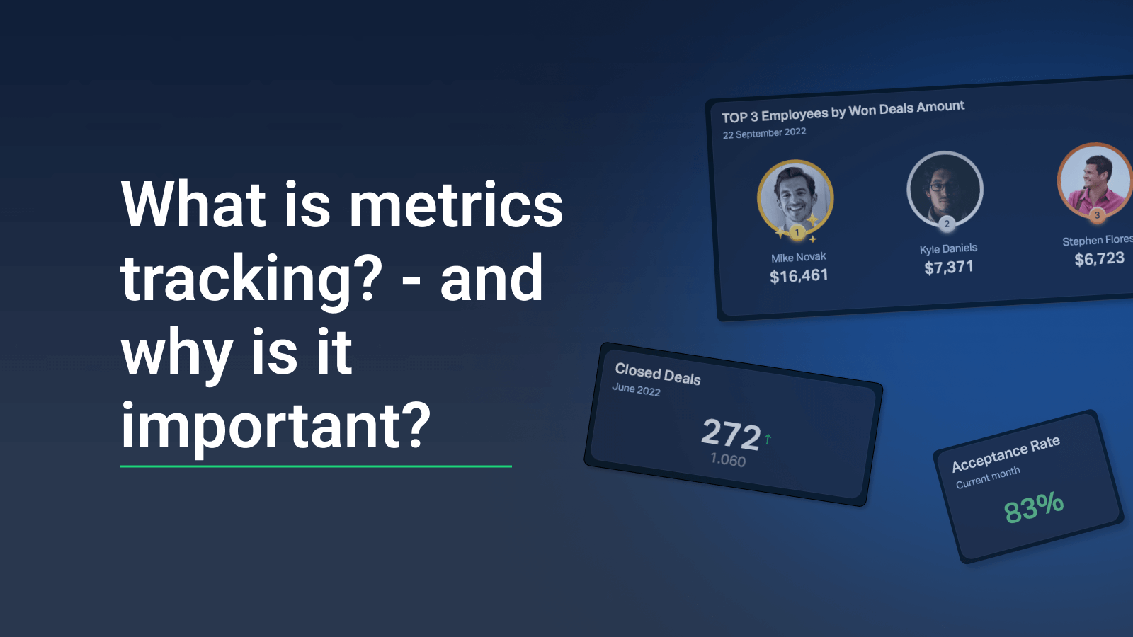
What is Metrics Tracking, and Why is it Important in 2026?
Metrics vs. KPIs: do you know the difference? Learn the "what" and the "how" of metrics tracking to provide context for your performance and reach your business goals.

3 Easy Tricks to Track OKRs in Plecto
Do you use OKRs? Learn how to track OKRs and display them in your Plecto dashboard, and engage your employees in the business' performance on a daily basis.
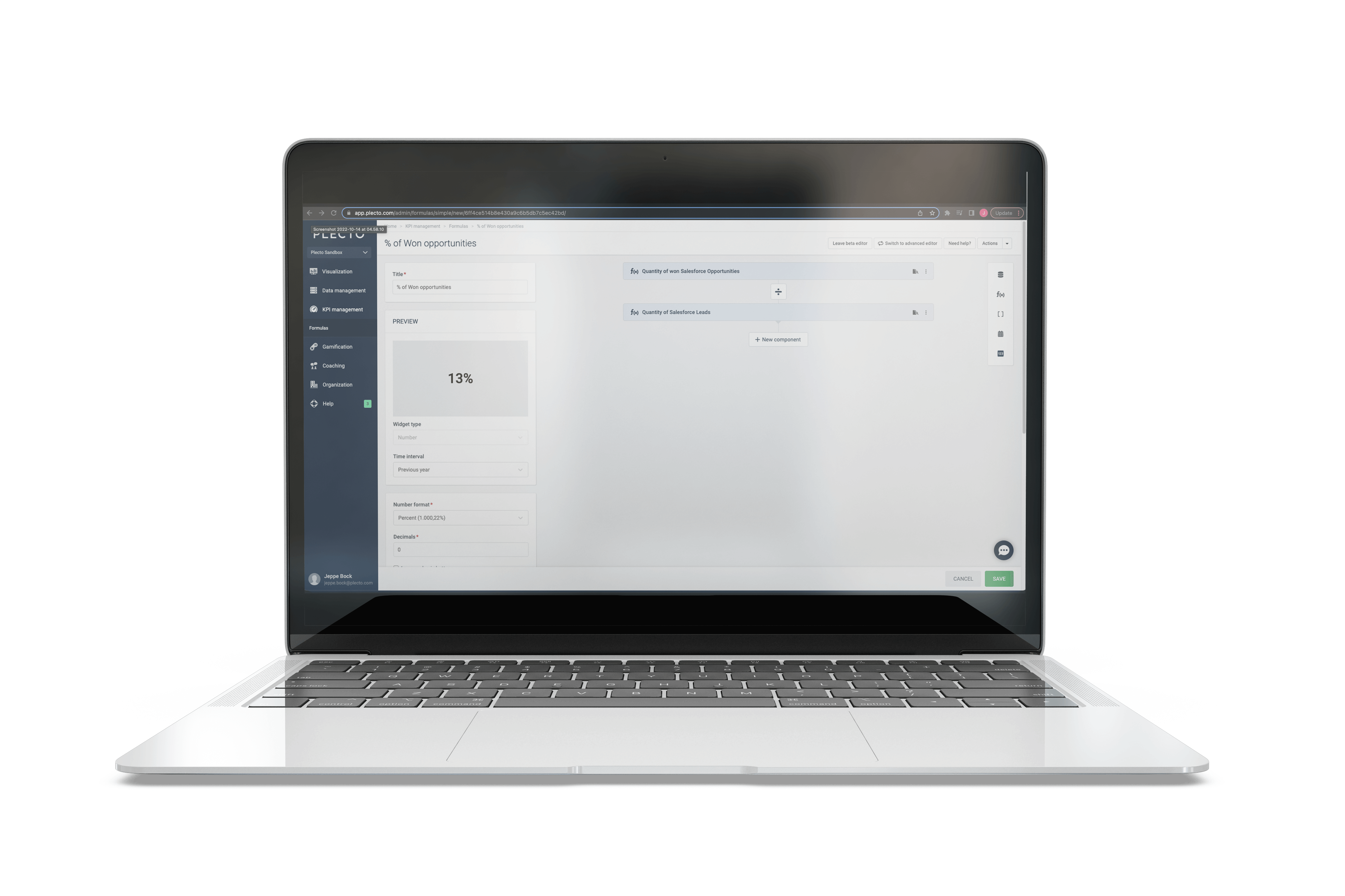
Step-by-Step Guide: How to Create Custom Metrics in Plecto
Discover how to create and customize specialized metrics in Plecto in this easy step-by-step walkthrough.
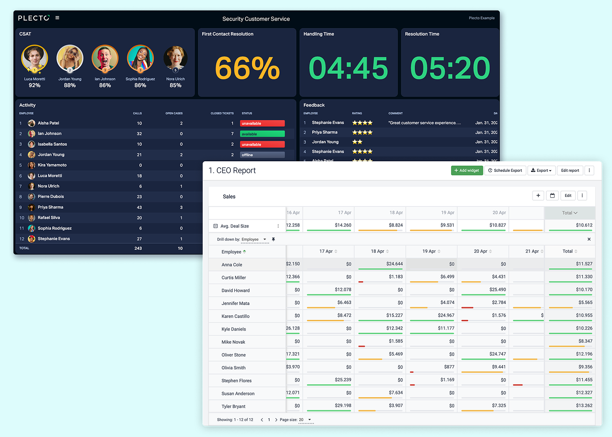
Dashboards vs. Reports: Key Differences Explained
Dashboards and reports are two crucial features for understanding your business data. Learn here about their differences and similarities, and how to leverage both for maximal effect!
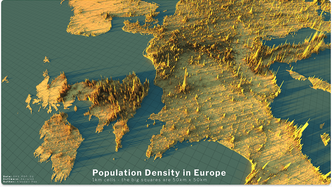
5 Examples of the Best Data Visualizations
What makes a data visualization truly "great"? Explore 5 world-class examples—from 3D terrain maps to interactive federal budgets—that turn complex data into visual masterpieces.
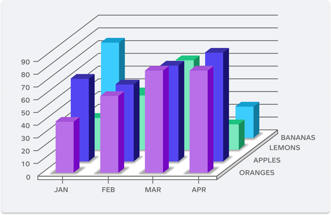
6 Examples of Bad Data Visualizations
We break down six examples of poor-quality data visualizations, looking at what makes them bad and how they can be improved for clearer, more effective data storytelling.

6 of the Biggest Data Visualization Trends of 2025
Explore 6 top data visualization trends of 2025—including real-time dashboards, AI-driven insights, and mobile-first design—that enhance business competitiveness and decision-making.

How to Visualize Data for Actionable Insights in 2026
Did you know 90% of information sent to the brain is visual? Master the art of data visualization to uncover hidden trends, empower your team, and drive smarter business decisions.

Top 10 Dashboard Solutions for Businesses: A Comprehensive Guide
Discover the top 10 dashboard solutions for businesses in this guide, featuring key features, pricing, and strengths to help you choose the perfect platform for your data needs.
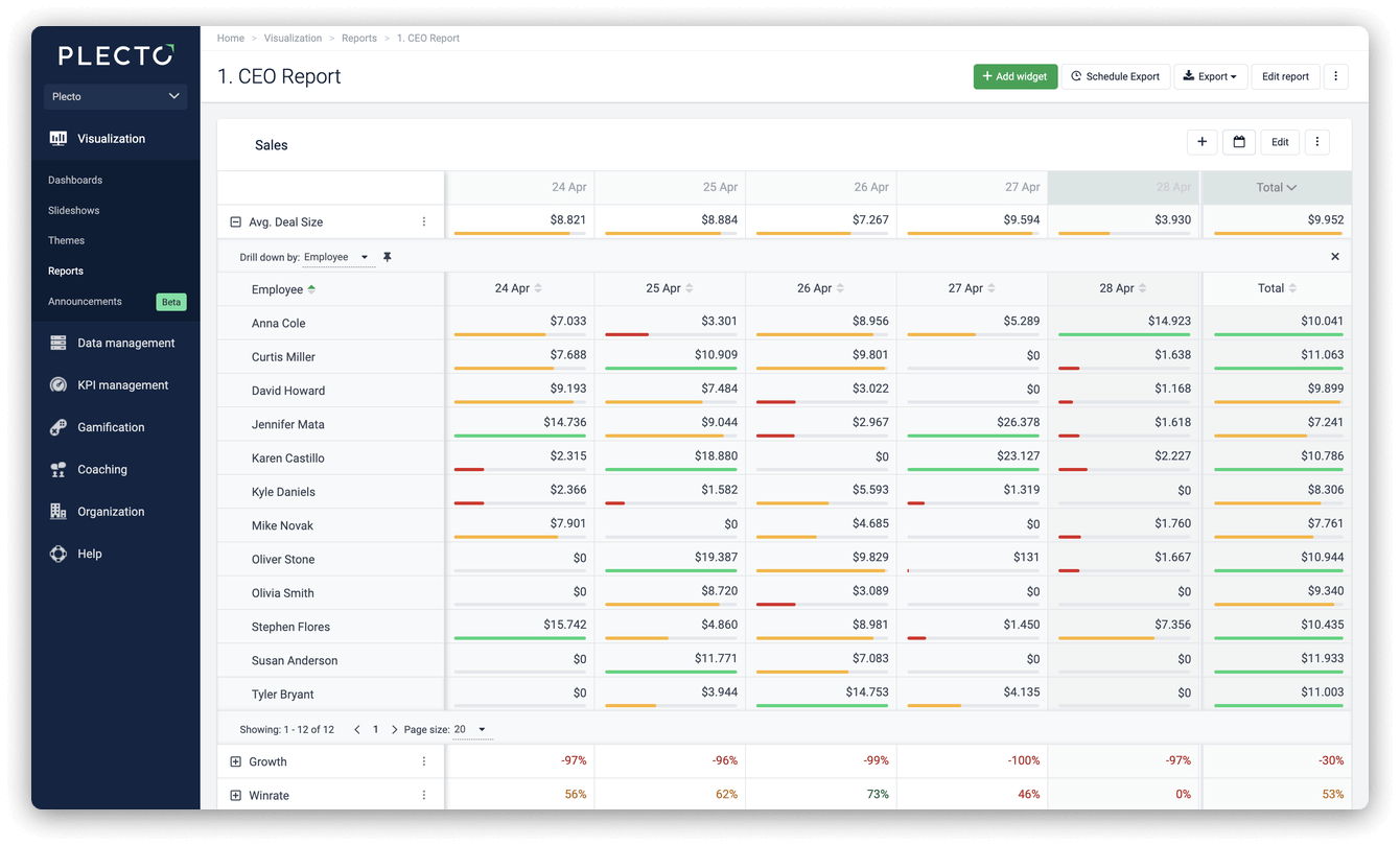
Step-by-Step Guide: How to Create an Automatic Report in 2026
Still writing reports by hand? Discover how automated reporting saves hours of manual work and delivers real-time KPI insights straight to your inbox.

4 Sports-Themed Sales Contest Ideas to Engage Your Team in 2026
Ready to skyrocket sales performance? Learn how to run high-energy, sports-themed contests that turn every deal into a touchdown. Perfect for Plecto users!
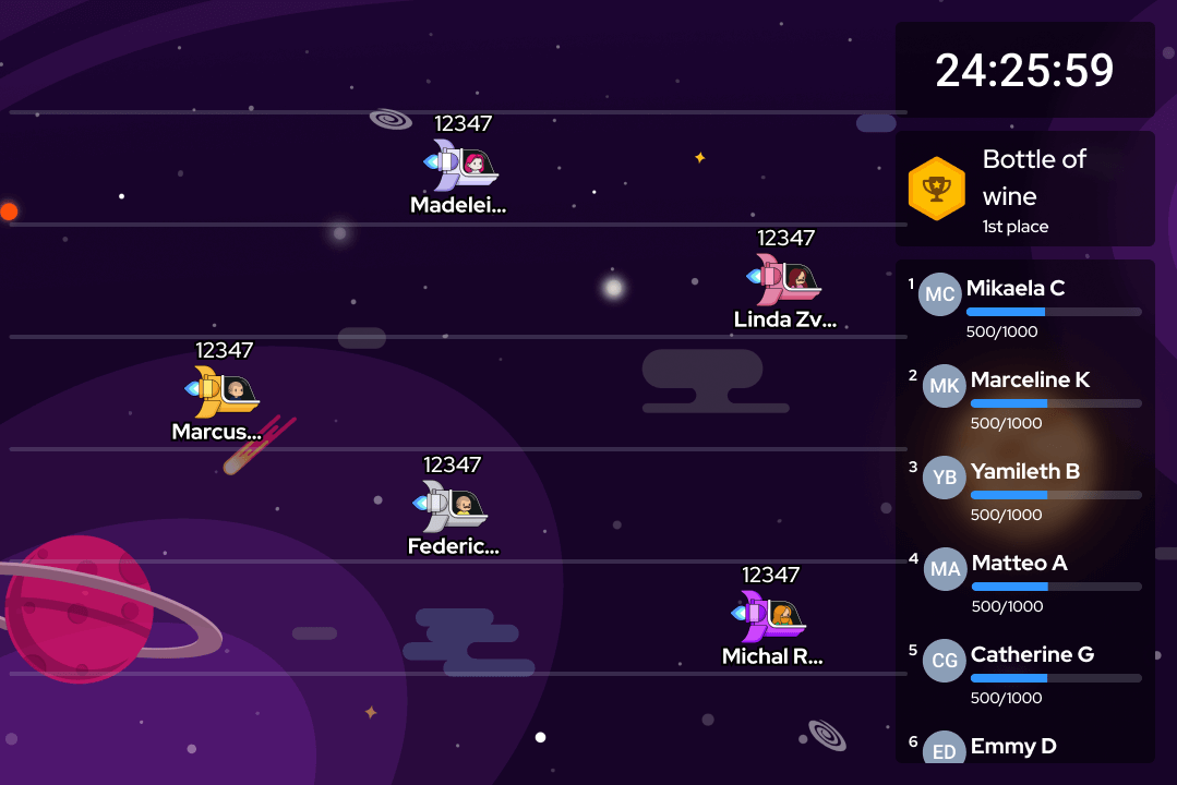
Step-by-Step Guide: How to Create a Fun and Engaging Contest
In this Step-by-Step Guide, you'll learn how to create fun and engaging Plecto contests for your team in no time!
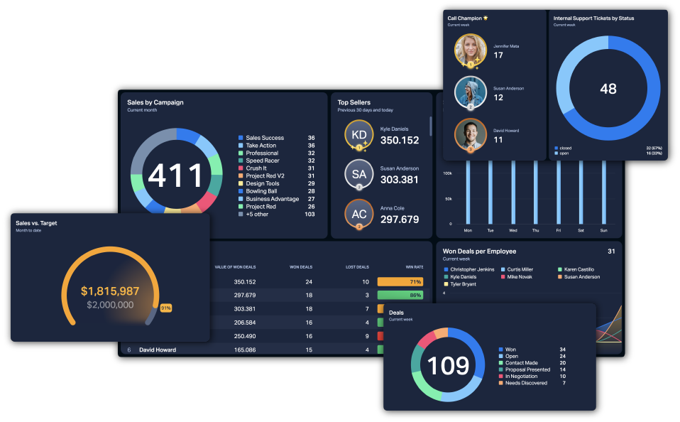
The 15 Golden Rules of Dashboard Design
Transform your data into action. Discover the 15 golden rules of dashboard design to align your team, visualize KPIs, and boost performance at a single glance.

How to Analyze Data: A Beginner's Guide for 2026
Master the basics of data analysis. Learn the 6 essential steps to gathering, scrubbing, and interpreting data to reduce costs and outperform your competition in 2026.
What Are Data Dashboards, and Why Should You Be Using Them?
Find out what a data dashboard is, what it can do for your business, and how to use dashboards to make the best decisions for your business.
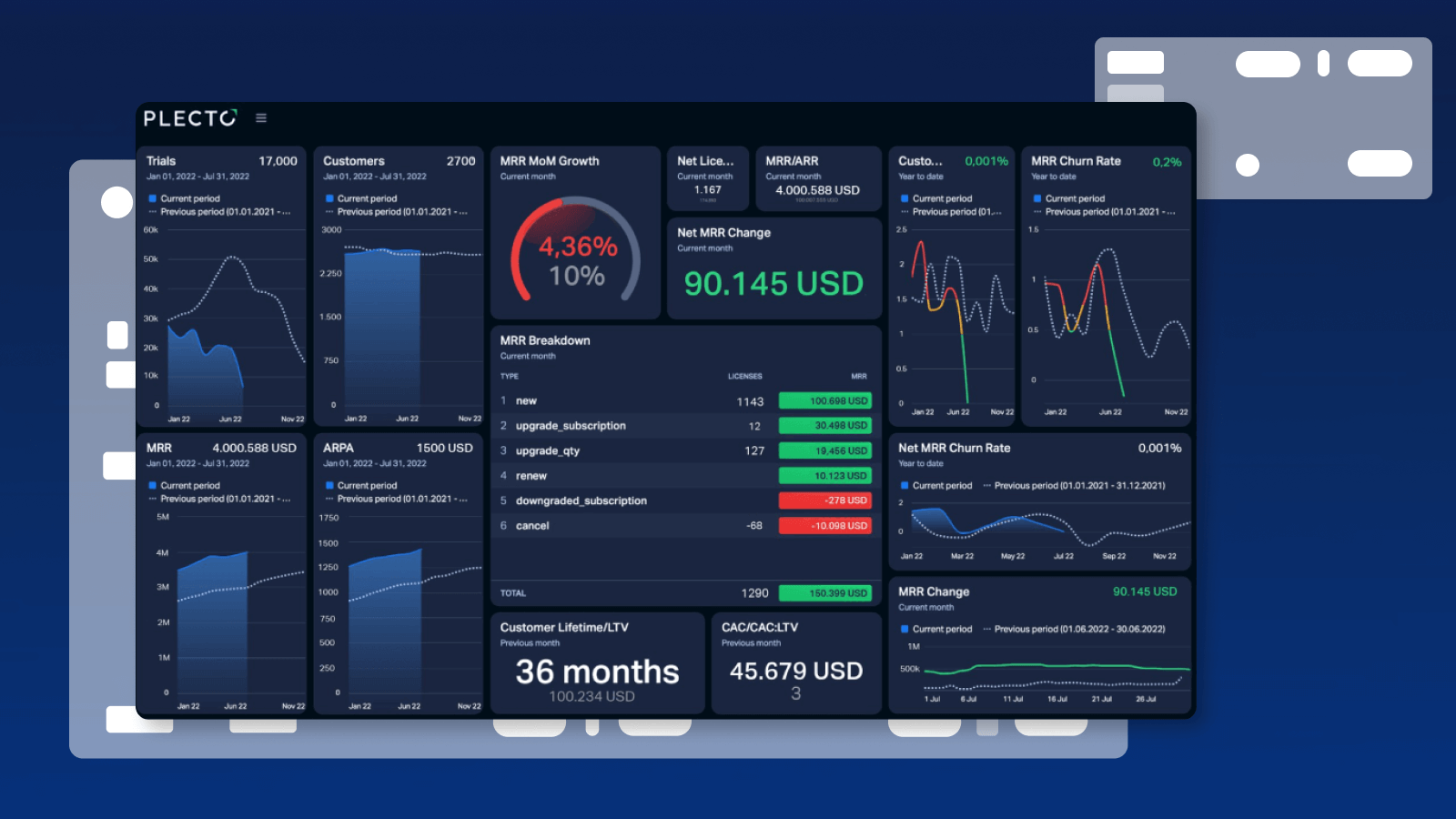
The 3 Types of Dashboards You Need To Be Using
Learn about the three mission-critical dashboard types, which ones you should choose, and how to get the most out of them in your company’s operations.
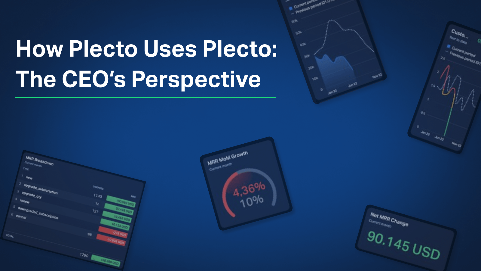
How Plecto Uses Plecto: The CEO's Perspective
Ever wonder how a SaaS CEO tracks performance? Kristian Øllegaard shares the exact KPIs, dashboards, and automated reports he uses to lead Plecto and manage investors.
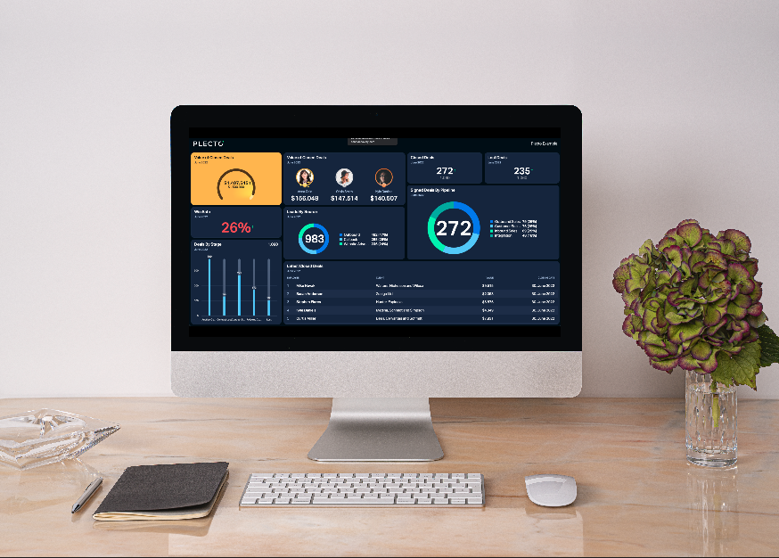
Business Dashboards 101: Definition, Types, and Top Benefits
Discover how visualizing data on dashboards automates reporting, improves decision-making, and motivates teams. Learn about KPI, Project, and Executive dashboards here.
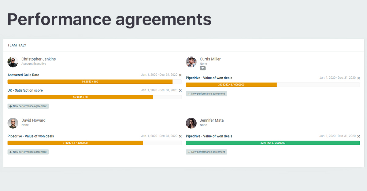
How to Use Performance Agreements to Scale Up Your One-on-Ones!
Discover Plecto's "Performance Agreements" feature, and how to easily use it to scale up your one-on-ones with your employees.
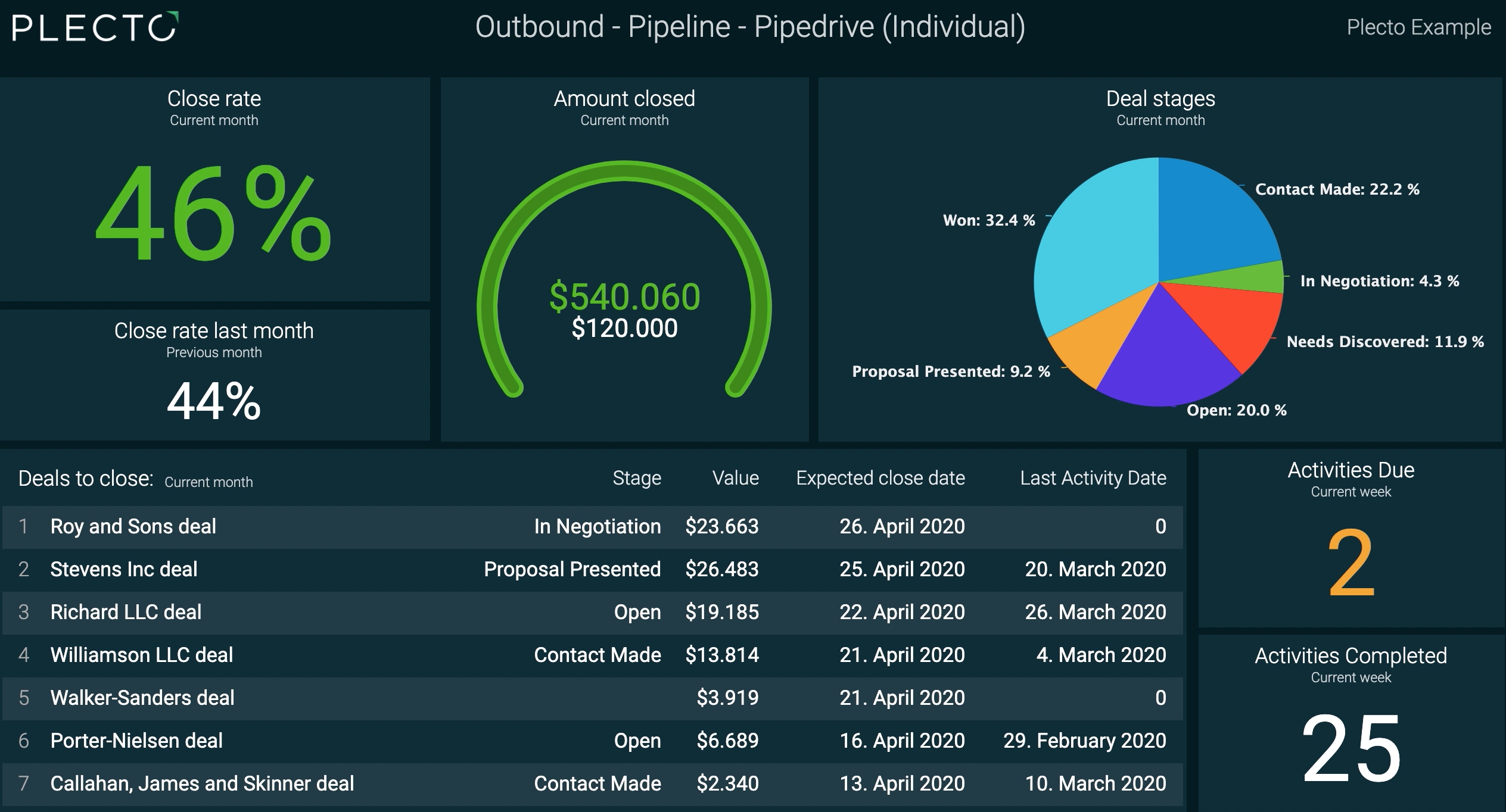
Engage Your Remote Team With our 'Limit Dashboard Access' Feature!
Discover our new Limit Dashboard Access feature to get the best out of your Plecto dashboards. Improve communication with your remote team with these easy tips and tricks!