
5 Examples of the Best Data Visualizations
The Power of Good Data Visualization
In the previous post, we took a look at some poor examples of data visualization—so it’s only natural that we balance the scales and break down what makes some of the best contemporary data visualizations so good!
From beautiful, interactive graphics to deceptively simple charts, here we’ll take five of the best data viz examples around and discuss what these graphics show, what makes them so compelling, and why. If there are three words that describe these examples, they are creative, innovative, scientific—and you’ll see why.
What Makes a Data Visualization Good?
Unlike bad data visualizations, successful data visualizations are clear, sensible, and scientific.
Let's break this down a bit further:
- Visually appealing—they are pleasant to look at
- Intuitive—components of the visualization "click" for the reader with little to no explanation
- Clear—data is organized or presented with little to no "fluff." While the data presented might be complex, it's not complicated.
- Science-based—data aligns with the scientific method and statistical analysis, either the foundation or result of rigorous research.
- Honest—perhaps most importantly, there is no attempt to mislead the audience.
In short: a data visualization is good if its data is presented in a clear, creative, and honest way.
 Build your own
1. Terrain Map of Europe’s Population
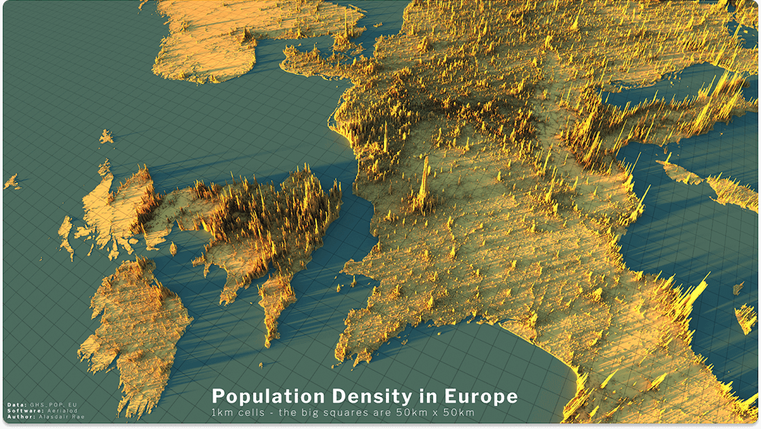
Population density is represented by height and density of visual "needles."
What Is It?
This remarkable map shows the population density of European countries through 3D terrain imaging. Needle-like structures are used to indicate population and population density per square kilometer. The taller the needle, the higher the population per square kilometer. The more needles there are over several square kilometers, the denser that area’s population.
Why It’s Great
If there’s one thing that stands out about this map, it’s detail. Because the needles indicate population per square kilometer, population statistics are drilled down to the smallest reasonable unit that makes sense over such a vast area. Also, while more an artistic than data-based element, the shadows cast by the needles add a special touch, giving the visualization an aspect of realism—and making it one of the more beautiful examples you’ll come across.
The other remarkable aspect of this map is its readability. It’s immediately obvious what the needles and their clusters mean with no explanation necessary. Important information about population distribution across Europe can be found at a glance, and lead to fascinating and even unexpected insights. One can see, for example, just how deserted Norway and Scotland are, or how much of Italy's population hugs the country’s coasts.
2. US Federal Budget, 2016
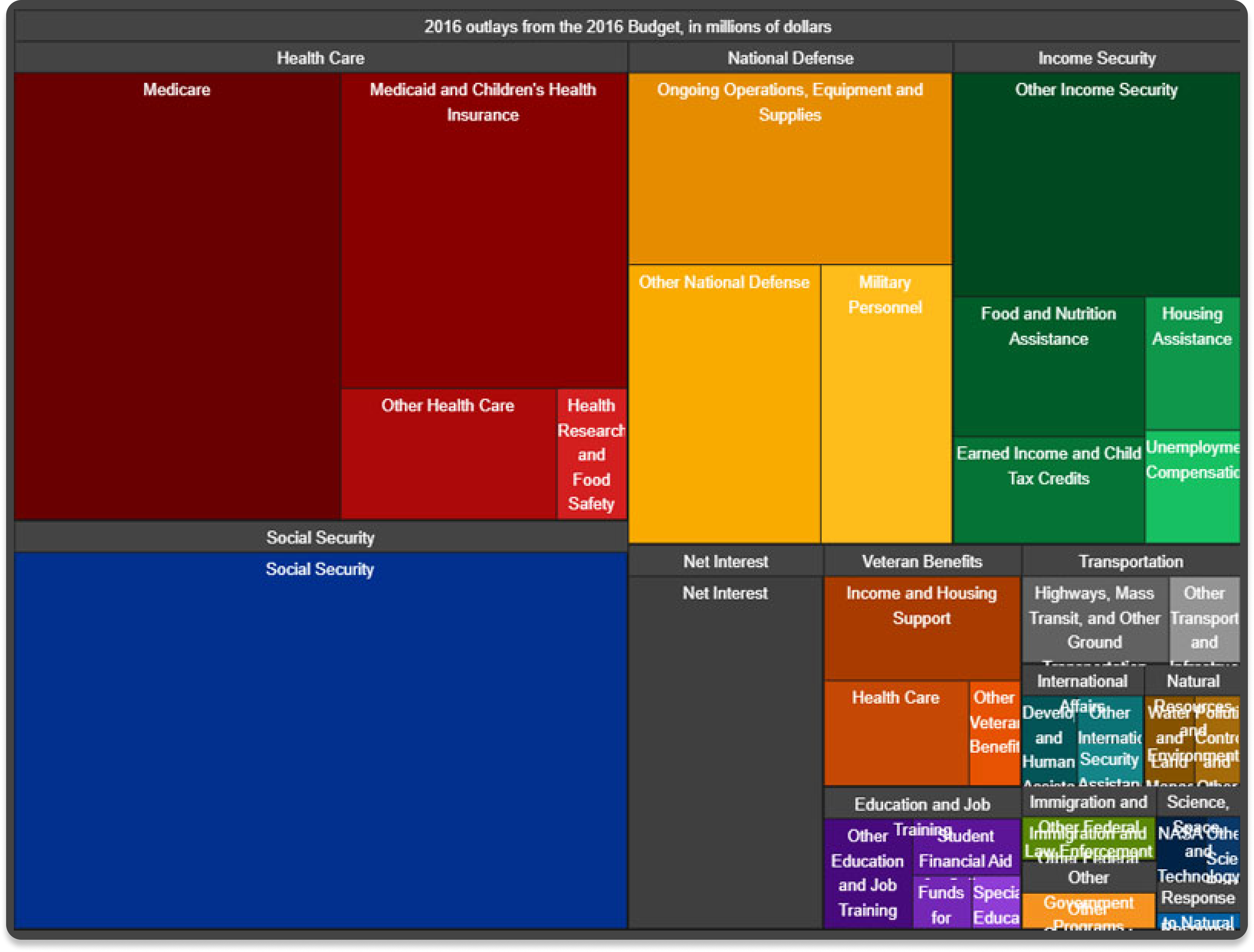
Every part of the USA's massive Federal budget is broken down into easy-to-read sections.
What Is It?
As part of then-President Barack Obama’s initiative encouraging greater transparency within the US Government toward American citizens, the White House published the Federal Government’s 2016 budget as a heat map. Breaking down the Government’s expenses by Social Security, National Defense, Income Security, and several other categories, the graphic is interactive, allowing the viewer to click on one of the colored boxes and obtain more (written) information about what each segment of the budget means. Because the graphic below is a screenshot, you can click here to access the original, interactive version.
Why It’s Great
In two words: data democracy. This initiative from the Obama Administration took a previously incomprehensible piece of legislation—the vast and unwieldy Federal Budget—and presented it on a single webpage, allowing easy access to this data for anyone with an internet connection.
There’s nothing flashy or even particularly original about this graphic, but the simplicity is the point. This graphic’s transparency was intended to empower ordinary citizens to better understand how the government works, and equip them with the knowledge to better participate in the democratic process.
3. Global Surface Temperature
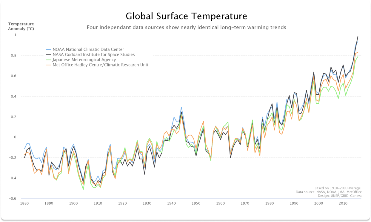
The long-term trend of increasing global temperature is evident from this simple line chart.
What Is It?
Another simple visualization that nonetheless communicates a lot, especially about a contentious issue where data is often cherry-picked for politics’ sake. This line chart shows data from four separate sources measuring average global surface temperature anomalies over a long period—from 1880 to 2010. Temperature is marked off by 0.2 degree C, and time is marked off in decades. Each data source is listed in the key, and indicated by a different color in the graph.
Why It’s Great
Once again, the key here is simplicity. The colored lines tell a clear and immediate story: that global surface temperatures are indeed increasing, and four separate, reputable sources correlate closely and agree on this fact.
Another key aspect of this graph is its longevity. One of the critical issues in climate change discourse is whether the current warming trend is a blip on the radar, or the culmination of decades of gradually increasing temperatures. This graph definitively answers the question.
4. World Population
Irregular slices in this atypical pie chart allow shares of data to be easily seen.
What Is It?
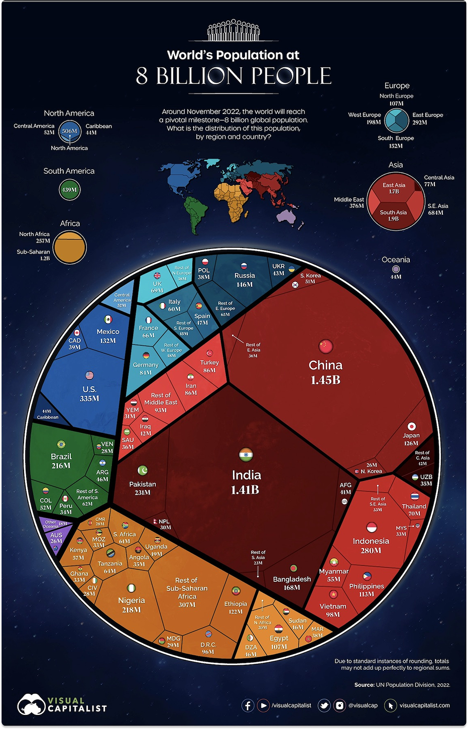
This graphic is a fascinating take on a pie chart, preserving the intent of the original format while completely upending the presentation. It shows the distribution of the world’s eight-billion strong population by country and by region. Each continent follows a given color theme, and the regions within continents have various shades of this overall theme. For example, Asia’s color theme is red, with South Asia being dark red and the Middle East being pale red.
Individual countries and continents are demarcated by straight edges within the chart, and are sized proportionately to their given population. This allows the reader to not only read each country’s population size, but also compare its population relative to the other countries displayed.
Why It’s Great
The significant advantage of this nontraditional pie chart is that it communicates far more information than a typical pie chart ever could. An ordinary pie chart divides a circle into increasingly smaller slices that, at some point, can’t be distinguished. For this reason, traditional pie charts are best for showing only large fractions.
However, by dispensing with the traditional “pie slice” format and instead relying on irregular shapes to communicate data, this chart manages to convey an incredible amount of information that would simply be classified as “other” on an ordinary pie chart. Best yet, this unique take on a pie chart is highly readable.
 Build your own
5. Top 50 Websites
A huge, complex dataset is made simple through a few basic shapes.
What Is It?
Because this graphic can’t be classified as any one type of visualization, it absolutely wins points for its uniqueness—it might be one of the coolest examples on this whole list!
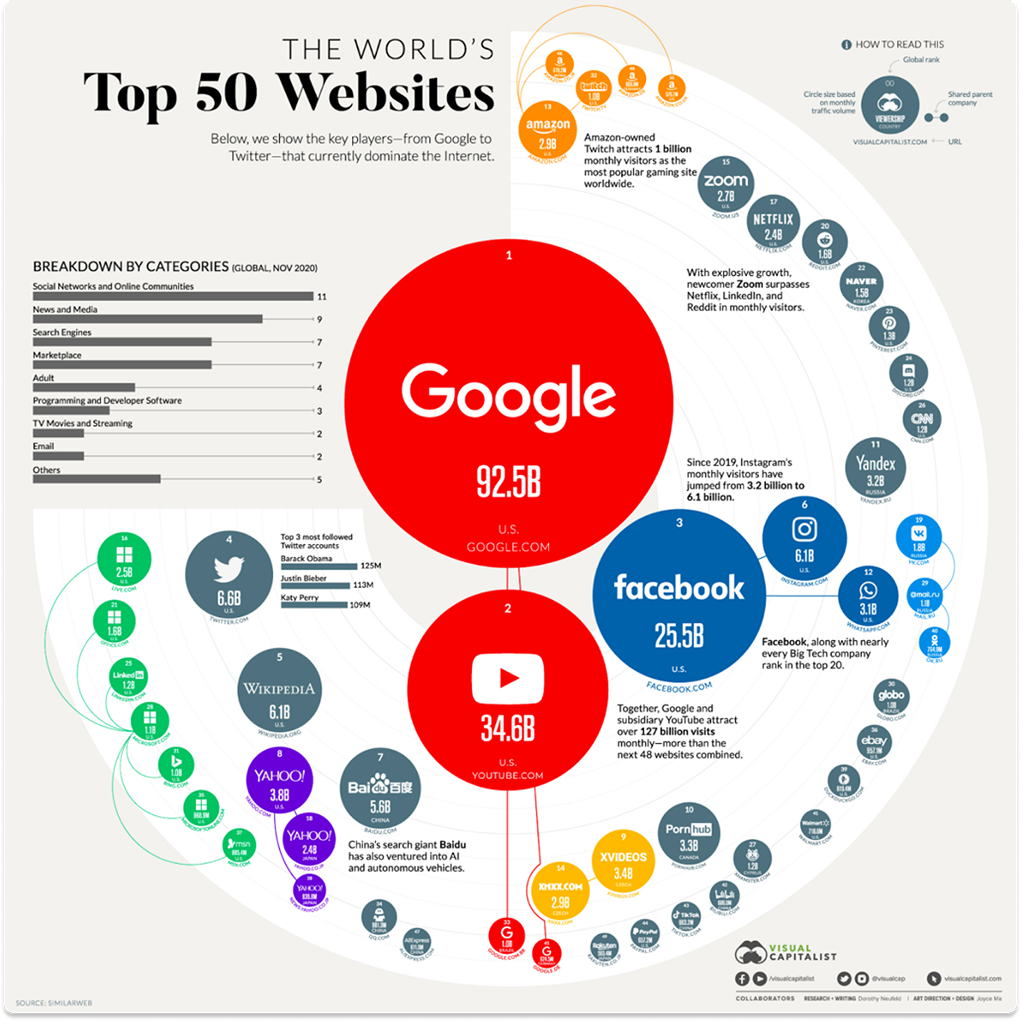
This graphic displays not only the world’s 50 largest websites, but also communicates a large amount of other information about them. Website size is indicated not only by bubble size, but also by size tier, with larger companies sitting toward the middle and smaller ones lying at the outskirts.
Parent companies are all assigned a color: Google is red, Meta is blue, Microsoft is green, and so on. Sites that have no parent company are colored grey.
Relationships between sites are indicated by looped lines connecting the bubbles. Finally, a bar chart is provided to the left of the main chart, displaying how many websites fall in each “genre” (search engine, email, video streaming, and so on).
Why It’s Great
The way this graphic displays relationships is by far its most prominent feature. Because this visualization is multifaceted and highly complex, it would be easy to overwhelm the viewer with the amount of information it presents.
But instead, the graphic invites the viewer to explore the relationships between the world’s largest websites. The differently-sized bubbles, the colors and numbers, the size tiers and the relationship lines encourage this exploration. Crucially, the visualization also doesn’t overdo things: it keeps some of the data in a bar chart separate from the main graphic for easier audience comprehension.
Plecto: The Perfect Data Visualization Tool
These five graphics are some of the best examples of contemporary data visualization around. Although the visualizations all have wildly different formats and are based on significantly different subject matter, they all possess a similar blueprint: the typical, simple data visualization format has at least one of its components altered, expanding it into something new and exciting while still preserving the original’s clarity and readability.
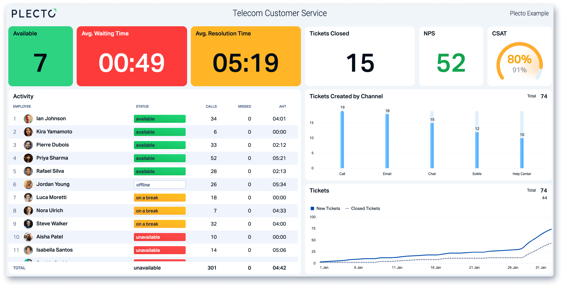
While you might not be able to create visualizations of this caliber regularly, you can still harness the power of visualization to create exciting and informative graphics to motivate, educate, and empower your team with Plecto.
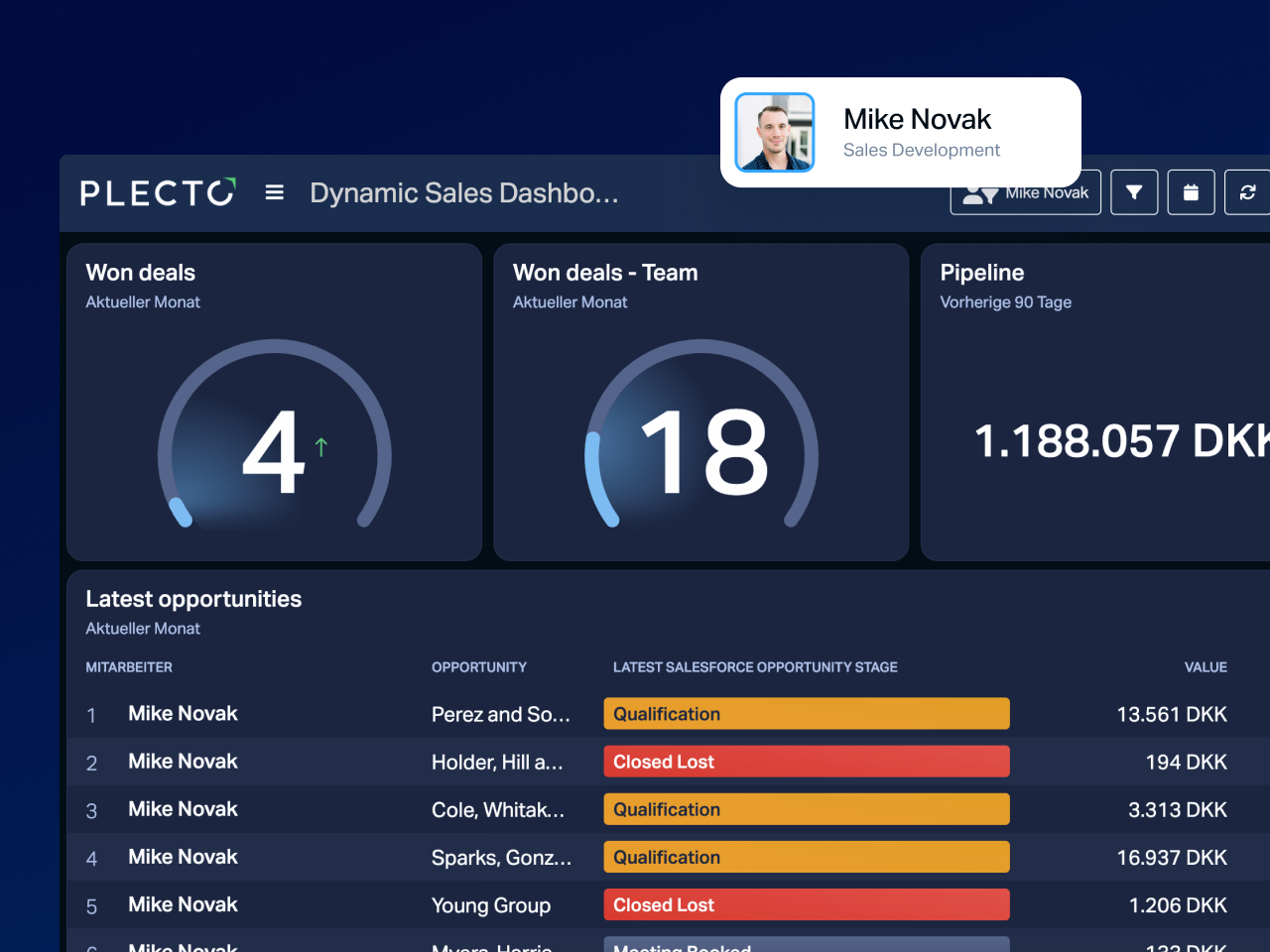
The difference? These five are static masterpieces, frozen in time—but your own numbers are always moving. Plecto turns them into interactive, real-time dashboards and dynamic, filterable views that stay clear and compelling while updating themselves, so you get a great data visualization, not a screenshot.
Paired with Plecto’s gamification capabilities, it’s a proven formula for teams across a wide variety of industries, so why wait? Sign up below for a free Plecto demo, and watch the magic of data viz enhance your office workflow!
FAQ
Frequently asked questions
The most successful visualizations take a simple, familiar format and alter at least one component to make it exciting, while still preserving clarity and readability. Plecto follows this blueprint by allowing businesses to transform abstract numbers into interactive, real-time dashboards.
The primary advantage of the terrain map is its use of 3D needles to represent population density per square kilometer. While a traditional 2D map might use color shading, the height and cluster density of these needles provide an immediate, instinctive understanding of where people live.
Traditional pie charts are notorious for becoming unreadable when they have too many slices, as small data points get lost in a sliver of "Other." This visualization solves that by using a non-traditional pie chart with irregular, straight-edged shapes sized proportionately to each country's population.
Two of the examples above are interactive: the US federal budget heat map lets you click each category for more detail, and the top 50 websites chart invites you to explore the relationships between sites. Interactive visualizations let the viewer explore the data themselves rather than read a static snapshot—which is exactly what a live, interactive dashboard does with your own numbers.
A beautiful data visualization pairs aesthetic appeal with clarity: it's pleasant to look at, but the color, shape, size, and layout choices all serve the data rather than merely decorate it. The 3D terrain map of Europe's population above is a good example—its needles and shadows are striking, yet you grasp the data at a glance.
Start your 14-day free Plecto trial today.
Enjoyed the article? Share it:


JAMES NIILER