Table of contents:
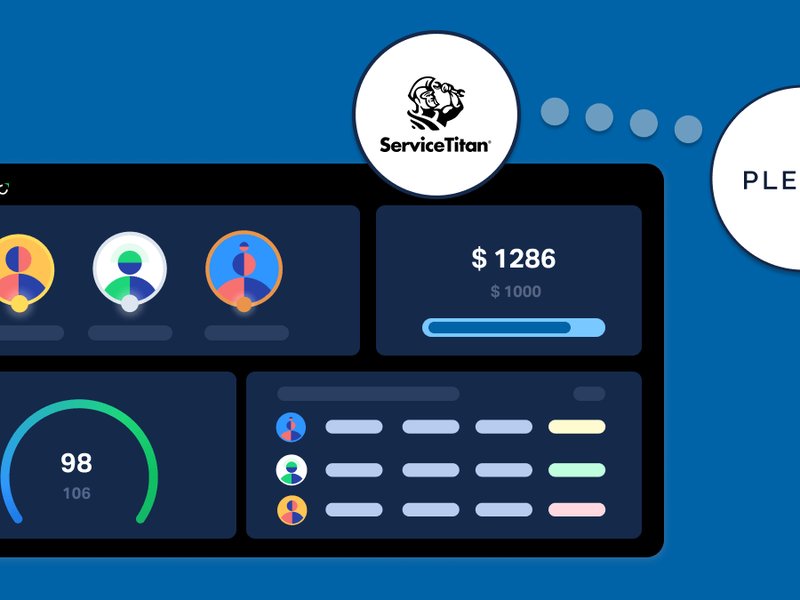
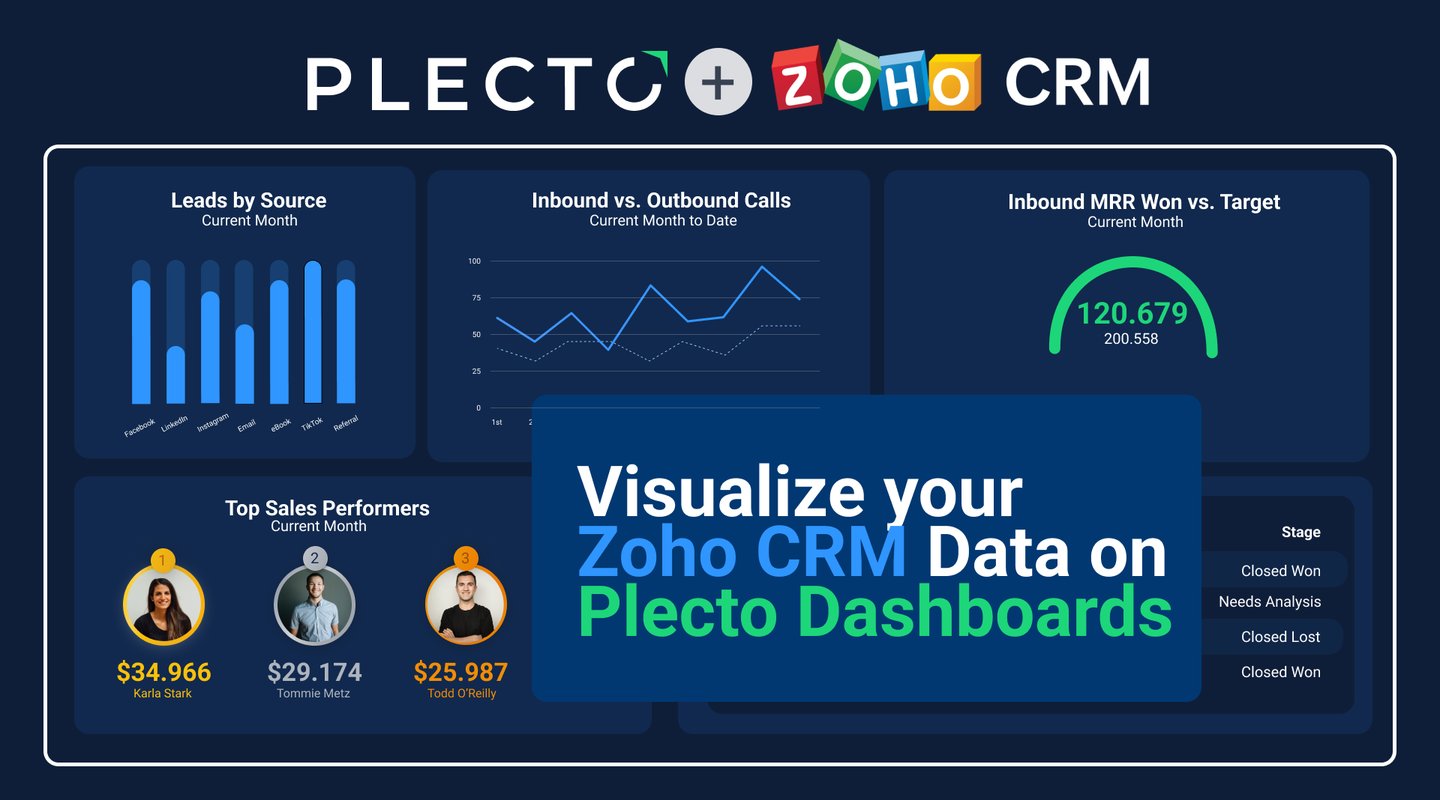
How to Visualize Your Zoho CRM Data with Plecto
It's no surprise that top-performing sales teams are those supported by top-level CRM systems. What makes a CRM better than others? No matter which way you look at it, it all boils down to ease of use.
Upon transitioning to Zoho CRM, users see a significant conversion rate of up to 300% and a sales cycle shortened by around 24%. These improvements are owed to Zoho CRM’s user-friendliness and visualizing Zoho CRM sales analytics on Plecto’s real-time dashboard solution.
Read on to find out how you can fast-track your business growth by integrating and visualizing your Zoho CRM data analytics dashboards with Plecto!
Plecto: Making Great CRMs Even Better
Ideally, a CRM is all about efficiently handling customer relationships and interactions. Whether it's a first-time CRM user or an everyday user, what keeps them engaged with the platform is its usability—or in other words, how easily users can read and understand their CRM analytics without getting bogged down in confusion.
So, how do top-performing organizations optimize their CRM data to make it even easier to understand and use? Primarily, using data visualization. Zoho CRM makes it easy to view volumes of sales data broken down into visually consumable elements on customizable dashboards–optimized for computers and mobile devices alike.
In this way, users can derive insights at a glance…and on the go! Users are guaranteed a simplified experience with a world of intuitive features with Zoho CRM’s personalized, industry-specific layouts and automated workflows.
Most importantly, when you integrate your Zoho CRM data into Plecto, you get real-time insights into your individual, team, or entire company’s business performance–procuring data from multiple sources and systems for you to customize to suit your business goals!
Why Is CRM Data Visualization Important?
Businesses often struggle to convince their teams to fully embrace using CRM systems to their full potential–oftentimes leaving CRMs with incomplete or outdated information, bringing more bother than benefit. It’s no doubt that having to go through mountains of sales, marketing or customer data can be tedious. But these challenges can easily be solved using data visualization dashboards.
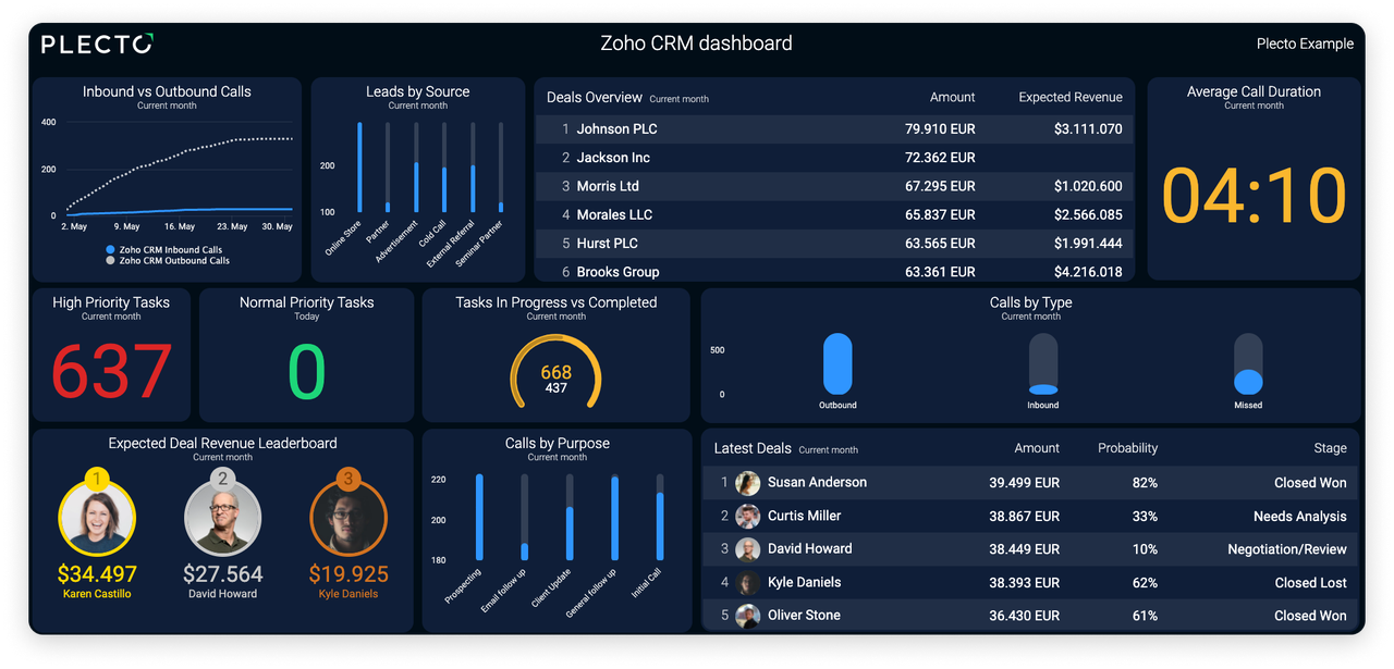
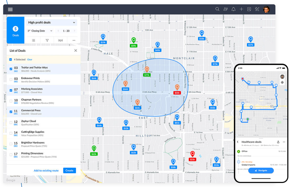
Visualize your custom Zoho CRM KPIs on Plecto data dashboards so you can view your quarterly sales performance and identify top-performing reps at a glance without having to navigate across multiple windows.
Customer journey mapping data is more engaging when displayed in appealing and easily-digestible formats like charts, funnels, and graphs, or even in customizable fields. When data is visualized on dashboards, managers and team leads can clearly gain relevant and useful insights like which marketing or sales activities are performing well or worked for them.
Similarly, it’s much easier to identify areas, if any, where improvements are required–so coaching can be tailored towards converting weaknesses into strengths. Visualizing your CRM data can also help to pinpoint and focus on support cases that need immediate action based on red flag behaviors or activity–so you can improve the customer experience and reduce churn!
When high-impact insights and significant results like reducing customer churn, boosting sales, and increasing revenue, are at stake, it’s hard to ignore the benefits of visualizing your CRM information on data dashboards.
Data Visualization for Marketing and Sales
Your sales and marketing teams don’t act in silos, and should be aligned–a feat that’s easier said than done. Data visualization dashboards are a great way to combine both departments’ activities to see where there are opportunities to optimize!
Since sales and marketing go hand-in-hand, this should be reflected on your data visualization dashboards. Combine and customize lead information from various sources–social media, website tracking, campaigns, organic blogs, and forms. Then filter, nurture, enrich, and observe lead information including preferences, buying behavior, demographics, and purchase trends—so you can assign leads to the teams who have a higher chance of closing them.
Save time and keep control of your sales and marketing performance on an individual or team basis by integrating your valuable Zoho CRM analytic insights with Plecto’s customizable visualization and gamification tools!
Sales Visualizations
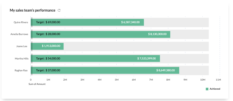
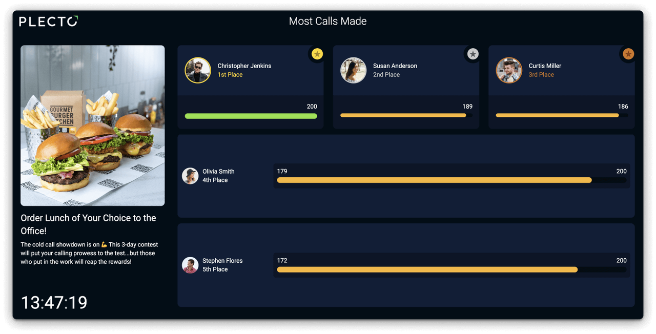
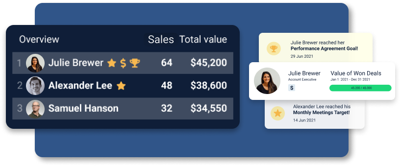
Salespeople are competitive by nature–so motivate them to unleash this competitive spirit and unlock their full sales performance potential by combining Zoho CRM’s Sales Performance Management (SPM) software with Plecto’s gamification features.
Not sure exactly what gamification is, and how to use it? Simply put, it involves using gameplay elements like points, challenges, and leaderboards, in traditionally non-game tasks or environments with the aim of engaging employees and motivating them to boost performance.
Choose your most important KPI, like sales revenue, and challenge your sales reps to a contest! Build a sales KPI dashboard that showcases all your Zoho CRM sales activities in real-time on Plecto dashboards. Then broadcast the results on a sales KPI dashboard and keep track, in real-time, of who's at the top!
Get everyone involved by displaying it on TVs around the office so you can charge motivation and competition–agents will be even more driven to perform when they can see their efforts paying off.
If you really want your reps to be motivated to participate, reward the winner with a prize. Rewards don’t always have to be tangible but make sure they’re valuable–it could be a LinkedIn shoutout from the CEO, a trip to Copenhagen, a choice of the best parking spot, a restaurant voucher, or even a month of leaving early on Fridays.
Marketing Visualizations
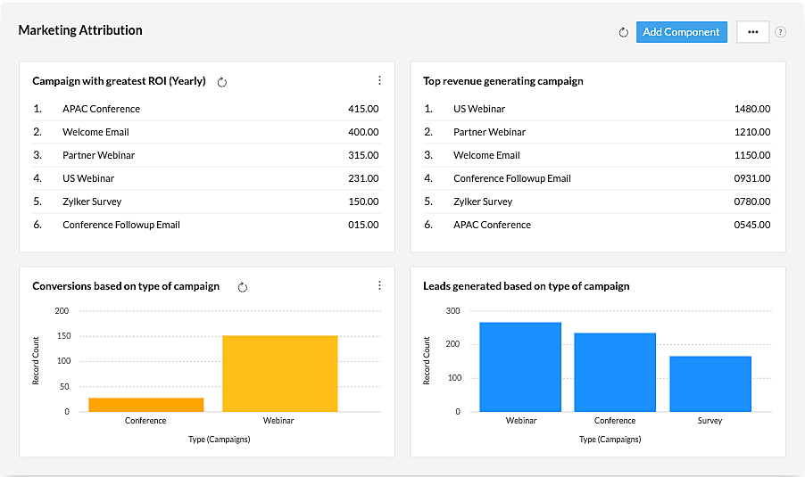
Increase your marketing efficiency with targeted campaigns based on lead data, campaign ROI visibility, and growth indices. Visualizing your marketing data on dashboards works best on a team-based or department level–as often marketing campaigns and activities are running in tandem.
It’s important to identify which campaigns are achieving your desired goal–whether that’s bringing in more leads, resulting in the highest conversions, or generally improving your brand awareness. This is made simpler when you have a pie chart that shows exactly what percentage of your leads are coming from which campaign, or a bar chart displaying your conversion rates from month to month, for example.
Use Zoho CRM’s customizable reports to identify areas of improvement at a glance–and say goodbye to hours spent on repetitive reporting. Send all your reports directly to your inbox, or automatically export them as presentations with Plecto so you’re ready to ‘wow’ at management meetings!
Check out the types of customizable marketing data you can display in reports, on this example below – or get inspired to create custom KPIs of your own!
CS Visualizations
Understanding how customers experience your product or service is essential information for any business. This is effortless when you have easily-accessible information on all your customer interactions and the entire user journey–better yet, when they’re centralized in one place!
When you combine Zoho CRM’s AI capabilities with Plecto, you can make actionable real-time decisions based on comprehensive customer interaction insights–to assure you deliver the best customer experience, and ultimately build trust and loyalty.
Use Zoho’s AI assistant Zia to fetch information on customer interactions across modules–including decision-making factors, product usage, support interactions, and product or service purchase history.
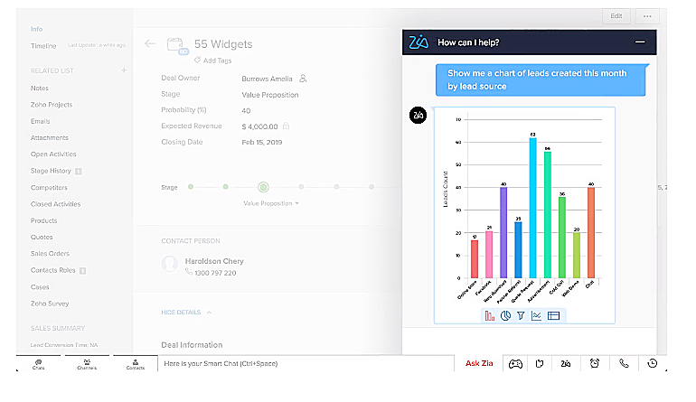
Display these interactions on data dashboards that make it easy for all your teams to visualize the user journey. In this way, you can identify areas of improvement, and even determine whether there are opportunities to optimize your marketing, sales, or CS efforts.
For example, let’s say your total MRR is lower than usual. You can pinpoint whether this is because fewer leads are being generated than usual, your sales reps are not converting the high-value deals, or there has been a high churn rate that month–and then make necessary course corrections.
Check out this article to find out how to create your own customer experience dashboard!
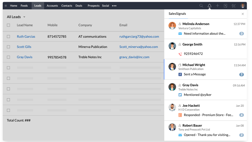
Set up instant notifications on Plecto so that you are instantly alerted whenever a customer interaction is registered in your Zoho CRM system. This way you’ll never keep new leads or existing customers waiting when they encounter purchasing issues or raise support requests.
Since you’ll be getting this information in real-time, you’ll be able to address issues as they arise–and chances are that you’ll end up with more satisfied customers!
The advantages of visualizing your Zoho CRM data on data dashboards can be seen in terms of both customer and agent. That is, you can provide the best customer experience when you have access to customer information and data on your agent’s performance.
For example, if one agent is spending less time on calls but receiving higher CSAT scores–ask them to share what they’re doing. Take this a step further and assign a badge, for example, a star icon, next to the agent who holds the highest average CSAT rating.
Badges are a great way to recognize achievements and celebrate every win together as a team. You are both rewarding your top performers and motivating your other agents to improve their performance and reach that top spot–it’s a win-win!
Finance Visualizations
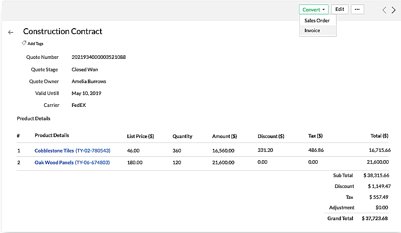
Given the volatile nature of the industry (and the economy), finance teams have to stay on their toes. This is especially true given buyer’s rights to a cooling-off period–that is when a deal is closed but before a transaction takes place, customers still have time to reconsider their purchases. One way to seal the deal is by engaging customers quickly with auto-generated invoices. This enables sales teams to step in and complete payments, as well as to market complementary products or services.
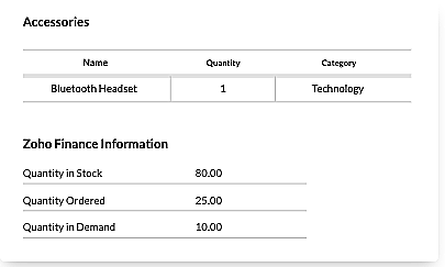
Stay updated with order statuses, products in demand, inventory, and shipments at a glance by visualizing all your subscription, invoicing, and finance information on data dashboards. This way you’ll always give customers accurate product availability information and avoid discrepancies with an inventory database updated in real time.
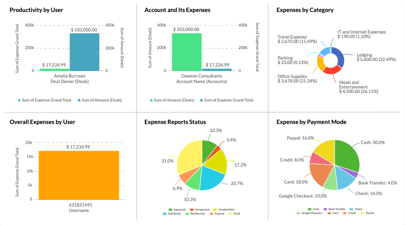
Finance teams can benefit from combining Zoho CRM metrics, dashboards, and reports into Plecto–with extensive integration capabilities–so team, individual, and account expense reports can be easily viewed on attractive data dashboards or as real-time reports that you can schedule to be sent directly to your inbox! Better yet, showcase your team or department’s higher-level strategic metrics by exporting these reports as presentations for management meetings.
Make important metrics and sales report insights, like the ones below, a part of your 1:1s and coaching sessions to show sales teams how expenses can be handled more efficiently. Or even break it down on an individual basis, and make customized and confidential performance agreements that work to strengthen each agent’s skills, based upon targets mutually agreed upon by both manager and rep.
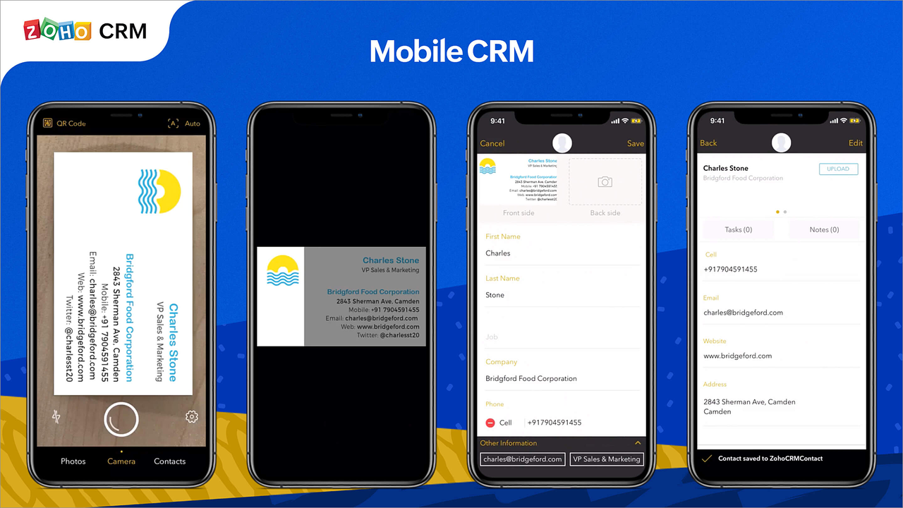
Make data-driven decisions while on the go!
Access your Zoho CRM data from your mobile device in real-time anytime, anywhere on the Plecto App! Out of the office for a meeting? Never miss out on sales opportunities by using SalesIQ and AI assistant Zia to determine the best time to follow up with a contact.
Where there’s a screen, there’s Plecto–celebrate every deal as it happens by setting up instant notifications to be sent to your smartphone, iPad, Apple Watch, or TV screen so your whole team is alerted whenever specified activities and milestones are achieved.
Once a deal is closed, quickly scan your customer’s business card and convert them into a contact. And that’s right; the deal's status will be immediately updated on your Plecto account, too!
Accelerate Performance with Zoho CRM and Plecto Dashboards
From lead to closing and even reporting, you can elevate all your Zoho CRM data by integrating it with Plecto! Visualize your team’s Zoho CRM activities on data dashboards that will boost motivation and skyrocket performance.
Take advantage of real-time data and sell smarter with the Plecto and Zoho CRM integration!
Get started with Zoho CRM at just $14/user/ per month and integrate with Plecto and over 300+ other integrations. Why not give it a go and see for yourself?
Start your 14-day
free Plecto trial today.
AARTHI BAKTHAVATHSALAM
Product Marketer, Zoho CRM