Table of contents:
Why Does Visual Management Matter?
Image is everything.
Okay, maybe it’s not quite everything unless you work in fashion. But it’s incredibly important, no matter which industry you work in.
Take effective communication and teamwork. Things work so much better if there’s a clear visual depiction that everyone can access. This is the principle at the heart of visual management.
In this article, we’ll look at what visual management is, its key principles, and some best practices.
What Is Visual Management?
We all know what management is (or should be, at least). However, in case you could do with a pointer, we can define management as a technique for producing results through harnessing the efforts of others.
How can one do this? The key ingredient of management is communication. If you want a team to reach a goal, you have to be able to communicate what the aim is and how to achieve it.
Communication can be a quick one-to-one chat or a team briefing. Or it can be in the form of images. By this, we’re referring to imagery such as graphs and charts, simple signs, post-it notes, or any other visual material that aids teams in achieving desired results.
Visual management is exactly what it sounds like: using visuals to communicate clearly with your team to produce results.

Key Principles of Visual Management
As you might expect, there are a number of vital considerations when designing visual management assets. The main ones are outlined below.
1. Utilize Intuitive Visuals To Communicate Information Clearly
One of the basic requirements for visual management material is that it should require minimal explanation. Explanation takes time and effort, and can be open to misinterpretation.
Imagine you’re sharing your sales KPI as line graphs, but you haven’t labeled the axes, and all the lines are the same color. This renders it meaningless (especially if the lines overlap!), and you have to spend time clarifying the details.
Any images you use should contain all the necessary information and be easy to understand.
2. Ensure That Information Is Easily Visible and Accessible
Visual Material should be easy to see. This doesn’t just mean prominently displayed–it means available to all. Hosting your visual materials online allows both in-person and remote workers to access them with ease.
Of course, it’s not just the location that needs to be accessible, it’s the materials themselves. Make sure they’re suitable for anyone with color blindness, and use dyslexia-friendly fonts. This holds true no matter what kind of material you’re putting in place, from a meeting handout to the designs around your video conferencing API integration.

3. Design Engaging Visuals To Enhance Motivation and Focus
Make no mistake, people like to be engaged. Sounds obvious, but it’s remarkable how this can elude the designers (or implementers) of visual material.
Visuals need to be relevant and eye-catching, as well as (and you should never overlook this) pleasing to the eye. Unsightly fonts and clashing color schemes will hinder, rather than help, focus.
4. Apply Visual Cues To Boost Accountability and Responsiveness
If you lack clarity over who’s doing what, a lack of accountability will likely take hold. Visual management excels here because it’s clear to all who's expected to complete a task. All it takes is a quick glance, and you know exactly who to follow up with.
Key Uses of Visual Management
There are a wide range of reasons that visual management can be useful to you and your sales teams. Here we’ve compiled a list of some of the main ways that you can apply visual management.
1. Provide Up-to-Date Insights for Timely Decision-Making
If there’s a massive sign high on the office wall depicting a quill dipping in a pot of ink, you have an excellently visible and intuitive reminder to keep your quill nib sufficiently loaded with ink. The only trouble is that nobody uses quills at work anymore, so this excellently designed visual management material is useless!
This is an extreme example, but the principle is clear: you have to update your assets to reflect the latest developments. There’s no point in having clear guides that apply to previous software versions or sales data that’s a decade old.
Luckily, with visual tools like Plecto’s dashboards, you can get updates in real time so they’re as up-to-date as it’s possible to be.
2. Represent Workflows and Standardized Processes Visually
One of the great things about workflows and office processes is that they lend themselves very well to visual representation. This is because they consist of sequential steps, something that easily lends itself to graphics and visuals.
Trying to get the information across in an audio design can be a challenge, and it’s hard to refer back to previous steps. Visually, though, you can lay processes out in a simple-to-follow way.
3. Use Visual Tools To Define, Understand, and Address Problems
If sales management is about trying to direct teams to achieve sales goals, an inherent part of this is overcoming the snags and challenges that crop up en route. One way to help teams get a good idea of the problems they’ll be facing is through visual representation of these problems.
This might be screenshots of common technical issues and their associated pop-ups, or it could be an infographic highlighting customer churn signals. That way, your team can go into things prepared for what they may find.

Best Practices for Visual Management in Sales Teams
So, now you know what visual management should include. Let’s turn to how you can implement it for your sales teams.
1. Select Appropriate Visual Management Tools
There’s an enormous range of visual management tools you can pick from, from those that use simple graphic progress indicators to those that fully embrace AI, with inter-system communication enabled through image embeddings. (What are embeddings? These are the transformation of images into digits so that computers can understand them.) However, not all of these tools will be entirely right for every organization or for every team within that organization.
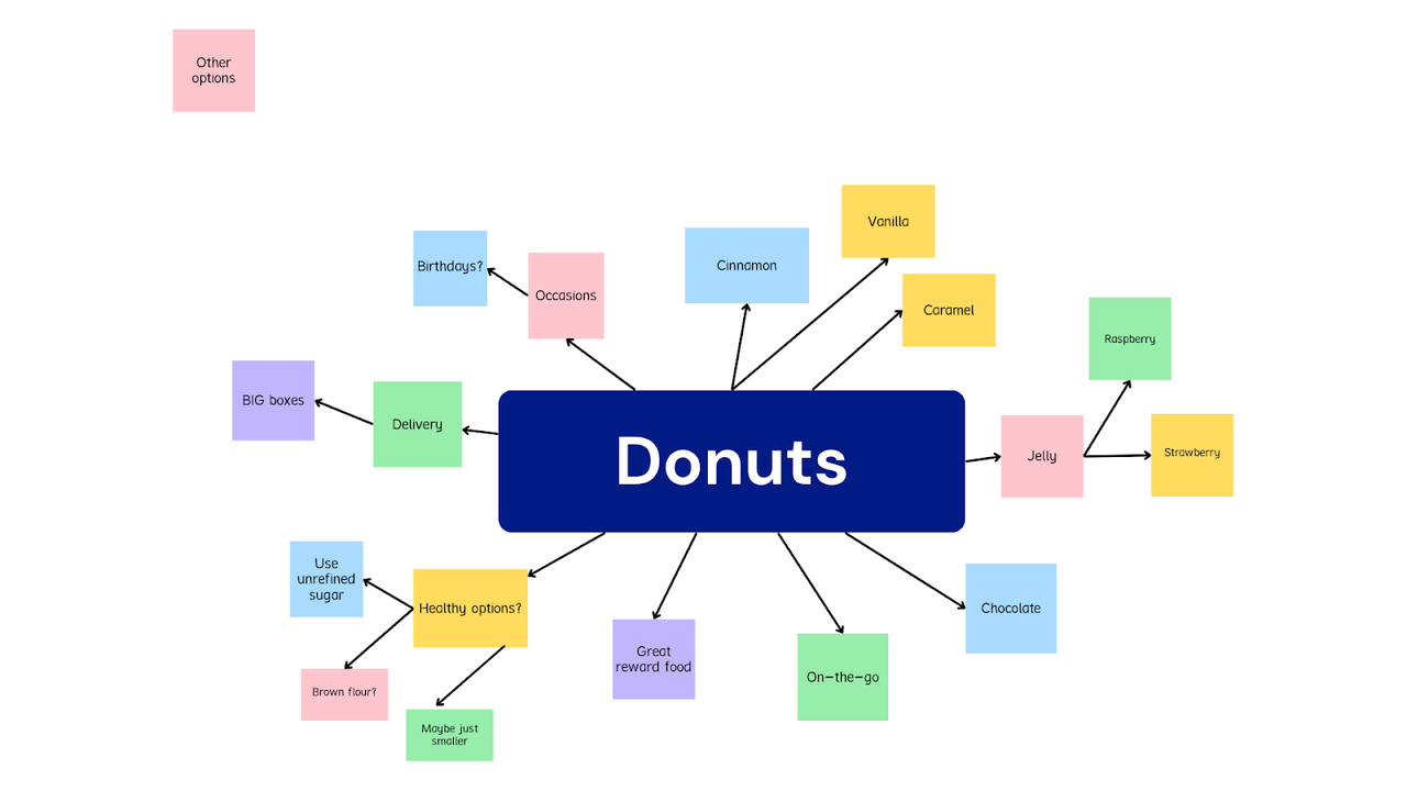
For instance, if you have a smaller team all engaged in aspects of the same task, then you could try a visual management tool such as mind mapping. This pictorially captures a concept and highlights any connected concepts or materials. Let’s say your sales team is being asked to brainstorm how to offer customers a more compelling donut offer.
Another popular visual management tool is the Kanban board. This is a visual representation of a workflow that clearly shows the different elements of work going on and the stage of completion of each.
This kind of visual management board is an excellent choice if you have a large team engaged in several different tasks simultaneously, as it shows both progress across the board and any bottlenecks developing. For this reason, Kanban can be a great visual display option for sales teams.
2. Ensure Consistent Use of Colors, Symbols, and Layouts
It’s enormously important to pick a way of displaying information and stick to it. Why? Because we are creatures of habit and tend to respond better to information that’s presented in a way that we’re used to processing it. Sure, there’s value in surprise, but you don’t want to confuse employees.
Take road signs. In the US, as in most countries, they follow a predictable visual indicator pattern. You won’t find a STOP sign on a square board, and traffic lights will always have a red light. This is important as it cuts down on confusion and speeds up understanding. It is the same with the workplace. So don’t be tempted to throw in some startling colors to get attention—it’s usually distracting rather than engaging.

3. Encourage Team Members To Contribute to and Maintain Displays
Decisions that seemingly emerge and are enforced by higher management without explanation can lead to a reluctance by employees to fully engage. One way to tackle this difficulty and improve team motivation is to enlist the help of your staff to introduce and maintain the visual management tool.
Let’s consider Pareto diagrams. These are powerful tools that attempt to isolate a problem’s specific causes through statistical analysis. They work on the principle that a mere 20% of causes are responsible for as much as 80% of problems. Now, when putting a Pareto together, you could simply go into a quiet room by yourself and brainstorm for a while, then roll out your findings to your workforce.
However, your sales reps might resent having an unfamiliar technique imposed upon them. Much better to get them involved from the start. Invite them to consider common problems in the workplace and what could be causing them. Allowing them all to use the Pareto method will help to narrow down those causes to the most potent among them.
You’ll wind up with a more enthused workforce and more comprehensive data input into your problem-solving process. A win-win.
4. Display Key Sales Metrics in a Clear and Concise Manner
Consider who you’re displaying metrics for and for what purpose. Certain metrics might be better suited for a team manager viewing and others for frontline sales members.
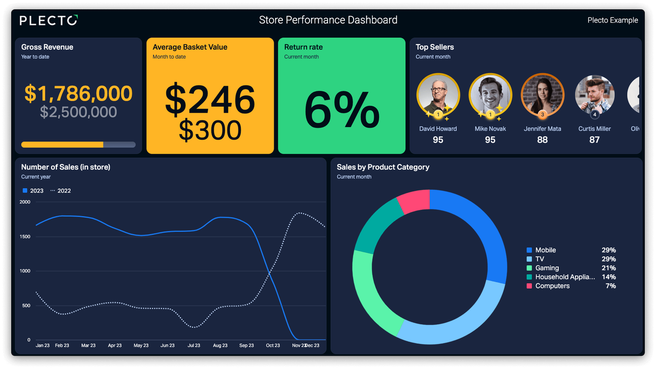
Take the Plecto Store Performance dashboard below, for example. A retail sales manager might use this to motivate their teams and monitor performance from a big picture perspective. Alternatively, an individual team member might be more focused on their own rate of sales stats.
When considering who your data visualization is for, it doesn’t end there. Your dashboard design needs to be clear so that the metrics are displayed in a straightforward manner.
Dashboards should be created with the user in mind. In other words, data visualization should be as accessible, digestible, and ergonomic as possible. When your sales team can easily understand the metrics presented to them, they are more likely to act on them.
5. Use Visual Aids To Map the Sales Process and Track Progress
Remember those old-school TV fundraising marathons? The ones where there’s a financial target of, say, $100,000, and there’s a big red progress indicator, like a thermometer, which shows exactly how well efforts are progressing? There’s a reason why they were used so often. They’re a clear and simple visual aid that maps progress toward a target.
Dynamic KPI dashboards that show accurate and real-time progression toward a sales target down to even seconds are also invaluable for depicting the correct course of action for sales representatives in the form of visual workflows.
6. Employ Visuals To Recognize and Celebrate Accomplishments
This one’s for the child in all of us. We all love to have our efforts rewarded. This can be in the form of concrete bonuses, such as pay increases. Or they might be simple words of congratulations and encouragement from the management.
When you implement words of encouragement with visual management systems, you end up with powerful virtual reward systems. This method builds on what’s known as gamification, where virtual rewards are distributed when certain business goals are reached.
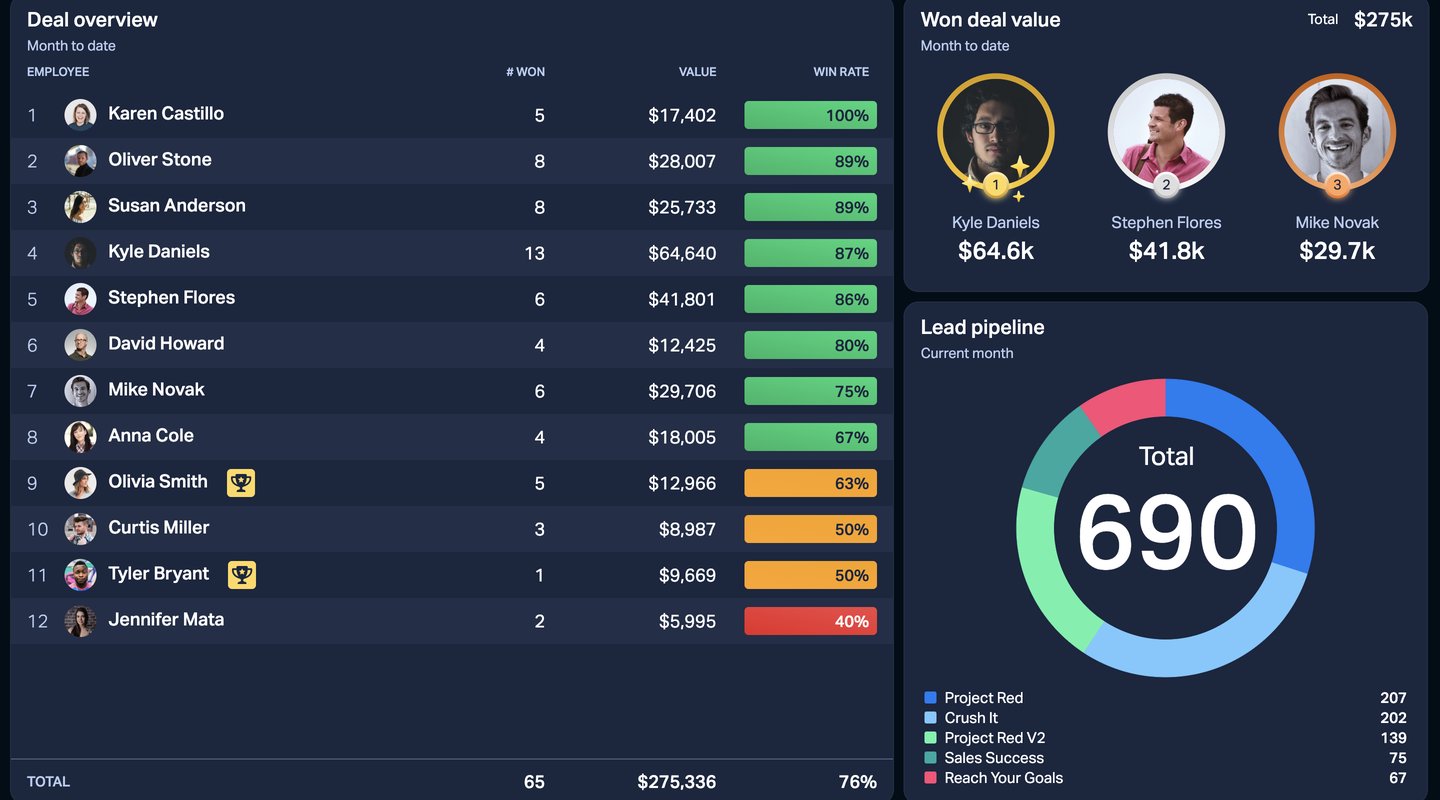
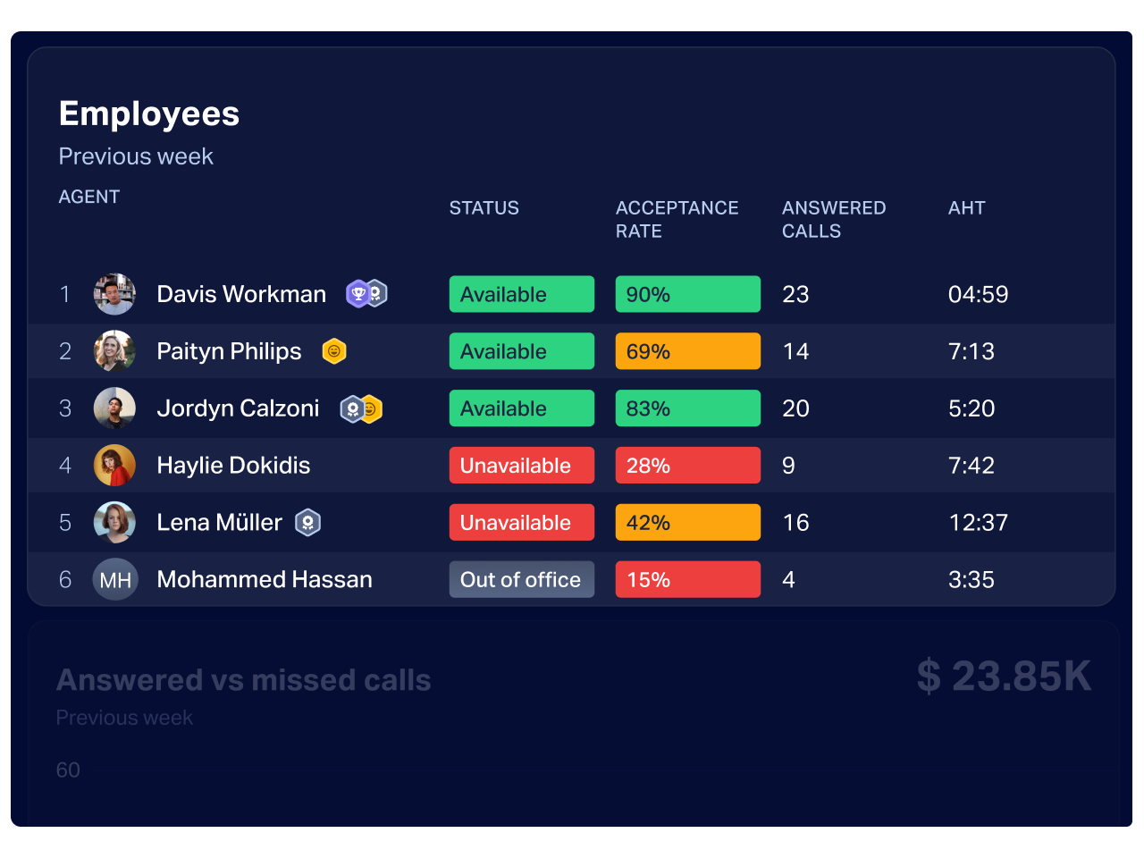
What kind of virtual rewards? Where dashboards are involved, a simple “virtual badge,” or graphical representation of a trophy or medal next to the name of the best performing member of the sales team, can go a long way to motivate employees.
7. Leverage Digital Tools for Real-Time Updates and Collaboration
Visual management tools are best used when providing timely information that facilitates collaboration between (perhaps geographically separated) teams or departments at work.
With tools such as Plecto’s real-time KPI dashboards on the market, sales managers have ample opportunities to provide their team with real-time feedback on sales KPIs simply and visually.
Combine this with a knowledge center, and you can make sure everyone has easy access to the same data, enabling a healthy collaborative team culture. You can even connect your service team’s chatbots to your knowledge base using AI large language models so that the entire organization is operating from the same up-to-date, accurate information.
Visualize Your Sales Team's Performance With Plecto
Let’s refresh. Visual management is a graphical method that assists teams by giving information in a clear visual format.
Sales teams can benefit from the use of visual management practices because a great deal of their output is dependent upon accurate, simple (and, in the best-casebest case scenario, real-time) KPI visualization.
Sales teams can use key metrics to understand where they’re going right (and, just as importantly, where they’re going wrong). Through clear KPI visualization, together with other kinds of improved communication, visual management can revolutionize the efficacy of sales teams.
All in all, visual management tools like real-time sales KPI dashboards are well worth keeping an eye on for sales teams looking to consistently hit their targets.
Build your first dashboard.
Start your 14-day free trial today
COHERE
Cohere is a leading enterprise AI platform that builds enterprise-grade frontier AI models and products designed to solve real-world business challenges. Their products are cloud-agnostic to meet companies wherever their data is stored while offering the highest levels of security, privacy, and customization with on-premises and private cloud deployment options.