
Introduction
Reports are essential tools for understanding how your business is performing at a given time. With reports, management can see a comprehensive overview of their teams’ progress within a specified period, while using the metrics listed on these reports to project future revenue growth and overall strategy.
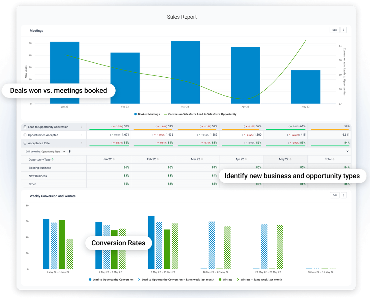
Sales reports are hugely important for tracking—you guessed it—how your sales are impacting your revenue, how extensive your market reach is, and the sales revenue you can reasonably project for the future. With Plecto’s reporting features, you can download a full sales report at any time with all currently available data, an incredibly efficient means to see how well you’re hitting your sales KPIs.
In this article, we’ll explore further why sales reports are essential for the data-driven company to use. We’ll also look at a sales report sample template, and of course describe how to create, edit, and export sales reports in Plecto. With that, let’s get started!
The importance of reporting sales
There’s several reasons why reporting sales data is a vital activity for any sales team to do regularly. Here are just a few:
Performance monitoring and accountability
Sales reports track progress toward goals, evaluate team performance, and provide transparency for stakeholders.
Data-driven decision-making
Thanks to their basis in raw data, reports inform key business decisions related to pricing, marketing, staffing, and budgeting by offering a clear view of sales performance.
Customer and market insights
Reports can help management identify sales trends, customer preferences, and seasonal patterns. This allows better ICP targeting and product development.
Operational and financial efficiency
Sales reports support accurate inventory management, demand forecasting, and financial planning, ensuring your company or organization uses its resources efficiently while maintaining a healthy cash flow.
Build your first dashboard.
Start your 14-day free trial today
Sales report sample template
What follows below is a general template for sales reporting. As it’s only a general guideline, not a hard-and-fast set of rules, feel free to modify or customize it to best suit your needs.
Title and Timeframe
Clearly state the title of the report and the period it covers (e.g., monthly, quarterly, annually).
Executive Summary
Provide a brief overview of your recent sales performance, making sure to highlight key achievements, challenges, and trends that you have picked up on or the data has presented to you.
Sales Metrics
- Total sales revenue: The total amount of money generated from sales in the period.
- Sales growth: The percentage increase or decrease in sales compared to a previous period.
- Sales by product/service: Breakdown of sales figures by individual products or services.
- Sales by region/market: Sales performance across different regions or markets.
- Sales by agent/team: Performance of individual agents and teams.
Also ensure to compare your actual sales figures against targets and quotas set at the start of the period.
Customer Analysis
- New vs. repeat customers: The number of new customers acquired versus repeat customers.
- Customer segmentation: Sales performance across different customer segments.
Other relevant information
- Sales trends: Analyze your sales trends since the start of the period, incorporating factors such as seasonality and market trends.
- Conversion rates: Describe the percentage of leads or prospects that resulted in actual sales.
- Sales pipeline: This is where you’ll provide a comprehensive overview of your pipeline from the relevant period, including your number of leads, opportunities, and their stages in the sales process.
- Competitor analysis: Give an in-depth analysis of your sales performance measured against that of your key competitors, if available.
- Challenges and opportunities: Identify the challenges faced during the reporting period and opportunities for improvement.
Recommendations and Conclusion
Provide a list of actionable recommendations based on the analysis to improve sales performance.
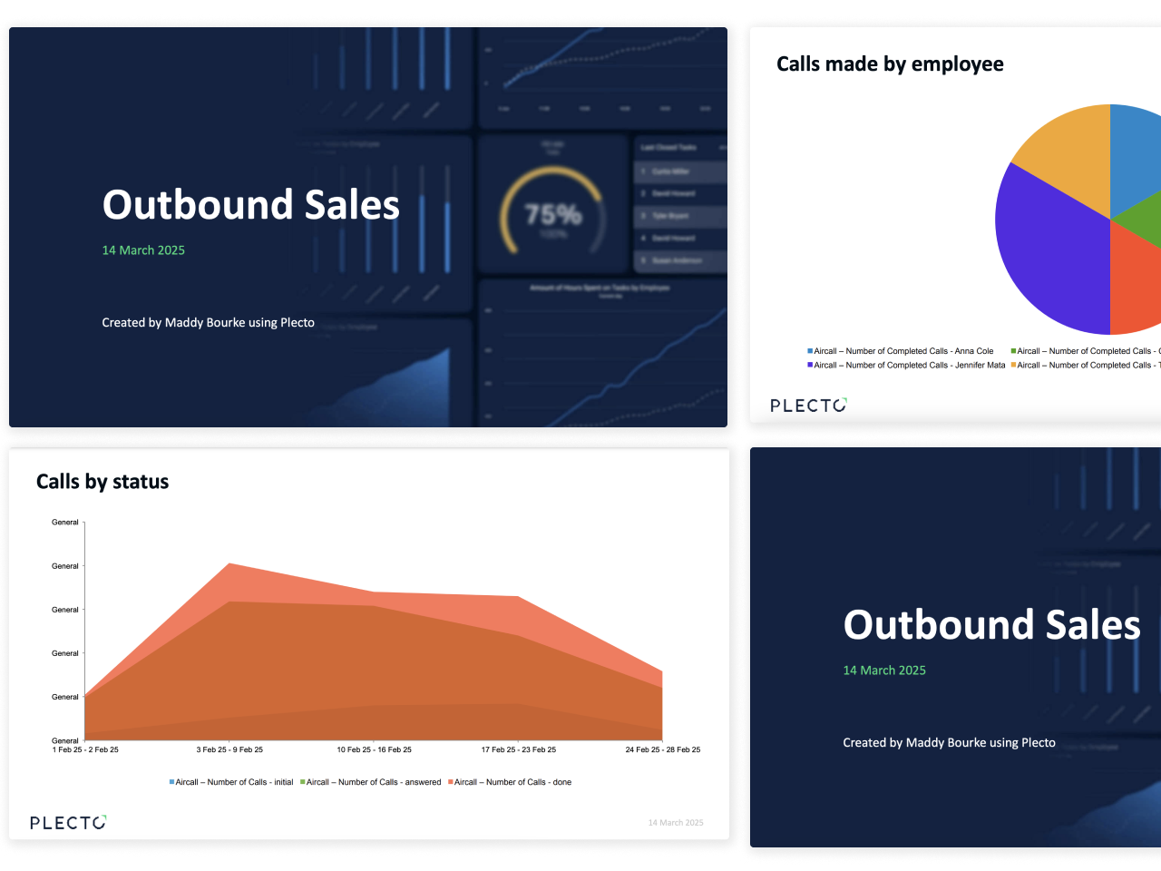
Visualizations
Include any charts, graphs, or tables that provide relevant information about what you’ve discussed over the course of your report.
Appendices
These include additional detailed data or supporting documents that provide further context or details.
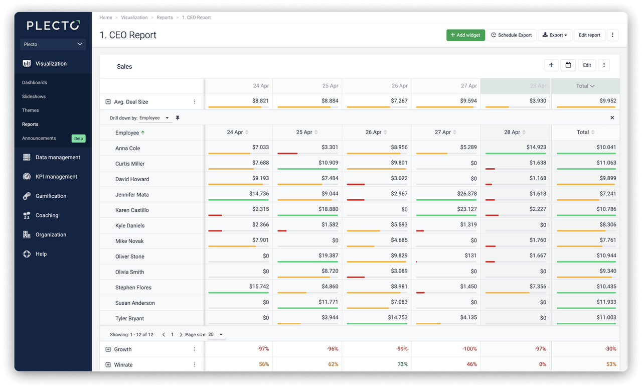
Creating and editing reports in Plecto
Creating reports from scratch in Plecto is extremely easy, as well as editing and customizing them. When complete, you’ll be able to download your reports in either PowerPoint or Excel format, and schedule them for regular publication too. And because reports are updated with the latest information automatically, you’ll save hours of time otherwise spent in manual input.
Here’s how to create a Plecto report:
- Go to Reports > New report. Name your report.
- Select accessibility for the report.
- For everyone: Give viewing access to everyone in the organization.
- Admins and me: Give viewing access to yourself, organization admins, and those who have permission to View all reports.
- Admins, me, and…: Gives viewing access to yourself, admins, those with permission to View all reports, and select Teams. The teams will have viewing access, but they will not be able to edit the report (unless some team members have admin access).
- Show data for: Choose specific teams or employees and create a report based on their data.
- Click Confirm to finish. You have now created a blank report.
Here’s how to add widgets and KPIs to your report:
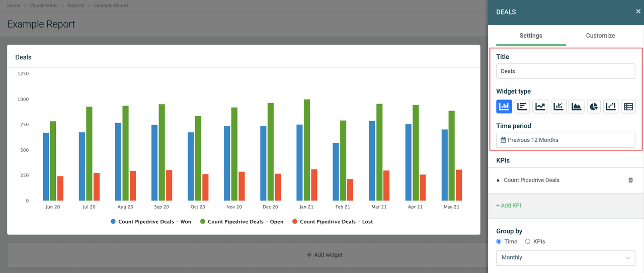
- Click Add widget in your report.
- Choose a widget from the menu. A slide-in menu will appear on the right.
- Enter a widget title and choose a time period.
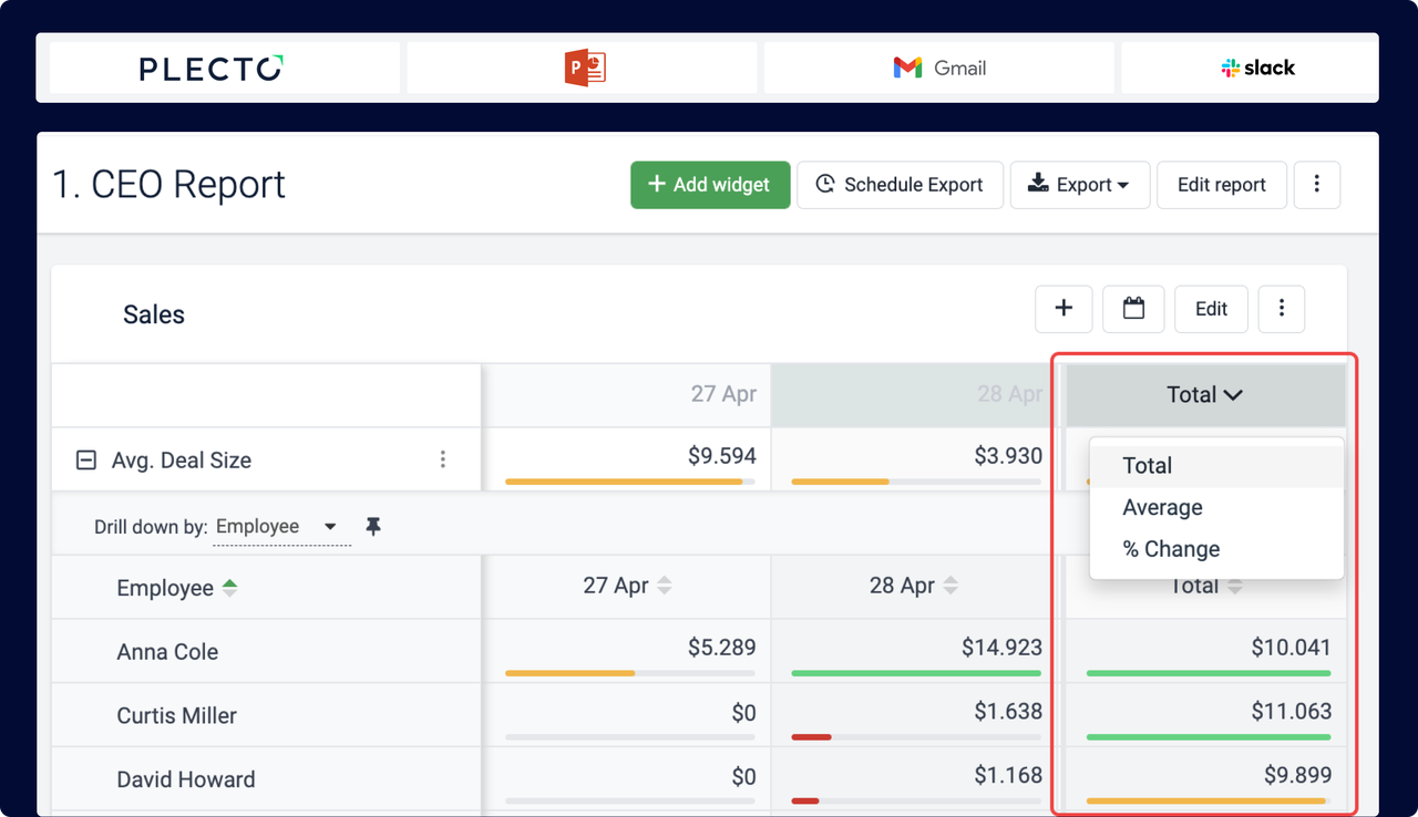
- Click Add KPI to add a formula. You can further customize the KPI you chose by selecting a drill-down option.
- Title (optional): The KPI titles are displayed as legend texts on charts and as row titles on tables.
- KPI: Choose a formula. Here you can also edit the formula or create a new one.
- Drill down by: Filter your metrics by specific parameters such as teams, stage, status, etc. The drill-down options are based on the fields available in your data source.
- Group by: Each widget offers different grouping options. If you select Time, your data will be grouped based on the selected time period. If you group by KPIs, you will see each added KPI as a separate unit on the chart.
- Accumulate (optional): The widget will add up your data.
- Compare to (optional): Compare your data to a different time period or, in some cases, a target KPI.
- Filter data by: Show data for specific teams or employees.
- Click Save changes to finish and create the widget.
Here’s how to export a report:
- Go to Reports and open the report you want to export.
- Click Export in the top-right corner.
- Select file format:
- PowerPoint (.pptx): This format exports all widgets as PowerPoint charts and graphs in the presentation.
- PowerPoint as images (.pptx): Exports all widgets as images in the presentation.
- Excel (.xlsx): Exports an Excel spreadsheet.
- Plecto will generate the report and download it on your local device.
- To schedule a report, click Schedule Export on the top-right corner and choose between hourly, daily, weekly, or monthly export.
Notes
- You have eight widgets to choose from and use:
- Column chart
- Bar chart
- Line chart
- Combo chart
- Area chart
- Pie chart
- Waterfall chart
- Table
Conclusion
Reports are essential for any serious sales team to make sense of what they’re doing and where they’re going. With its focus on data visualization and transparency, Plecto is the perfect platform for engaging with and interpreting your sales data.
Have more questions? Check out the Reports section on our Plecto Docs website. And if you’re new to sales reporting, why not give Plecto a try for free? Happy reporting!

JAMES NIILER
Content Specialist
An in-house content writer and specialist at Plecto, James brings an academic touch and journalistic flair to his marketing copy. Having worked and studied on both sides of the Atlantic, James is a great believer in the importance of communicating across cultures and industries. Catch his work here on the Plecto blog, or as a guest contributor on other B2B websites.