Introduction
Customer service (CS) is the bread-and-butter of customer happiness. Knowing how your CS team is performing—how well they are meeting customer needs, and how satisfied customers are as a result—is essential for determining how to best respond to several types of issues, both customer-related and beyond.
Customer service reports are your key to unlocking this information. Keeping track of your CS data in a comprehensive and easily-understood visual format, particularly through KPI widgets, allows you to stay on top of both your customers’ and your CS team’s needs.
Plecto’s main display format is its dashboards. But reports are also integral to the Plecto experience. Plecto reports update automatically and can be downloaded at any time, saving you dozens of hours of time that would otherwise be spent manually entering data. With Plecto, you get the best of both worlds: the ability to easily track data, and a dedicated feature to generate reports without any additional work from your end.
In this article, we’ll briefly discuss why CS reports are crucial for your data-driven CS team. After looking at a sample CS report template, we’ll describe how you can create, edit, and export CS reports in Plecto—and revolutionize your CS workflow forever. Let’s dive in.

The importance of CS reports
CS reports serve several essential needs for a typical team. We’ve listed just a few of these below:
Monitoring service quality
CS reports help evaluate how effectively a company responds to customer needs and whether service standards are being met.
Improving customer satisfaction
By analyzing feedback and performance found in CS reports, businesses can identify and fix pain points that affect the customer experience.
Driving operational efficiency
CS reports highlight bottlenecks, slow response times, or workload imbalances, helping optimize team workflow.
Informing strategic decisions
Because they are derived from real-life customer feedback, insights in CS reports can guide improvements in your service or product.
A typical CS report template
Just how should you structure a CS report? What follows is a general template for how a CS report can look. Of course, depending on your needs, you can choose to emphasize a specific aspect of this report structure and downplay others.
Executive Summary
A brief overview of the report’s key findings and recommendations.
Introduction
Here the report proper begins. You’ll outline the purpose and scope of the report, and of course mention the time period the report covers.
Customer Feedback
Next follows a summary of customer feedback, including both positive and negative comments and reactions. This allows you to do an in-depth analysis in the method you deem best of themes or issues customers have raised.
Service Metrics
Here you’ll list the latest results of relevant KPIs, including First Response Time, Resolution Time, and Escalation Rate. Also be sure to include scores related to customer satisfaction, such as CSAT and NPS!

Trends and Patterns
In this section, you identify and describe trends over the report’s specified period, such as changes in customer satisfaction or other common issues. This section should also include an analysis of peak times for customer inquiries and complaints.
Agent Performance
This consists of an evaluation of individual and team performance based on metrics like Response Time, Cost per Resolution, and Latest Received Rating Comment.
Recommendations
These are suggested actions to improve customer service based on the report’s findings. They can include proposed changes to processes, training, or how to better allocate resources.
Conclusion
The Conclusion should contain a summary of the report’s key points, and any final thoughts on the overall performance of your CS team.
Appendices
Appendices consist of any additional data, charts or graphics that support the report’s findings. If present, you can include other detailed customer feedback or case studies.
References
Be sure to include any data or methodologies used in the report—it’s important for maintaining your credibility.
Build your first dashboard.
Start your 14-day free trial today
Creating and editing reports in Plecto
Creating reports in Plecto is a simple process, but be aware that doing so will generate a blank template rather than a CS-specific one. You can then customize this blank template to reflect your data and metrics. When complete, you can download your reports in either PowerPoint or Excel format, and schedule them for automatic publication at regular intervals too.
Here’s how to create a Plecto report:
- Go to Reports > New report. Name your report.
- Select accessibility for the report.
- For everyone: Give viewing access to everyone in the organization.
- Admins and me: Give viewing access to yourself, organization admins, and those who have permission to View all reports.
- Admins, me, and…: Gives viewing access to yourself, admins, those with permission to View all reports, and select Teams. The teams will have viewing access, but they will not be able to edit the report (unless some team members have admin access).
- Show data for: Choose specific teams or employees and create a report based on their data.
- Click Confirm to finish. You have now created a blank report.
Here’s how to add widgets and KPIs to your report:
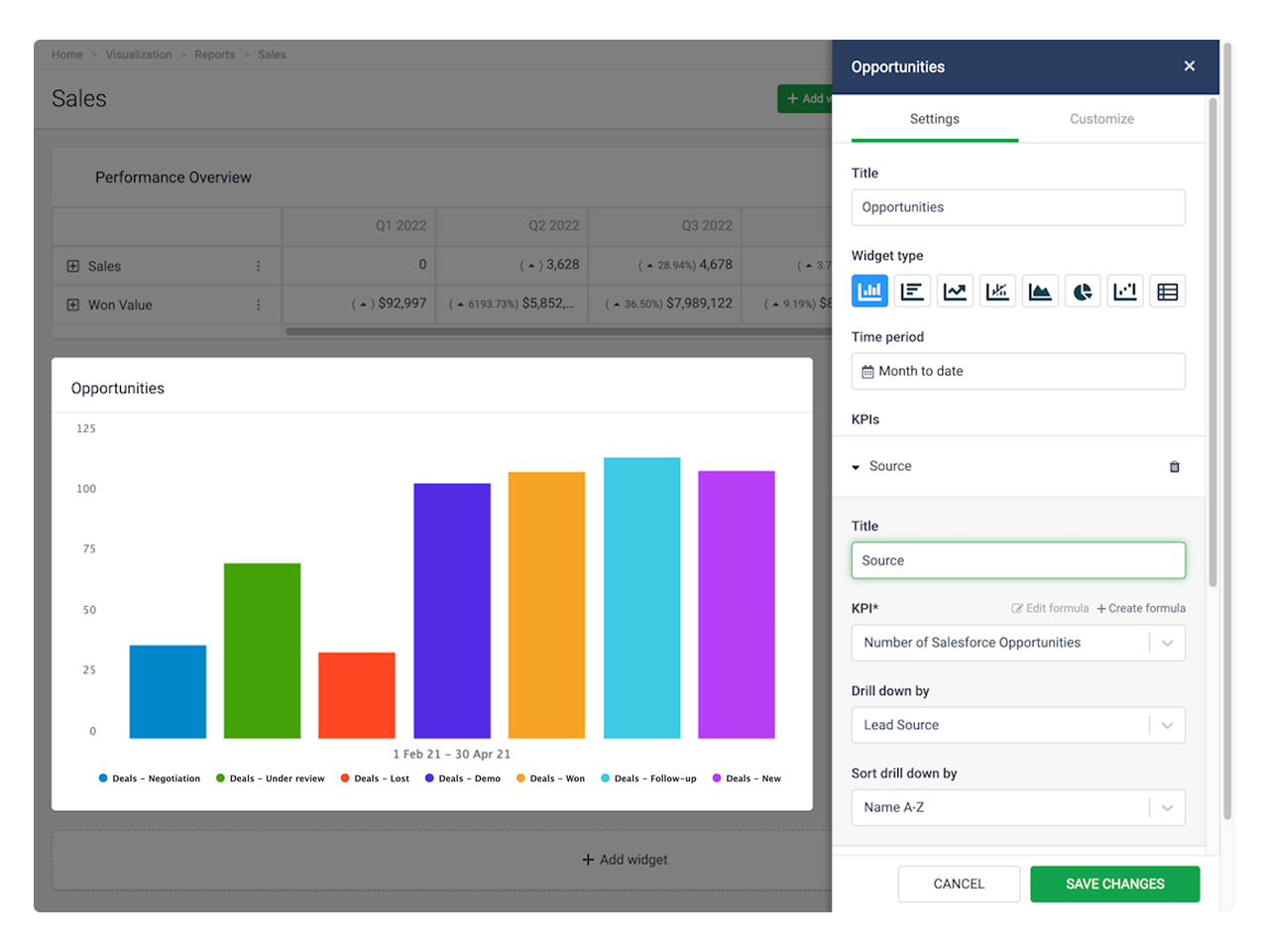
- Click Add widget in your report.
- Choose a widget from the menu. A slide-in menu will appear on the right.
- Enter a widget title and choose a time period.
- Click Add KPI to add a formula. You can further customize the KPI you chose by selecting a drill-down option.
- Title (optional): The KPI titles are displayed as legend texts on charts and as row titles on tables.
- KPI: Choose a formula. Here you can also edit the formula or create a new one.
- Drill down by: Filter your metrics by specific parameters such as teams, stage, status, etc. The drill-down options are based on the fields available in your data source.
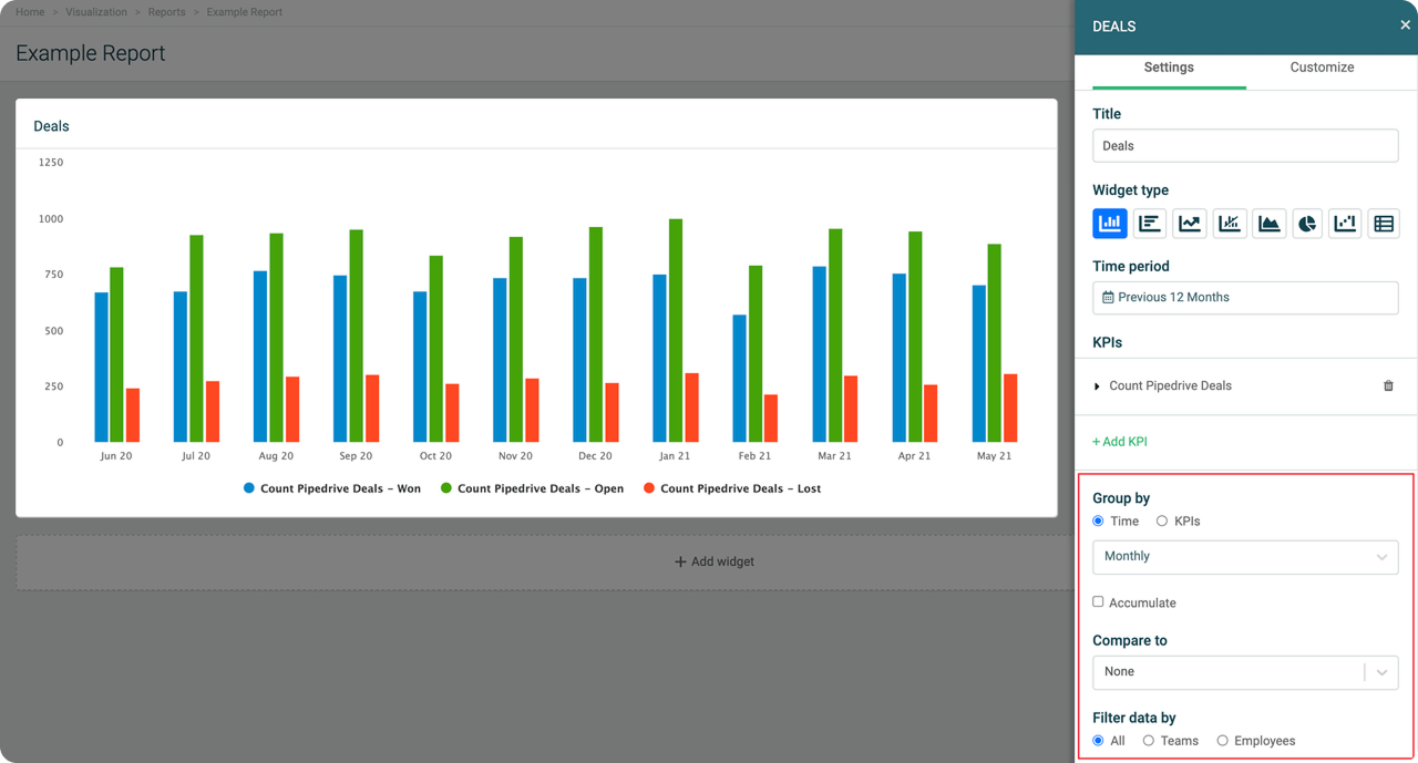
- Group by: Each widget offers different grouping options. If you select Time, your data will be grouped based on the selected time period. If you group by KPIs, you will see each added KPI as a separate unit on the chart.
- Accumulate (optional): The widget will add up your data.
- Compare to (optional): Compare your data to a different time period or, in some cases, a target KPI.
- Filter data by: Show data for specific teams or employees.
- Click Save changes to finish and create the widget.
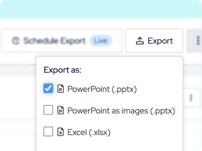
Here’s how to export a report:
- Go to Reports and open the report you want to export.
- Click Export in the top-right corner.
- Select file format:
- PowerPoint (.pptx): This format exports all widgets as PowerPoint charts and graphs in the presentation.
- PowerPoint as images (.pptx): Exports all widgets as images in the presentation.
- Excel (.xlsx): Exports an Excel spreadsheet.
- Plecto will generate the report and download it on your local device.
- To schedule a report, click Schedule Export on the top-right corner and choose between hourly, daily, weekly, or monthly export.
Notes
- You have eight widgets to choose from and use:
- Column chart
- Bar chart
- Line chart
- Combo chart
- Area chart
- Pie chart
- Waterfall chart
- Table
- You can add up to 20 KPIs in a single widget, and display up to 30 widgets in a single report.
Conclusion
CS teams that use reports are ahead of the game in not only visualizing their data, but understanding it. Reports display actionable insights to improve performance, and the more regularly your team generates reports, the more data you’ll have to accurately determine and analyze trends.
With its ethos of empowering teams through the power of data analysis, and its automatically-generated and customizable reporting feature, Plecto is ideal for engaging with and interpreting your CS data.
For more information, visit the Reports section on the Plecto Docs website. And if you want to get started on empowering your CS team with data dashboards, you can always give Plecto a try for free.

JAMES NIILER
Content Specialist
An in-house content writer and specialist at Plecto, James brings an academic touch and journalistic flair to his marketing copy. Having worked and studied on both sides of the Atlantic, James is a great believer in the importance of communicating across cultures and industries. Catch his work here on the Plecto blog, or as a guest contributor on other B2B websites.