Customer Success Story
Jysk Fynske Medier Motivates Telemarketing Teams with Plecto Dashboards
Plecto helped Jysk Fynske Medier align its teams; improve awareness and access to performance data; and build more empowered and motivated employees. Read on to discover how this Danish media company accomplished all of this—and more—with Plecto.

Company Background
As Denmark’s second-largest private media group, Jysk Fynske Medier has been committed to making daily news more accessible to everyday households since its inception in 2014. The company—a merge of Syddanske Medier, Jyske Medier, and Fynsker Medier—distributes its dailies, weekly newspapers, and digital media to over 2.6 million contacts over the entire country every week, generating over 2 billion DKK in turnover.
Visit websiteContact

Joachim Ankerstjerne
Data Analyst, Jysk Fynske Medier
The Challenge
Jysk Fynske Medier needed a way to make performance data available and accessible to all its employees, ultimately to optimize time and the company’s bottom line.
Joachim Ankerstjerne, Data Analyst at Jysk Fynske Medier (JFM), describes how his previous role as a Sales Manager for B2C telemarketing at the company meant that he had the insight—and the opportunity—to make significant changes to data visibility and accessibility for all company employees. "We wanted to get live visualization of performance in telemarketing, based on the person, based on the team, based on the segment, and on the campaigns," he says.
The Solution
The solution was to invest in a data visualization tool—Plecto. It was one that's paid off, Joachim says, who describes how Plecto has become JFM’s day-to-day tool used predominantly for data visualization so employees can “see their performance, and see where maybe they need some help.”
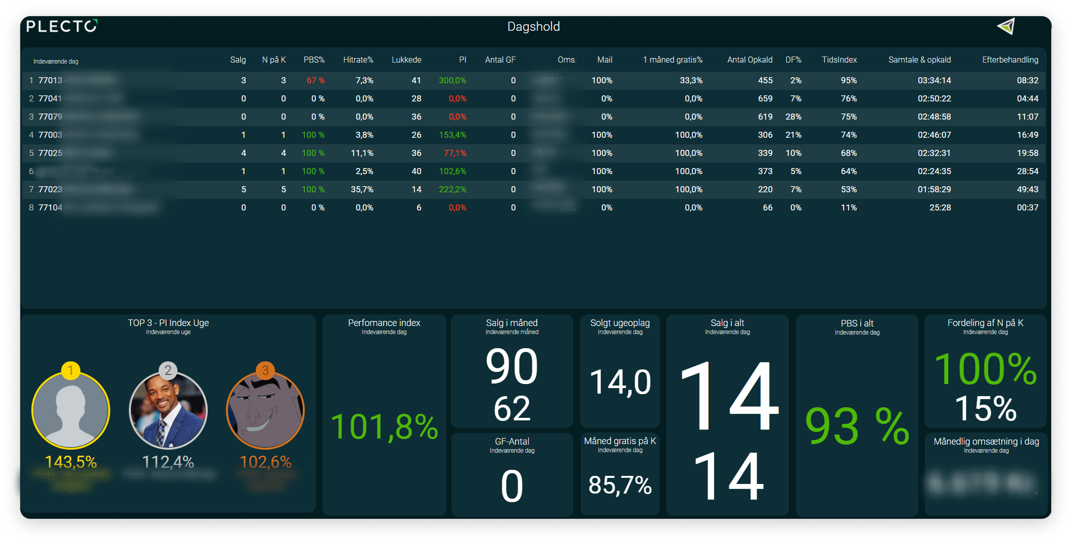
Jysk Fynske Medier uses its 191 real-time data visualization dashboards and 27 slideshows to make individual, team, and company performance accessible, visible, and actionable in real time. With this in mind, there's a particular focus on tracking and visualizing the KPIs important to achieving JFM’s business goals and motivating its sales and customer service agents to excel in their everyday work activities.
"We’ve even made personalized Plecto dashboards for each agent so they can have a look on their own," Joachim says. "They only look at Plecto. That’s their whole world."
“We’ve made personalized Plecto dashboards for each agent, so they can have a look on their own. They only look at Plecto. That’s their whole world.”
At JFM, each tracked employee has their own personal dashboard. There are also individual dashboards for team leads, and team dashboards too: for sales teams in various locations, supervisor teams, and coach teams.
These dashboards are put to good use. “They’re not just made, and then we don’t use them," Joachim says. Each dashboard is actively used on all managerial levels to guide coaching, track efficiency, and optimize business performance.
Notifications and Achievements for Motivation
JFM also found a solution to keep waning motivation at bay while maintaining sales and customer service team alignment: gamification tools, such as instant notifications and achievement badges.
Celebrating small wins, with notifications sent to the entire team in real time, is often just what sales reps and customer service agents need to stay motivated and engaged in their work. Similarly, JFM uses achievement badges to visualize and celebrate employees' accomplishments in a fun way, and display them on team dashboards for all to see.
Custom Formulas for Increased Revenue
Optimizing performance relies on pinpointing the right information, to get to “the real important things," as Joachim puts it. Sales is not one-size-fits-all enterprise, and neither are KPIs.
So what was important to JFM? Optimizing call time efficiency, and ultimately improving agent performance to boost revenue.
Joachim himself was able to build custom formulas that fit these goals. Two of the most significant are a time index KPI and a performance index, both constructed by extracting and combining metrics from a range of data systems and sources. Here are just a few of the other KPIs JFM has tracked with Plecto:
- Hit Rate
- Revenue
- Discounts
- Permissions
- Data Error Calls
- Sales or Mail Orders
- Time Index
- Performance Index
The Results
Jysk Fynske Medier set out to provide better performance data visibility, particularly for its sales telemarketing and outbound customer service teams. And they succeeded, even more than they anticipated, with Plecto's help.
Aligned Teams and Business Goals
Aided by Plecto’s data management and visualization capabilities, JFM has been able to “connect, benchmark, and compare teams” irrespective of department, managerial level, location, working hours, variable currencies, costs, or targets. This meant it was easier to compare performance and align morning and afternoon telemarketing team shifts.
“With this data visualization, you get an awareness throughout the whole organization that we’re actually running toward the same goals, which would be impossible without Plecto.”
With sales teams in Malaga (Spain) and Odense (Denmark), it was important to take into account other factors like expected sales, the number of leads used to make a sale, the number of calls made, and time efficiency when determining performance outcomes, instead of just focusing on the number of sales made by each team. In this way, JFM made was able to show an accurate representation of performance data across its office locations.
More Motivated Agents
Management at JFM keeps their frontline employees motivated by visualizing data that showcases the results of their everyday efforts. "It's much easier to see their salary and other motivating metrics, like reaching 100 on the performance index on their own personal dashboards," Joachim says. This visibility is particularly motivating for intrinsically driven people.
Notifications and achievements were the ideal solution for more extrinsically driven JFM employees, motivated by competition, praise, and recognition. Acknowledging milestones and celebrating colleagues’ success helps keep everyone aligned and motivated toward achieving the same goals.
Improved Team Performance
Pre-Plecto, everyone in the sales department had a hit rate in their mind that they thought they should achieve. Instead of relying on these "gut feelings," JFM’s individual and team dashboards provided concrete targets that could compare and benchmark performance.
Joachim notes that real-time data feedback has been critical for floor managers, who are able to make instant and informed decisions or course corrections where challenges arise, preventing any sales slump from becoming more serious. “If floor managers see a sales agent on the floor who is not performing, they need to make a change right now—not tomorrow, not in three days, right now. And that’s why live data is so important,” especially where sales are initiated, Joachim says.
“Plecto is a tool that can help better performance—not only how many sales, but how efficiently do we make a sale. It’s easy to understand, it’s easily accessible, and you get it live.”
With over 591 custom formulas and 10 data sources in use, JFM tailors their data tracking and visualization to boost performance on the KPIs that matter most.
"The possibility to code your own formulas is really important to us," Joachim says. "There’s so many things that if I didn’t have Plecto, I wouldn’t have even thought of because you need a tool to gain this visualization. Sometimes you need the data to see what you can do with it. The more you put in, the more you realize you can do. We made some formulas I couldn’t see our teams living without today."
More Engaged Coaching
With Plecto, JFM was able to get accurate and actionable insights that informed 1:1s and coaching sessions. Time index, hit rate, performance index, permissions, discounts, and sales revenue data are only useful if revisited and analyzed.
This is exactly what JFM does. Individual employee dashboards are used to compare the previous periods’ performance and development over the course of the current period. "The personalized Plecto dashboard is the core of our 1:1 sessions with our agents," Joachim says.
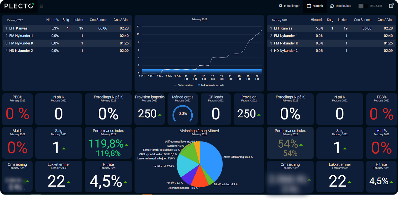
One such dashboard outlining that 40% of objections under the "No reason" category (Afvist uden årsag) indicate some performance adjustments need to be made to better communicate with and understand customers. Since 24% of customers didn’t purchase because the product was “too expensive" (for dyrt), JFM was also able to provide solutions such as offering different payment systems, or tailoring the product to offer more value.
Even more importantly, however, sales coaching for this particular employee then focused on handling particular recurring objections—something that the highlighted pie chart directly tracks and reflects.
Outperform with Plecto, Today.
Eager to align your teams, empower your staff to practice self-accountability, and personalize your coaching like Jysk Fynske Medier?
Book a personalized demo, and start boosting your sales and CS teams' efficiency today.
Here are your quick links to the resources of Jysk Fynske Medier's winning formula:
*Disclaimer: We are committed to data privacy. All dashboard images in this blog post have been provided by our customer Jysk Fynske Medier. Names and identification photos have been blurred out for security. Plecto does not access customer dashboards without written consent.
Start your 14-day free Plecto trial today.
Enjoyed the article? Share it:
Joachim Ankerstjerne
Data Analyst, Jysk Fynske Medier