Table of contents:
Why Data Dashboards Matter
Every year, companies collect terabytes upon terabytes of data across various systems. This data has the power to transform how they do business, propelling them to new heights of success. But this is only possible if they successfully extract the data from these systems and synthesize it into a format they can use.
In their quest to become more data-driven, many companies have discovered the magic of dashboards – a simple tool that enables them to harness the most important data, visualize it, and share it across teams and departments.
Custom dashboard software empowers companies to organize, analyze, and share mission-critical data on a data dashboard, making it easier for management to keep tabs on how the company is performing while enabling everyone to see what they’re doing well and what they could do to improve.
What Is a Data Dashboard?
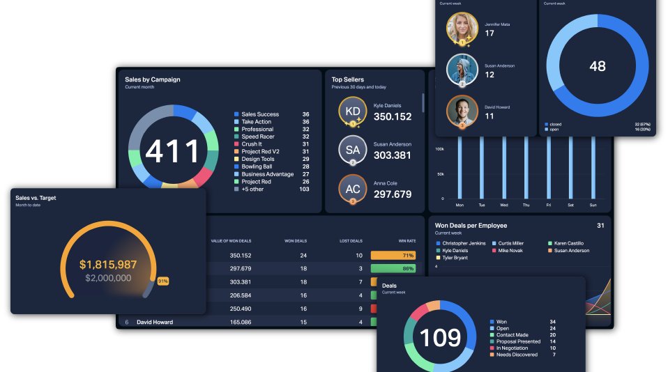
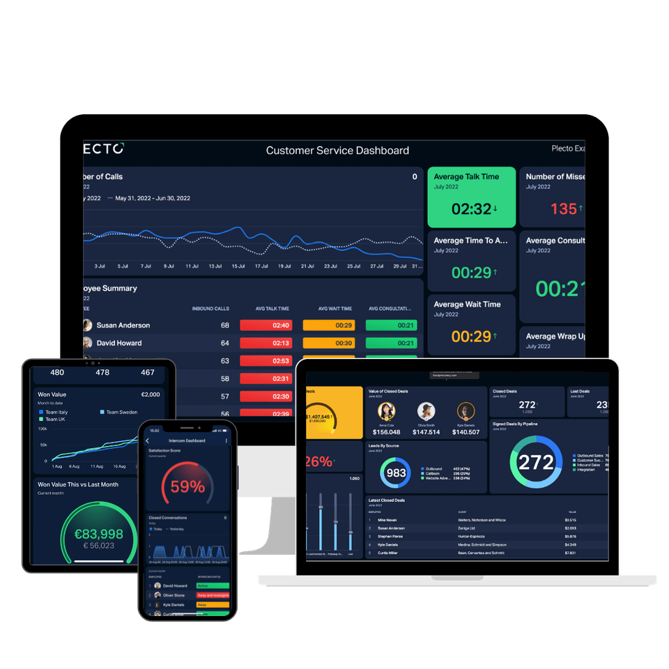
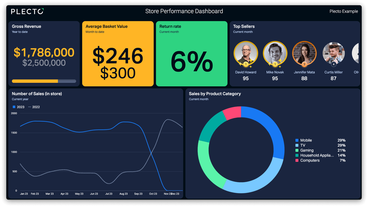
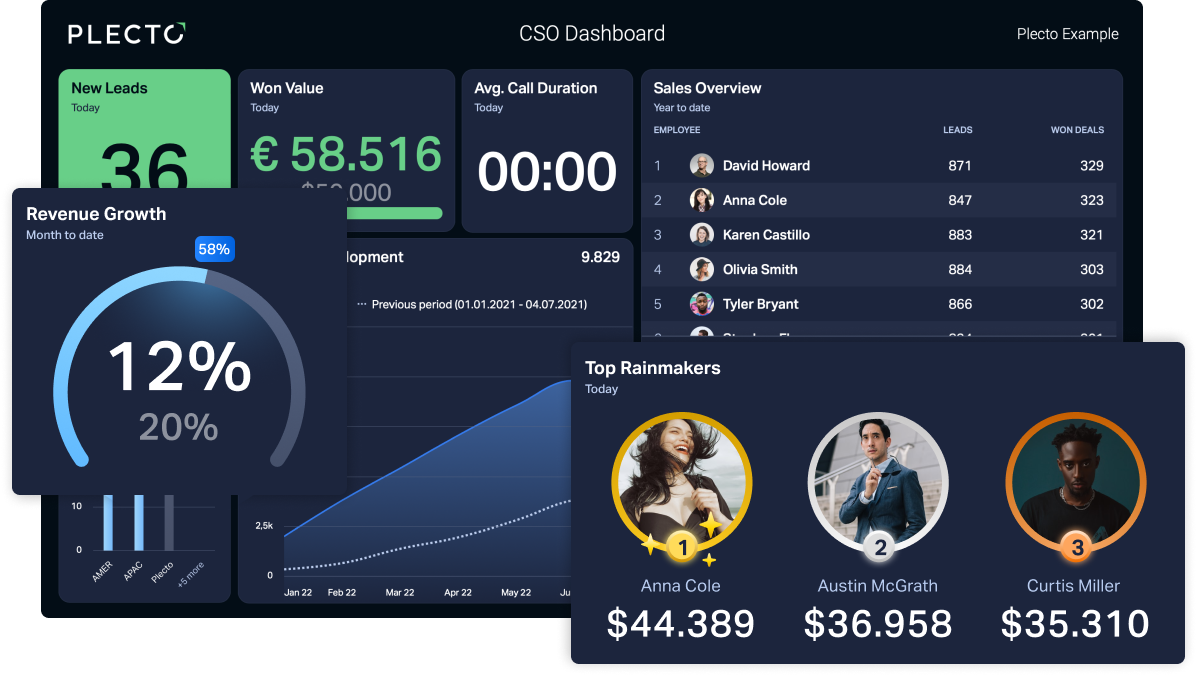
A data dashboard pulls data from various systems and presents it in a clean and easy-to-understand format that people throughout the company can use to help drive the right types of activities and decisions in their daily work. Over time, these data-informed decisions can have a major positive impact on everything from customer satisfaction to product development to revenue growth – and beyond!
Custom dashboard software can automate the process, ensuring that everyone has up-to-the-minute real-time data at their fingertips. This software can be a crucial helping hand in visually tracking, analyzing, and displaying important business metrics and KPIs to help monitor performance by departments, teams, and individuals while showing how the company is performing overall.
Dashboard data makes it easier to spot trends and predict potential issues so that companies can act accordingly. Many custom dashboard software solutions make dashboard data accessible on the go via mobile apps, making dashboards extremely popular with quota-based teams like outbound sales.
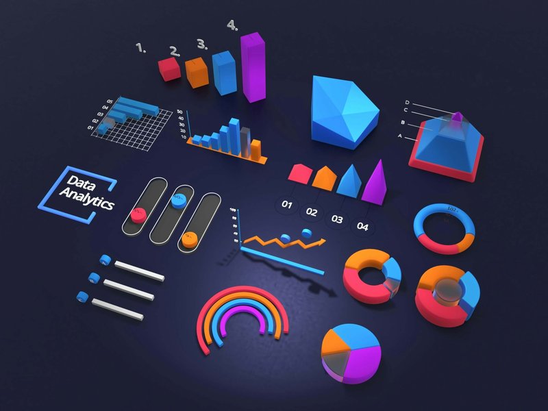
Visualizing Dashboard Data
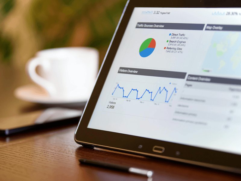
If you’re new to the idea of dashboards, you might be wondering how they’re different from reports. Unlike reports, which can be text-heavy, a data dashboard relies on different types of visual elements like charts and graphs to represent the bulk of the dashboard data.
In addition to providing real-time insights, a data dashboard can visualize large amounts of complex data in a way that makes it easily understood at a glance. Most custom dashboard software includes a variety of visual and other customization elements, so you always have plenty of choices for how to display your data for the biggest impact.
In today’s fast-paced business environment, people are more likely to pay attention to information that’s quick and easy to understand – and a data dashboard checks both of those boxes while providing the most current information available.
Why You Should Use Data Dashboards in Daily Operations
The visual presentation of dashboard data gives you immediate access to the information you need to become more data-driven in your day-to-day work. It’s a fantastic tool for measuring performance while improving transparency – check out this article to learn how workplace transparency improves company culture and performance. In addition, tracking real-time performance data enables everyone with dashboard access to pick up on changes and trends – and quickly adjust course before a bump in the road becomes a catastrophe.
Dashboards also make it easy to compare historical data with current data to help you better understand things like seasonal cycles and whether certain initiatives had the intended effect. Data is knowledge and knowledge is power. The world’s most successful companies understand this and that’s why many of them have fully embraced data dashboards as part of their operations.
Tips for Creating an Effective Data Dashboard
While many companies see positive growth after implementing dashboards, others make the mistake of starting out with too many dashboards that track too much information and can become confusing. This can make it difficult to see the forest for the trees.
Follow these tips to avoid this common pitfall and get off to the best possible start:
- Clearly define the dashboard audience and understand their data needs.
- Define a clear business objective for each dashboard.
- Limit the amount of data presented on each dashboard.
- Group or categorize your dashboard data logically.
- Choose data-appropriate visuals (e.g., bar charts, pie charts, line graphs).
- Choose a clean and uniform look and feel for all of your dashboards.
This article explains the three main types of data dashboards, which ones to choose, and how to get the most out of them.
Choosing Custom Dashboard Software
There’s never been a more opportune time to incorporate dashboards into your operations. A variety of custom dashboard software options makes it easier than ever to create dashboards that can help your company use data to achieve greater success!
If you’d like to get started with building your first data dashboard, you might want to read these six tricks to design the most engaging dashboards. Dashboards are particularly popular in achieving optimal customer experiences, and this article is full of information about how to create CX dashboards. Sales teams were some of the earliest adopters of this business-changing tool – these 5 dashboards that every sales team needs are an excellent place to start.
Plecto’s custom dashboard software makes it easy to aggregate data from multiple systems because it integrates with many of the most popular business systems to help you create customized dashboards to effectively track KPIs and share information with everyone who needs it.
Sign up for a free demo to see how Plecto’s custom dashboard software can help you become more data-driven – and successful!
Start your 14-day
free Plecto trial today.
SAGE CRAWFORD
Content Manager