Sign in
10 KPIs for Customer Service
Customer Service KPIs
The examples are based on integrations, such as Aircall, Zendesk, Salesforce, Vitally, and others. You can use any of our integrations to build the same or similar KPIs – it all depends on what data you import to Plecto.
You can add the same formula to multiple widgets to get different KPIs – this applies to all formulas in Plecto!
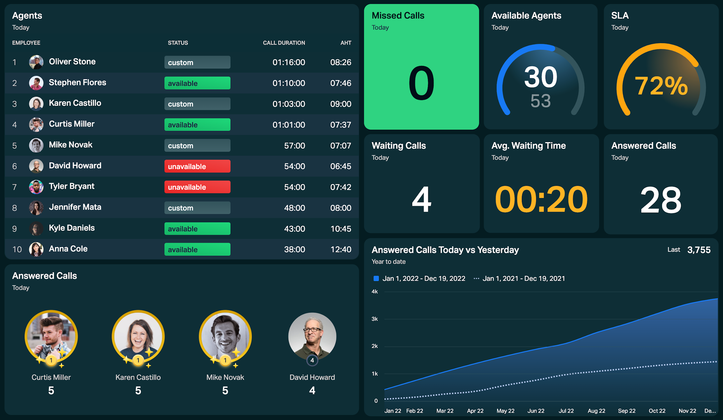
Draw inspiration for your CS dashboard and use these KPIs to give everyone a real-time overview of their workload, progress, status, and more.
Quick reminder!
In Plecto, a KPI consists of formula + widget + time period.
Number of new support tickets
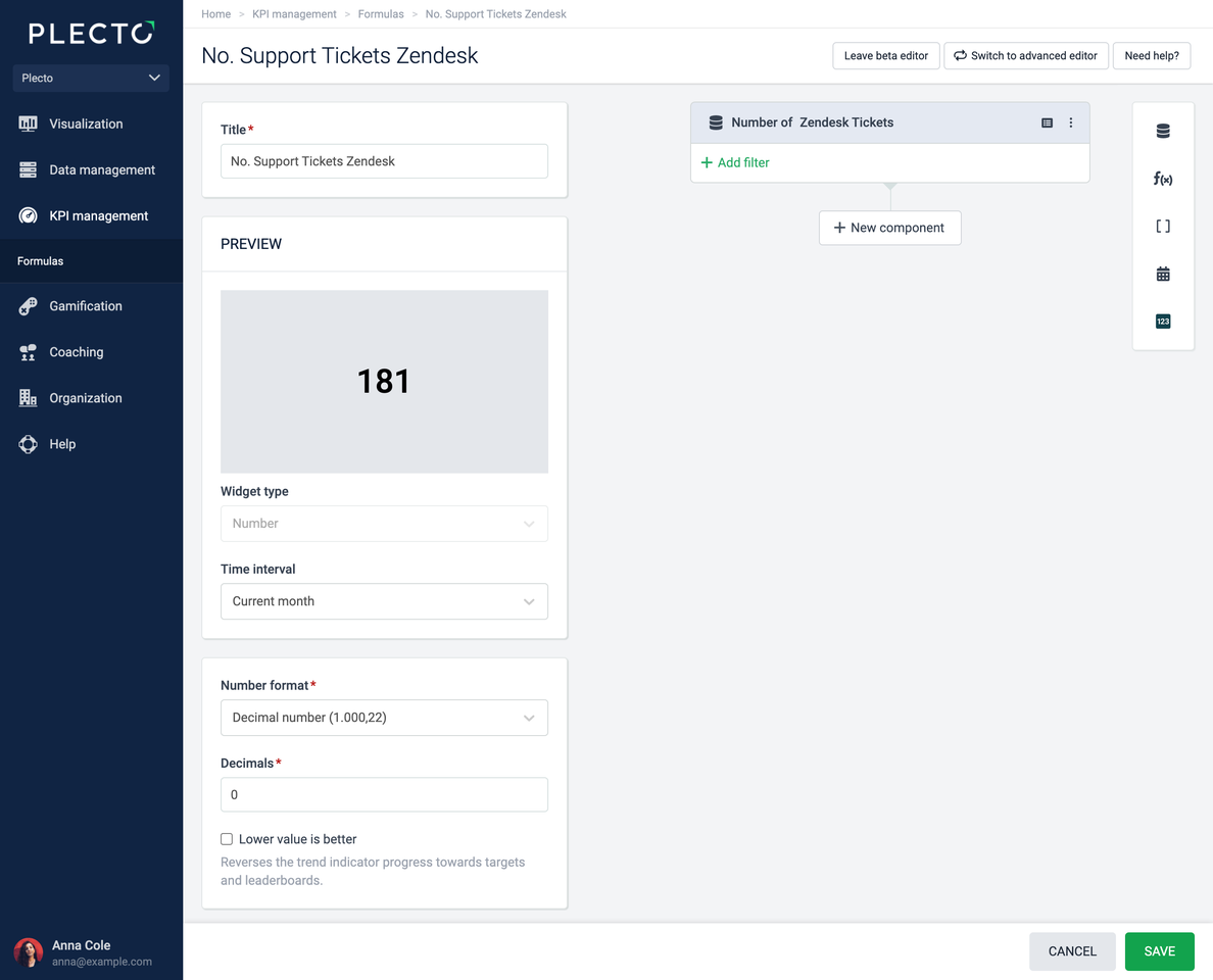
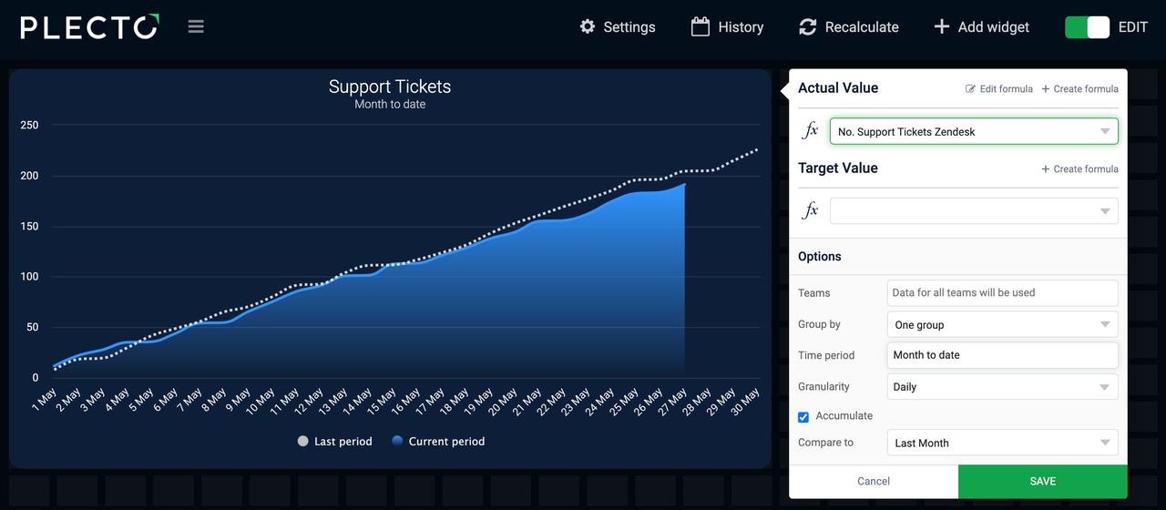
Get an overview of your support tickets. See the number of tickets created today or how many tickets you've had during the month compared to last month.
Example with Zendesk Tickets
-
Go to Formulas > New formula.
-
Add a Data function component:
-
Data source: Zendesk Tickets (or other data source such as Freshservice Tickets. Make sure to select the data source relevant to you)
-
Function: Number of
-
Date field: Choose a relevant date field, such as Created date or Created at
-
-
Keep the number format in the formula editor to Decimal number.
-
(Optional) Feel free to customize your formula by adding conditional colors.
-
Add a formula title.
-
Click Save in the bottom-right corner.
-
Open a dashboard and add the formula to a widget of your choice. We like line or area charts, but it's really up to you to decide how you want to see your metrics.
-
Choose the time period, for example, Today, Current month or Month to date.
-
(Optional) Adjust other widget settings depending on the available options.
-
Click Save to finish and create your KPI.
Advanced formula editor
This is how the formula looks in the Advanced editor: (Count(Zendesk Tickets))
You can copy and use the formula in your formula editor, but make sure to choose your own data source.
How to use this formula on dashboards
Here are some examples of how you can use the formula on a dashboard:
-
Add it to a number widget to see the number of tickets created today, the current week, or during another time period.
-
Add the formula to a column chart and group your tickets by status, priority, type, or other fields from your data source.
-
Add the formula to a line chart and see how many tickets got created this month vs. last month.
Use custom group by
Get an overview of your support cases by different mediums – how many customers contact you through chat, phone, email? Take a donut or column chart and group the results by a specific field from your data source.
Net promoter score (NPS)
Gather feedback from your customers to understand how well your product or service performs. To get the NPS score, you subtract the % of detractors from the % of promoters.
For example, if 70% of your respondents are Promoters and 10% are Detractors, your Net Promoter Score is 60.
Example with Vitally NPS responses
-
Go to Formulas > New formula and add a Group component.
-
In the Group component, add a Data function component that counts the Number of Vitally NPS responses.
-
Click Add filter to get the number of responses where the score is greater than or equal to 9.
-
Add a new Data function component that counts the Number of Vitally NPS responses.
-
Change the operator between the first and second components to ➗.
-
Add a third component in the group – static number. Enter 100, and change the operator between this component and the middle one to ✖️.
-
-
Duplicate the group by clicking on the three dots in the top-right corner of the group component.
-
In the duplicated group, find the first Data function component and change the filter condition to score is less than or equal to 6.
-
Change the operator between both groups to ➖.
-
(Optional) Add conditional colors.
-
Click Save in the bottom-right corner.
-
Open a dashboard and add the formula to a widget. We would choose a speedometer widget or a number box.
-
Choose a time period such as the Current quarter or year.
-
Click Save to add your KPI to the dashboard.
Advanced formula editor
This is how the formula looks in the Advanced editor: ((Count(Vitally NPS responses,Score>=9) / Count(Vitally NPS responses) * 100) - (Count(Vitally NPS responses,Score<=6) / Count(Vitally NPS responses) * 100))
You can copy and use the formula in your formula editor, but make sure to choose your own data source.

Agent availability status
See the latest availability status of your agents. Your agent statuses change constantly, and since you want to see the most recent agent status, you'll have to use the data function Last.
Example with Aircall Users
-
Go to Formulas > New formula.
-
Add a Data function component:
-
Data source: Aircall Users
-
Function: Last
-
Field: Availability status
-
Date function: Upload date
-
-
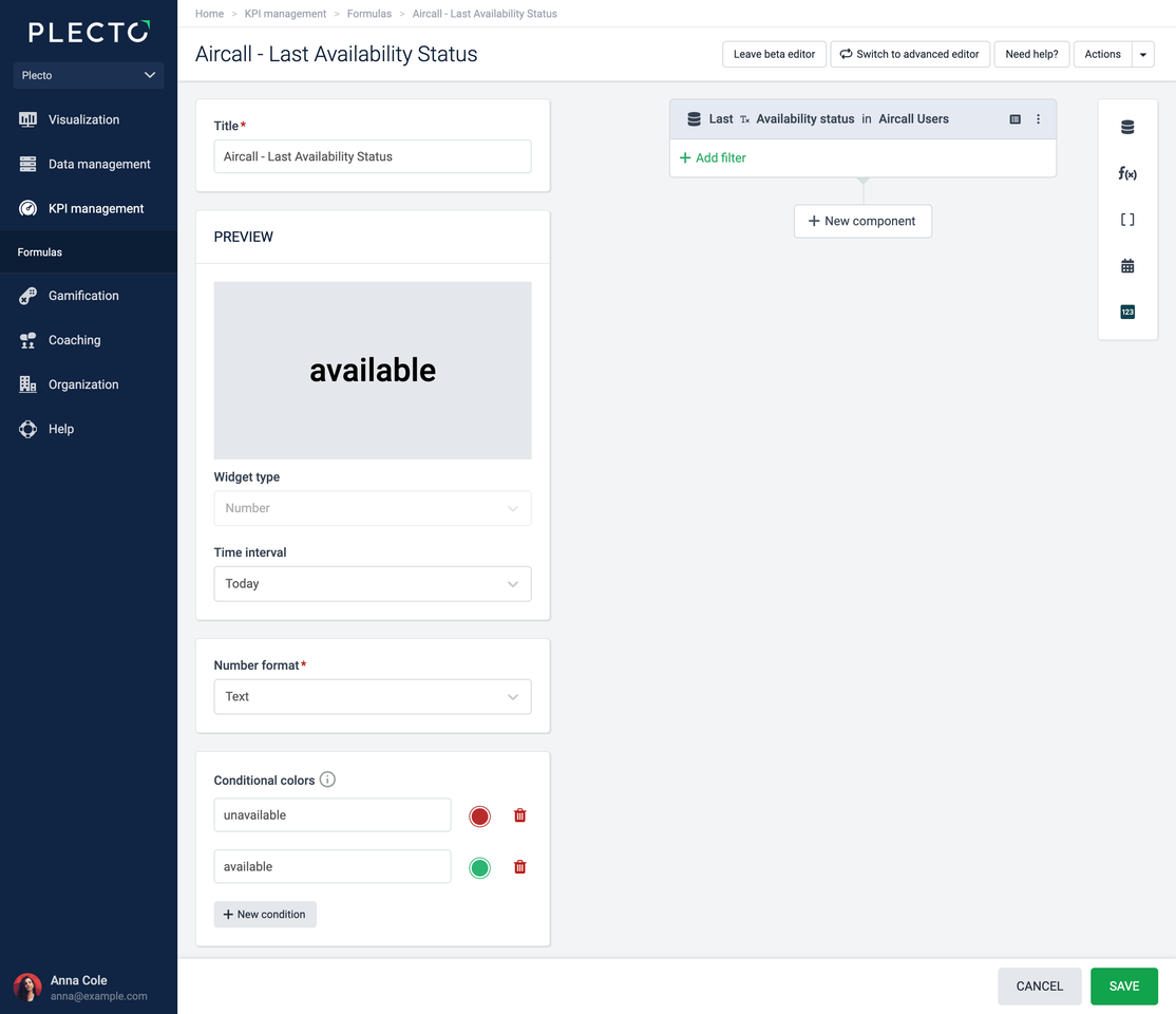
Change the number format to Text.
-
(Optional) Add conditional colors. For example, add red if the user's status is "unavailable," green if "available," and so on. Conditional colors are case-sensitive, so make sure to enter the values exactly as they appear in the data source.
-
Click Save in the bottom-right corner.
-
Open your dashboard and add the formula to a table widget. The table widget allows you to get an overview of all your agent statuses. Feel free to add multiple columns to see other agent KPIs on the same widget.
-
Set the time period to Today.
-
Click Save to finish and create your KPI.
Advanced formula editor
This is how the formula looks in the Advanced editor: (Last(Aircall Users,Availability status))
You can copy and use the formula in your formula editor, but make sure to choose your own data source.
Customer satisfaction score (CSAT)
See how satisfied your customers are by tracking your Customer Satisfaction Score. To get the CSAT score, divide the number of satisfied customer responses by the total number of responses.
Example with Freshdesk Satisfaction Ratings
-
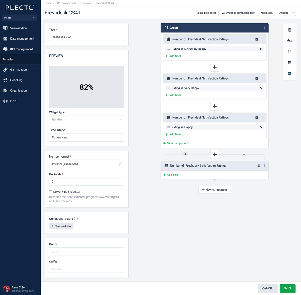
Go to Formulas > New formula and add a Group component.
-
In the Group component, add a Data function component:
-
Data source: Freshdesk Satisfaction Ratings
-
Function: Number of
-
Click Add filter and choose Rating = Extremely Happy.
-
-
Click the three little dots in the top-right corner of the data function component you just made and click Duplicate component.
-
Duplicate the component once more. You should now have three of the same components inside a Group component.
-
In the second component, change the filter to Rating = Very Happy.
-
In the third component, change the filter to Rating = Happy.
-
-
Add a new Data function component (not inside the group) that counts the Number of Freshdesk Satisfaction Ratings.
-
Change the operator between Data function and the big Group component to ➗.
-
Change the number format to Percent.
-
(Optional) Add conditional colors so that the widget turns green when you reach 80, for example.
-
Click Save in the bottom-right corner.
-
Open a dashboard and add the formula to a speedometer or number box widget.
-
Change the number format to the Current month, Current quarter, or another time period.
-
Click Save to add the KPI to your dashboard.
Advanced formula editor
This is how the formula looks in the Advanced editor: ((Count(Freshdesk Satisfaction Ratings,Rating="Extremely Happy") + Count(Freshdesk Satisfaction Ratings,Rating="Very Happy") + Count(Freshdesk Satisfaction Ratings,Rating="Happy")) / Count(Freshdesk Satisfaction Ratings))
You can copy and use the formula in your formula editor, but make sure to choose your own data source.
Top agents – Leaderboard
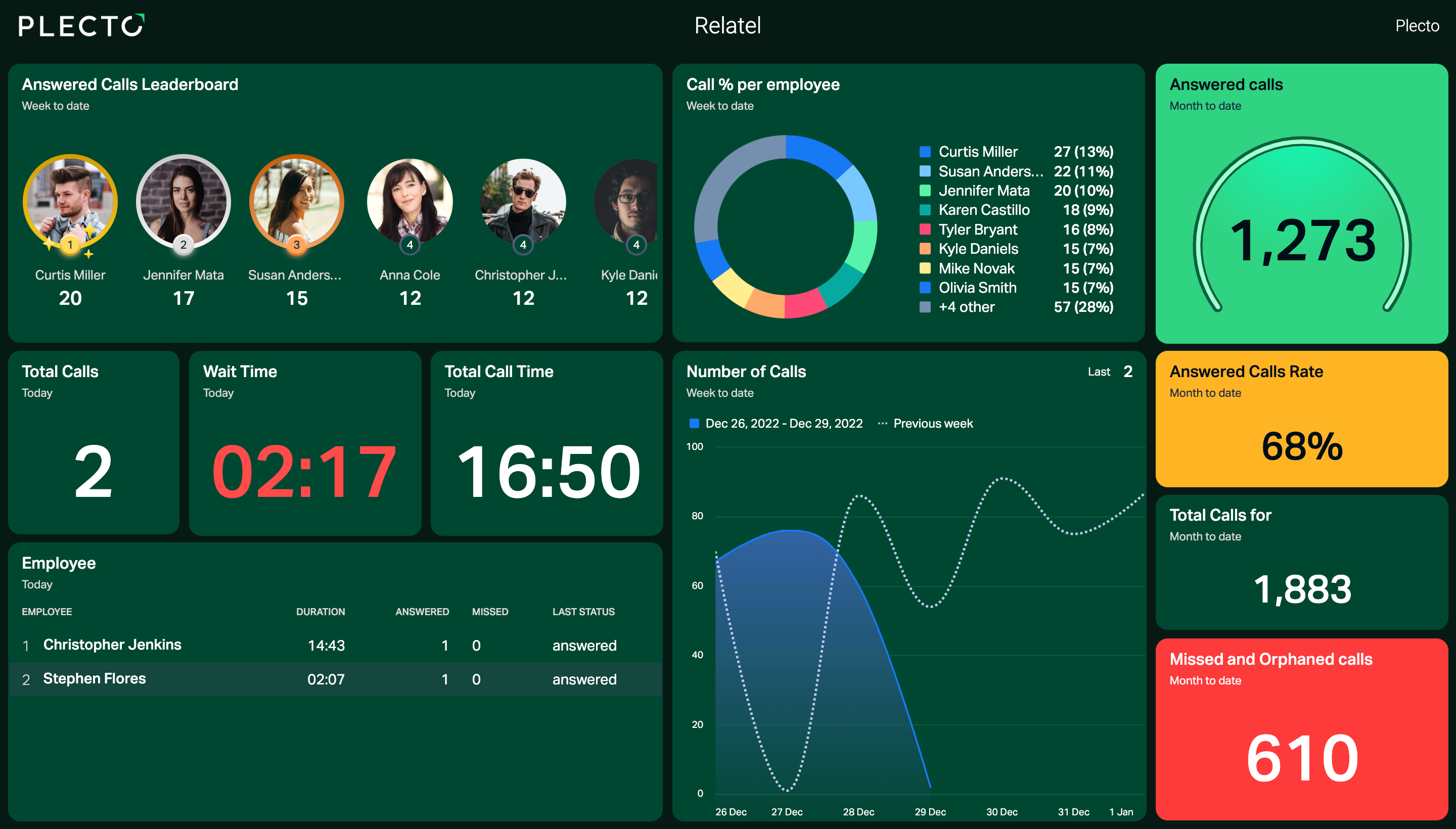
See who's answered the most calls, customer cases, and more. You can use one of your existing formulas that calculates, for example, the number of support tickets, the number of calls, or other metrics, and add it to a leaderboard on your dashboard. The widget will do the rest.
Works with any formula and data source
-
Open a dashboard and add a leaderboard widget.
-
Choose an existing formula such as Number of Answered Calls, Average Resolution Time, or others*.*
-
Choose a time period on the widget. Your widget will be most engaging if you set the time period to Today, the Current week, or Current month.
Average first response time (FRT)
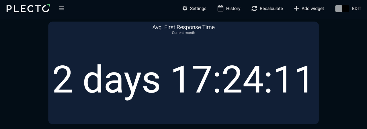
The Average First Response Time or FRT is the average time it takes your agents to respond to a customer inquiry or support ticket.
Example with Freshservice Tickets
-
Go to Formulas > New formula.
-
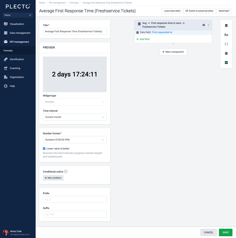
Add a Data function component:
-
Data source: Freshservice Tickets
-
Function: Avg of
-
Field: First response time in secs
-
Date field: First responded at
-
-
Change the number format to Duration. If lower resolution time is what you're going for, you can enable the Lower value is better option.
-
(Optional) Feel free to add conditional colors. For duration KPIs, the conditions need to be indicated in seconds.
-
Click Save in the bottom-right corner.
-
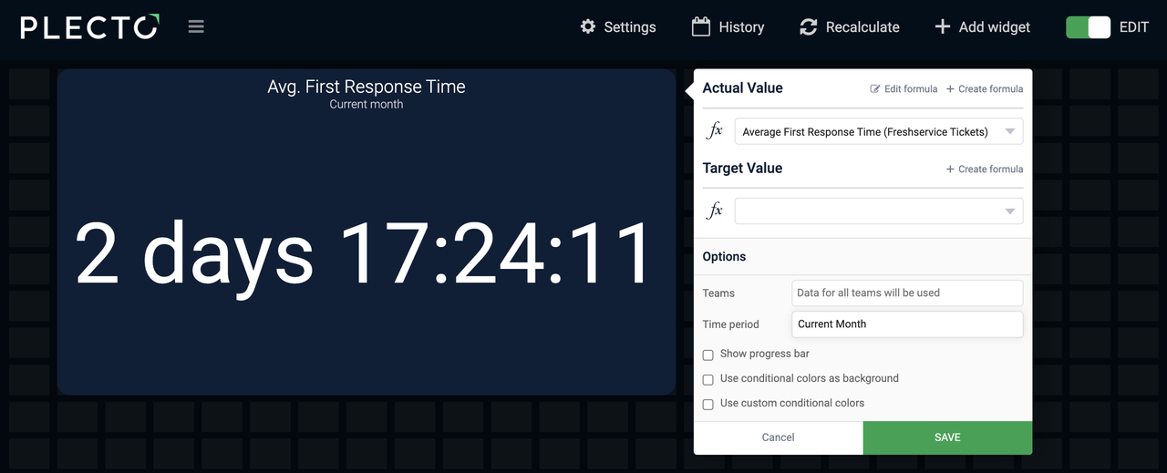
Open a dashboard and add the formula to a number box.
-
Choose a time period, such as Today, Current week, or others, depending on what you want to see.
-
Click Save to finish and create your KPI.
Advanced formula editor
This is how the formula looks in the Advanced editor: (Avg(Freshservice Tickets,First response time in secs).Date(First responded at))
You can copy and use the formula in your formula editor, but make sure to choose your own data source.
Number of solved tickets
This formula is similar to the Number of Support Tickets formula, except that it filters the registrations and only counts the number of tickets with the status solved. Please note that the status name can differ from integration to integration (solved, resolved, closed, etc.).
Example with Zendesk Tickets*,* Freshdesk Tickets*,* Freshservice Tickets
-
Go to Formulas > New formula.
-
Add a Data function component:
-
Data source: Choose a data source that stores data about your tickets, for example, Zendesk Tickets, Freshdesk Tickets, or others.
-
Function: Number of
-
Date field: Choose a relevant date field, such as Updated at or Resolved at
-
Click Add filter and choose the field that contains information about the ticket status. We've mapped some data sources and their field names and values. Look for the following, depending on your data source: Zendesk Tickets = Status = solved Freshdesk Tickets = Status = Resolved Freshservice Tickets = Status = Resolved
-
-
Keep the number format in the formula editor to Decimal number.
-
(Optional) Feel free to customize your formula by adding conditional colors.
-
Add a formula title.
-
Click Save in the bottom-right corner.
-
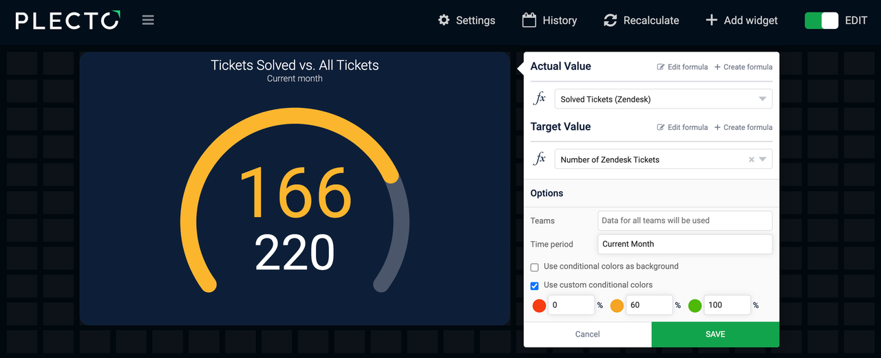
Open your dashboard and add the formula to a widget. We would choose a speedometer widget.
-
(Optional) Add a target formula, for example, one that counts the number of all tickets.
-
Choose the time period on the widget, such as Today or Current month.
-
Click Save to finish and create your KPI.
Advanced formula editor
This is how the formula looks in the Advanced editor: (Count(Zendesk Tickets,Status="solved").Date(Updated at))
You can copy and use the formula in your formula editor, but make sure to choose your relevant data source.

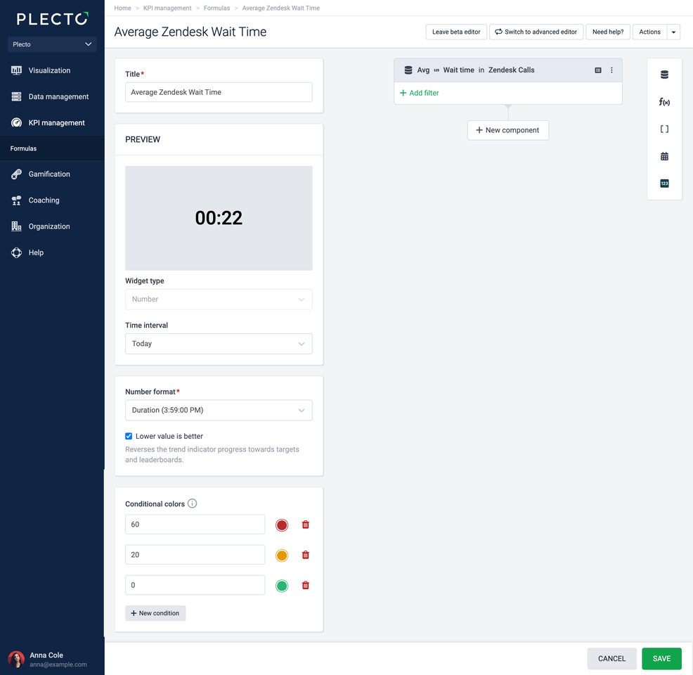
Average wait time
Your customers are more likely to give you a good score if they don't have to wait on an agent to reply to their call. Track your average waiting time and see where you can improve your service.
Example with Zendesk Calls
-
Go to Formulas > New formula.
-
Add a Data function component:
-
Data source: Zendesk Calls
-
Function: Avg of
-
Field: Wait time
-
-
(Optional) Customize your formula with conditional colors. Add red if the wait time is over 120 seconds, yellow if 30, green if 0. You will see different colors based on the range the KPI falls in.
-
Change the number format to Duration.
-
Click Save in the bottom-right corner.
-
Open your dashboard and add the formula to a number box.
-
Change the time period to Today, the Current week, or Current month.
-
Click Save to add your KPI to the dashboard.
Advanced formula editor
This is how the formula looks in the Advanced editor: (Avg(Zendesk Calls,Wait time))
You can copy and use the formula in your formula editor, but make sure to choose your own data source.
Useful tips
Here's some practical advice on how to get the best out of your formulas.
-
Once you create a formula in the formula editor, you can reuse the formula across the entire platform. Add the same formula to dashboard widgets, reports, contests, notifications, and more.
-
If you have a formula that counts the number of registrations in your data source (data function = Number of), you can add it to a dashboard widget that supports custom grouping and see the KPIs based on a specific field from your data source.
-
Know the default date field of your integration data sources. Plecto uses the default date to show your KPIs. If the default date is Created date, but you want to see the number of registrations based on Updated date, you might consider changing the default date field (which will apply to all formulas) OR adding a date modifier to your formula (will apply to a single formula). Find the default date field in your data source settings.
-
Is your widget showing 0? Check if you changed the Number format in the formula editor. If you expect the widget to display text such as Available, but the number format is Decimal number, the widget will show 0.
Average handle time (AHT)
The Average Handle Time (AHT) reflects how much time it takes your agents to handle a customer transaction. Usually AHT is calculated by dividing the total talk time + total hold time + total wrap-up time by the total number of calls.
Example with Zendesk Calls
-
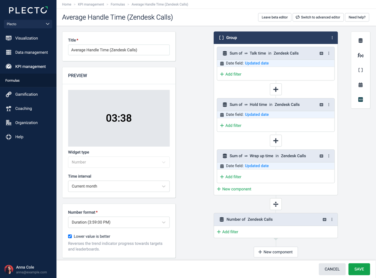
Go to Formulas > New formula and add a Group component.
-
In the Group component, add three Data function components:
-
Sum of Talk time in Zendesk Calls.
-
Sum of Hold time in Zendesk Calls.
-
Sum of Wrap up time in Zendesk Calls.
-
Update the date field to Updated date in all three components above.
-
-
Add a separate Data function component that counts the Number of Zendesk Calls.
-
Change the operator between the Group and Data function components to ➗.
-
Change the number format to Duration. If lower handling time is what you're going for, you can enable the Lower value is better option.
-
(Optional) Feel free to add conditional colors. For duration KPIs, the conditions need to be indicated in seconds.
-
Click Save in the bottom-right corner.
-
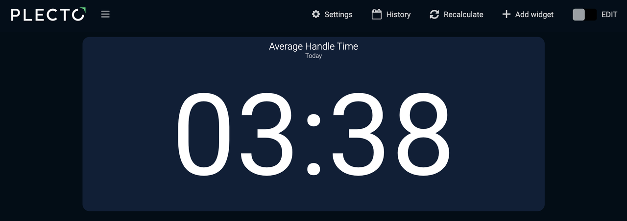
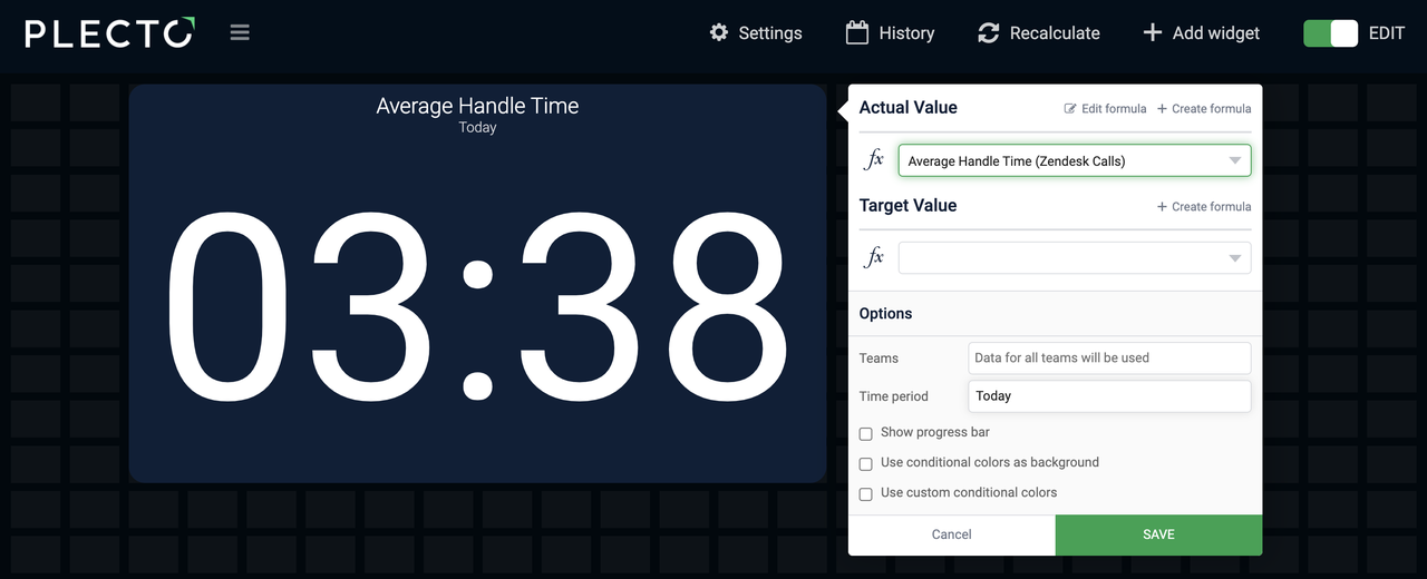
Open a dashboard and add the formula to a number box.
-
Choose a time period, such as Today, Current week, or others, depending on what you want to see.
-
Click Save to finish and create your KPI.
Advanced formula editor
This is how the formula looks in the Advanced editor: ((Sum(Zendesk Calls,Talk time).Date(Updated date) + Sum(Zendesk Calls,Hold time).Date(Updated date) + Sum(Zendesk Calls,Wrap up time).Date(Updated date)) / Count(Zendesk Calls))
You can copy and use the formula in your formula editor, but make sure to choose your own data source.
Average resolution time (ART)
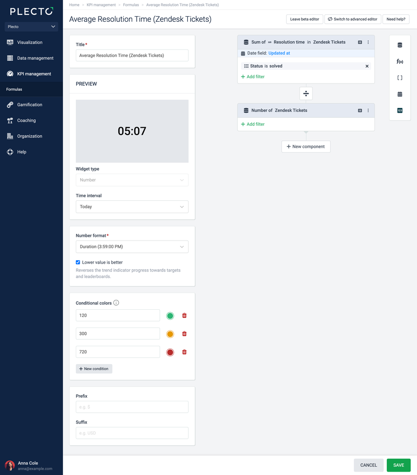
Average Resolution Time (ART) takes the total duration of all resolved customer interactions and divides it by the total number of interactions. This formula example is based on Zendesk Tickets, but feel free to use it with other systems.
Example with Zendesk Tickets
-
Go to Formulas > New formula.
-
Add a Data function component:
-
Data source: Zendesk Tickets
-
Function: Sum of
-
Field: Resolution time
-
Date field: Updated date
-
Click Add filter and choose Status = solved.
-
-
Add a new Data function component:
-
Data source: Zendesk Tickets
-
Function: Number of
-
-
Change the operator between both components to ➗.
-
Change the number format to Duration. If lower resolution time is what you're going for, you can enable the Lower value is better option.
-
(Optional) Feel free to add conditional colors. For duration KPIs, the conditions need to be indicated in seconds.
-
Click Save in the bottom-right corner.
-
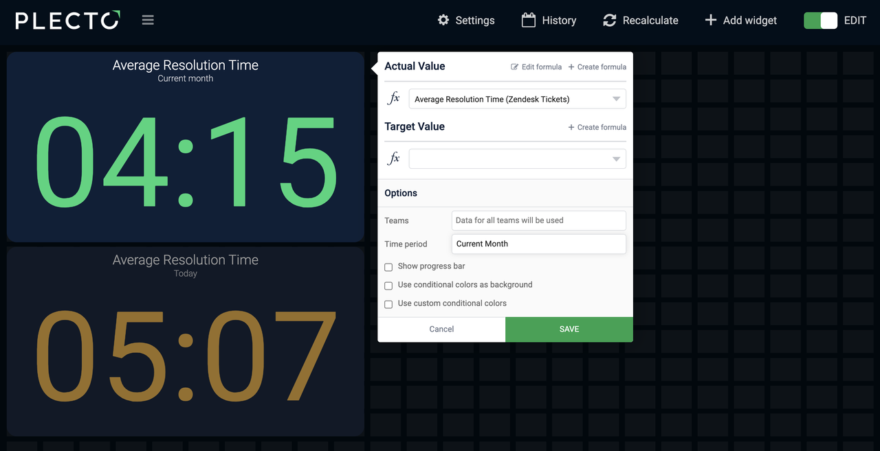
Open a dashboard and add the formula to a number box.
-
Choose a time period, such as Today, Current week, or others, depending on what you want to see.
-
Click Save to finish and create your KPI.
Advanced formula editor
This is how the formula looks in the Advanced editor: (Sum(Zendesk Tickets,Status="solved",Resolution time).Date(Updated at) / Count(Zendesk Tickets))
You can copy and use the formula in your formula editor, but make sure to choose your own data source.