 Sign in
Dashboard Widget Overview
Overview of dashboard widgets
Plecto offers 14 different dashboard widgets that are easy to add, edit, move, resize, and more. Each of the widgets is highly customizable.
You can add the same formula to multiple widgets to extract different KPIs. For example, Number of Calls (today) and Number of Calls (this month).
Default widget sizes
When you add a widget to your dashboard, it will appear at a default size based on the widget type. You can always resize it afterwards by dragging the widget edges.
| Widget type | Default size |
|---|---|
| Number | Small (compact) |
| Streaming Number | Small (compact) |
| Countdown | Small (compact) |
| Clock | Small (compact) |
| Speedometer | Small (square) |
| Streaming Speedometer | Small (square) |
| Text | Medium (wide) |
| Image | Medium |
| Funnel Chart | Medium |
| Leaderboard | Medium (square) |
| Pie Chart | Medium |
| Line Chart | Large (wide) |
| Area Chart | Large (wide) |
| Column Chart | Large (wide) |
| Table | Large (wide) |
| Timeline | Large (wide) |
Tip: Default sizes are chosen to give each widget enough space to display information clearly. If your dashboard feels crowded, try switching Number or Clock widgets to a smaller section of the grid, or use full-width widgets like Table and Charts in their own row.
Number box
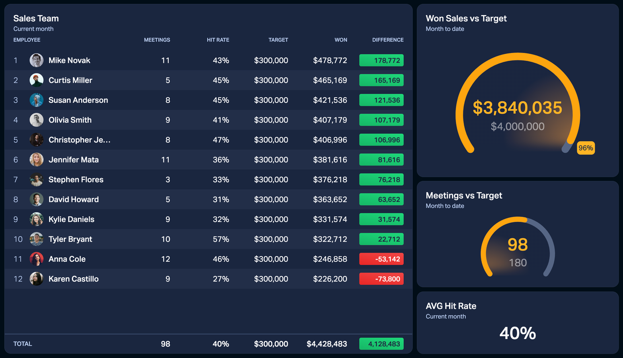
Number boxes are great for any type of KPIs. They allow you to display numbers, percentages, date and time, and much more.
For example, you can use the number box to see the value of won deals this month, number of calls today vs. target, and more.
Number box allows you to add custom conditional colors. They will override the colors applied in your formula (if any) and will only apply to the widget in question.
Table widget on dashboards
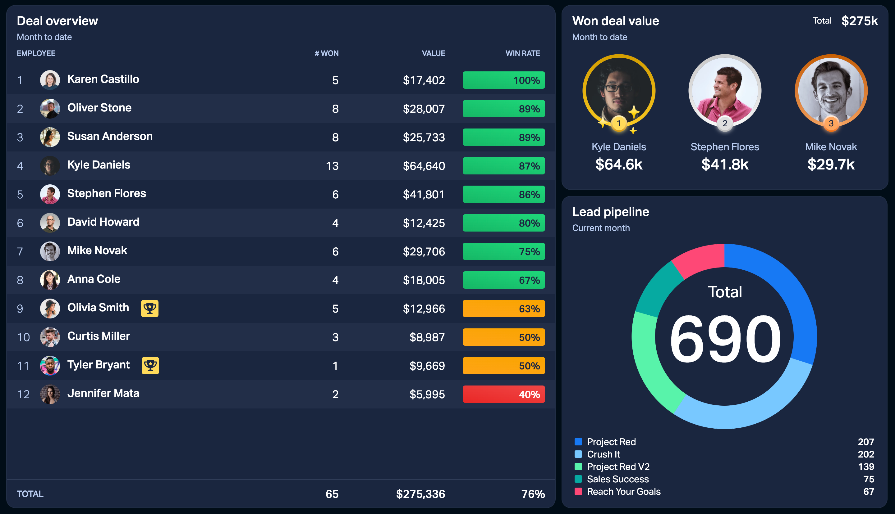
One column = one formula. The table widget is highly customizable and offers a great overview of your KPIs.
-
Add unlimited columns. Or, until there's no more space on your screen.
-
See conditional colors and employee achievement badges.
-
Sort the table columns. Click on the three little dots in the top-right corner of a column to sort it.
-
Show average or total values for each column by adding a summary heading.
-
Reorganize the columns using drag-and-drop.
-
Group your data by employees, teams, time, or custom fields from your data sources using the Group by option.
Clock
See your local time or the time in your Paris office. If you've built a dashboard for all your teams, the clock widget can help you keep track of the different time zones on the same dashboard.
You can choose between a 12 or 24-hour time format, as well as show a clock icon or add a widget background.
Area and Line charts
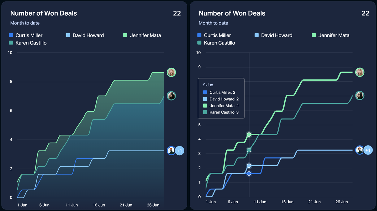
The area and line charts are very similar – the only difference is that the area chart highlights the data areas. The Y axis range on the charts adjusts automatically based on your data.
Here's how you can use the line and area charts:
-
Add two formulas to the chart to keep track of two metrics.
-
Add one formula and compare it to a previous time period.
-
Add one formula and group your data by employees, teams, or custom fields.
-
Show a summary in the top-right corner. You can choose to show the Total, Average or Last values.
Tip – Interact with the widgets! Click on the legends or hover over the lines to see the KPIs individually or summarized.
Text
The text widget allows you to add custom text to your dashboard. Write your message and adjust the text weight, size and alignment. You can also choose to show the widget background.
Donut chart
Forget about pie charts – donuts are the new standard! The donut chart in Plecto comes both in horizontal and vertical layout.
-
Group your data by employees, teams, time, or custom fields from the relevant data sources.
-
Grouping by time enables you to select a time period granularity.
-
If you show data with a daily granularity, you can choose to hide the weekends (Saturday and Sunday). This setting is purely visual and will not change the formula result.
-
-
Filter by team(s): If applied, this filter will show data for employees from the selected teams. If no teams are selected, the widget will use data for all teams in your organization.
-
Hide empty slices: This option gives your donut chart a cleaner look.
-
Display numbers as values or percentages within the donut. For example, 17 calls = 17 calls vs. 17 calls = 25% of all activities.
-
Show Total or Average summary values in the top-right corner of the widget.
-
Abbreviate large numbers: Instead of $24 325 show $24,3k.
Countdown
The countdown widget allows you to see how much time is left until your next important event. Use it to keep track of the deadlines or count the time until the next office party.
Timeline widget
The timeline widget displays data in chronological order. It can show your latest activities, but it will not summarize the KPIs.
The timeline widget is most commonly used with formulas that use the Last and Sum of data functions.
Hide rows with zero and negative values. If selected, Plecto will look at the sorted column and hide all rows with negative values, including 0. It means that it might exclude values from other columns on the same row, even if they show positive values.
Leaderboard
Show your top performing teams or employees. The leaderboard widget has both vertical and horizontal layouts, and it can display up to 30 people.
The leaderboard acknowledges ties. For example, if Louis and Clara both have made 40 calls, they will share the same place on the leaderboard.
Here are other leaderboard options:
-
Group your data by employees or teams.
-
Filter by team(s): If applied, this filter will show data for employees from the selected teams. If no teams are selected, the widget will use data for all teams in your organization.
-
Show Total or Average summary values in the top-right corner of the widget.
-
Hide items without data: This allows you to only list the employees or teams that have data to show.
-
Limit the number of items to display: This number determines how many items appear in the leaderboard view. For example, if you set it at 3, you will see 3 employees per view once you scroll through the leaderboard.
-
Abbreviate large numbers: Instead of $24 325 show $24,3k.
Tip – Invite everyone to upload their profile pictures! People can upload their pictures in their account settings. Make your leaderboards look better by inviting everyone in your organization to upload their own pictures.
Image widget
Add a fun twist to your dashboards with image widgets! Upload images and GIFs up to 10MB and make your dashboards more fun.
Larger images should scale along with the widget. If you upload a smaller image, they will stay as big as their maximum dimensions.
Combine image widgets with custom themes, and you'll get yourself some fun dashboards.
Friday dashboard
Here's a fun dashboard we made for fun Friday afternoons (install the package). We used the following IF statement with custom NetWorkDays:
( IF(NetWorkDays(StartDate(),EndDate(),1111011)>0,"🎊🎉Yes🎉🎊","No") )
Set the number format to Text.

Column chart
Here's what you can do with the column chart:
-
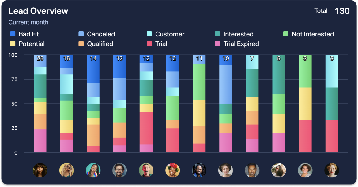
Group your data by employees, teams, time, or custom fields from the relevant data sources.
-
Grouping by time enables you to select a time period granularity.
-
If you show data with a daily granularity, you can choose to hide the weekends (Saturday and Sunday). This setting is purely visual and will not change the formula result.
-
-
Sort the columns alphabetically or by highest/lowest values.
-
Add a target: Compare each column against a target value. The target appears as a striped column next to the actual one, and both are shown in the legend. You can type in a fixed number or use a formula as the target. With a formula, each employee or team gets their own target, so everyone is measured against their personal goal.
-
Show employee and team names or their avatars.
-
Stack the columns: Visualize multiple dimensions from a single formula. Stacked columns allow you to compare the total values and single parts.
-
Filter by team(s): If applied, this filter will show data for employees from the selected teams. If no teams are selected, the widget will use data for all teams in your organization.
-
Vertical and horizontal columns: Customize the layout of your column chart.
-
Show Total or Average summary values in the top-right corner of the widget.
-
Abbreviate large numbers: Instead of $24 325 show $24,3k.
Speedometer
The speedometer widget is most often used to measure the current progress (actual value) against a target value. It works the same as the number box. If the widget size is big enough, you will see a percentage indicator that tells how far you are from reaching the target.
Custom conditional colors
Speedometer allows you to add custom conditional colors. They will override the colors applied in your formula (if any) and will only apply to the widget in question.
-
If you only add one KPI to the widget, the conditional colors will think in numbers.
-
If you add both the actual and target values, the number box will be in percentages. You will also see the % indicator next to the conditional value fields.
Time period options for Area & Line charts
Granularity
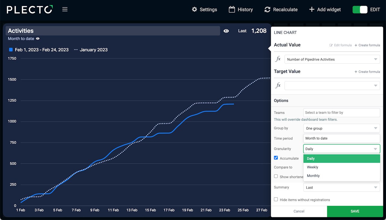
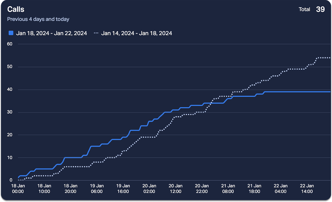
Granularity allows you to break up the data points on your line and area charts. The granularity options depend on your chosen time period.
-
When showing years, you can use the quarterly, monthly, and weekly granularity.
-
When showing quarters, you can use the monthly, weekly, and daily granularity.
-
When showing months, you can use the monthly, weekly, and daily granularity.
-
When showing days, you can use the daily and hourly granularity. Note that hourly granularity is limited to 4 days.
If you show data with a daily granularity, you can choose to hide the weekends (Saturday and Sunday). This setting is purely visual and will not change the formula result.
Accumulate
Accumulate the data points and track the total progress of your performance. For example, use it to see the total value of closed deals, completed tasks, or others, within your chosen time period.
Compare data to last time period
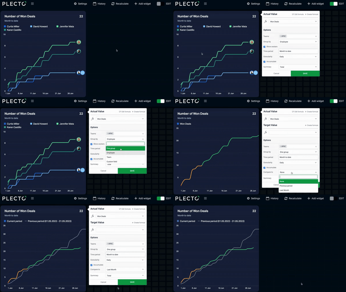
If the Group by option is set to None, you can compare the current KPI to the previous time period – for example, see the number of deals this month vs. last month, calls today vs. yesterday, and so on.
If you select to-date time periods such as Week to date or Month to date, you can compare the data to the last to-date period or last full period.
For example, if the selected time period is Month to date, you can compare it to Previous period (previous month to date) or Last month (the entire last month).
The Target Value and Compare to options are mutually exclusive. It means that you can only compare the actual value either to a target value or a past time period.
How to add a table widget
-
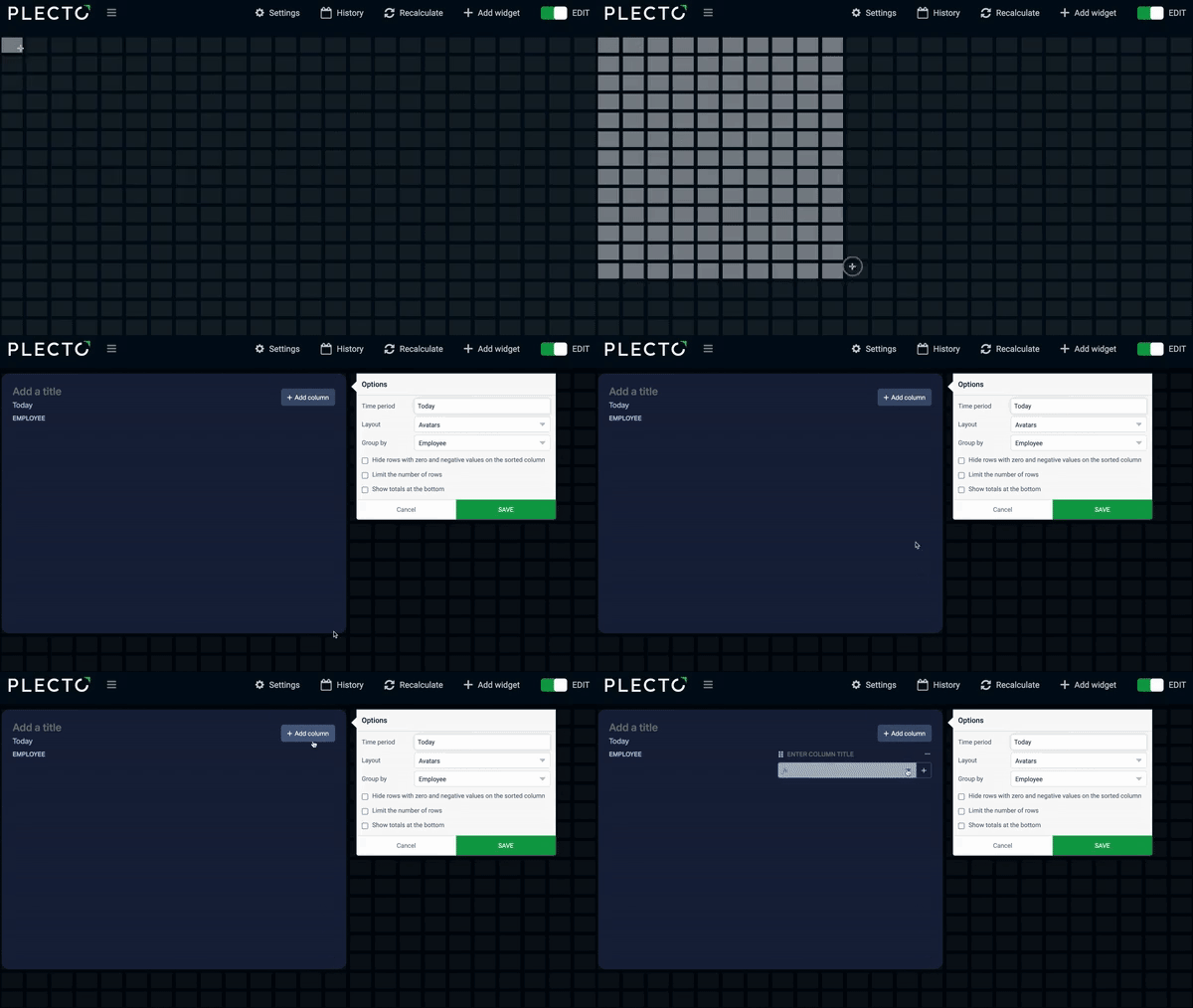
Open your dashboard, then click Add widget and select Table.
-
Hold the click button on your mouse and drag the widget onto the dashboard.
-
Click Add column and select a formula. You can add as many columns as you want and create new formulas right from the widget by clicking the New button.
-
(Optional) Give each column a title that describes the added formula.
-
(Optional) Give your table widget a title.
-
Adjust the settings such as the layout, grouping, time period, and others.
-
Click Save widget to finish.
How to sort table columns
Column sorting depends on how you group the data on the table widget.
- To sort the data, click on the three dots in the column header and choose your preferred sorting style.
If a column is sorted, you will see a little triangle in the header. To revert to the default sorting, click the dots again and deselect the current sorting style.
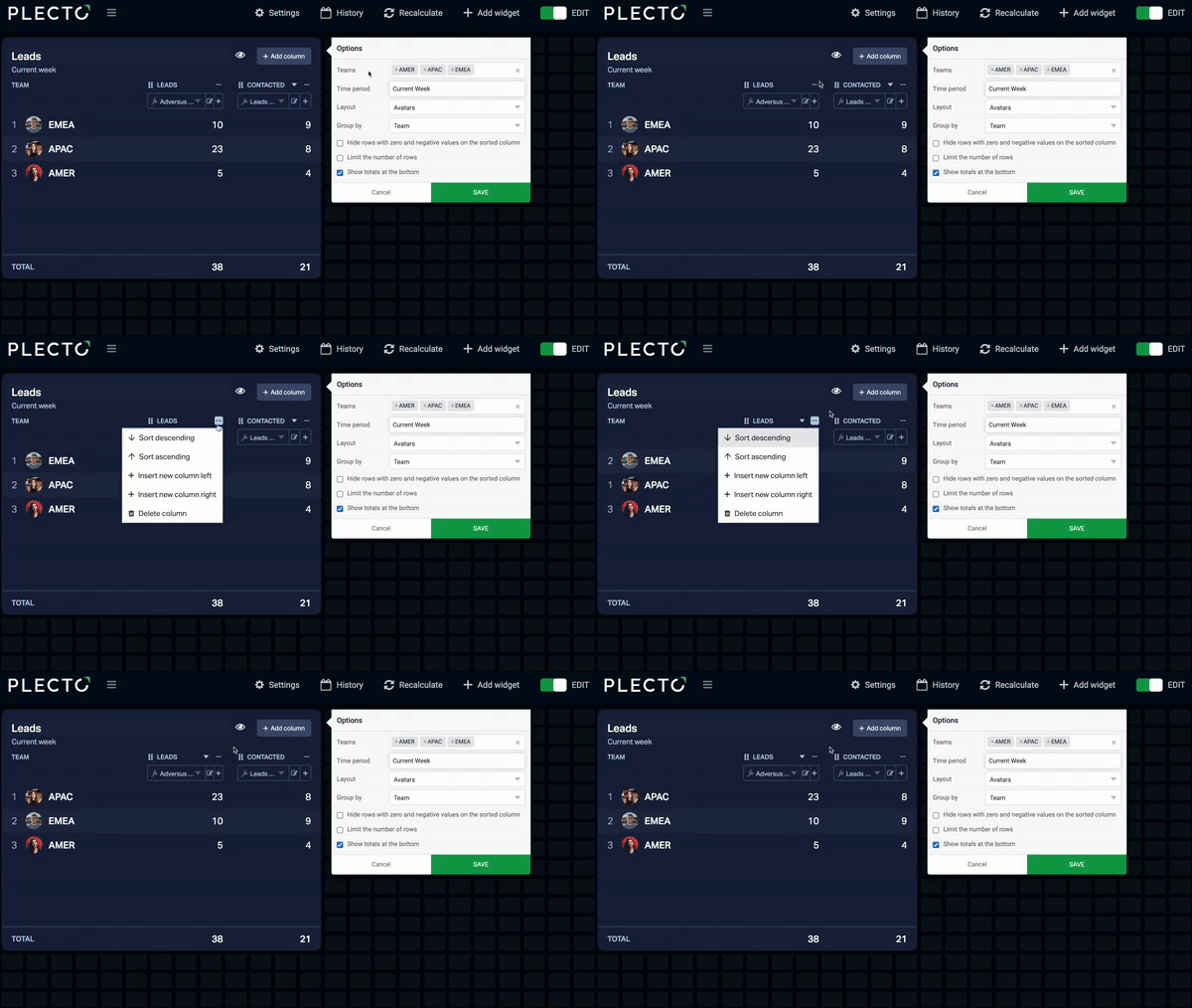
Table widget settings
-
Group by: Group your data in the left column by employees, teams, time, or custom fields from a data source.
- Custom field: Grouping data by a custom field from a data source only works when using formulas based on that same data source. If you add a formula that combines data from multiple data sources and group it by a field from one data source, you might not get any results.
-
Filter by team(s): If applied, this filter will show data for employees from the selected teams. If no teams are selected, the widget will use data for all teams in your organization.
-
First column: Customize the look of your widget by displaying avatars, names, or just your data.
-
Show totals/average at the bottom: See the total value of your formula result. To get the totals, Plecto looks at the selected time period and calculates totals of all your data, regardless of how many rows are visible on the widget.
-
Hide rows with zero and negative values: If selected, Plecto will look at the sorted column and hide all rows with negative values, including 0. It means that it might exclude values from other columns on the same row, even if they show positive values.
-
Limit the number of rows: Choose how many rows are visible on the table widget. Limiting rows doesn't affect the table totals.
-
Abbreviate large numbers: Instead of $24 325 show $24,3k.
-
Time period: Choose how much data you want to display on your widget by selecting a time period.
-
Employee status and substatus: These options apply for streaming data types. For more info on streaming metrics, go to the Streaming Metrics guide.
Funnel widget
Overview
Track conversion and drop-off rates across your pipeline stages. Just add a formula for each stage, or a single data source with multiple stages and the widget automatically calculates the conversion rates for you.
Setting up stages
-
Add stages: Enter one formula per stage, or use the stages that are in the data source.
-
Arrange: Drag and drop stages to reorder them. They will display from top-to-bottom (or left-to-right in the horizontal layout).
-
Remove: Delete any stages you no longer need.
How conversion rates are calculated
-
Step conversions: Each stage displays its value as a percentage of the very first (top) stage.
-
Step-to-step change: The ↑ or ↓ arrows show the change from the immediate previous stage, helping you pinpoint where you're losing the most deals.
-
Total conversion: Look at the top-right corner to see your total conversion rate (calculated as: last stage ÷ first stage).
Accumulate stages: Enable this to show a rolling total. Each stage will include its own value plus the totals of all subsequent stages, giving you a high-level view of your pipeline volume.
Note: Because a record only needs to exist in one stage to be counted, this represents total volume rather than exact/current stage-by-stage counts.
Funnel chart options
-
Group by: Break down each stage by employee or team.
-
Filter by team(s): Narrow down the data to specific teams. Leave this blank to include everyone.
-
Display numbers as: Choose whether to show raw values, percentages, or both on each stage.
-
Abbreviate large numbers: Shorten big numbers for cleaner viewing (e.g., $24.3k instead of $24,325).
-
Display stages: Toggle between a horizontal or vertical layout.
-
Hide groups with zero values: When grouping by employee or team, this hides groups with no data entirely. (Groups that equal exactly 0 will still display).
-
Conditional colors: Apply color thresholds based on the percentage of the first stage, rather than raw numbers.