Sign in
Widget Options – Group by
General grouping options
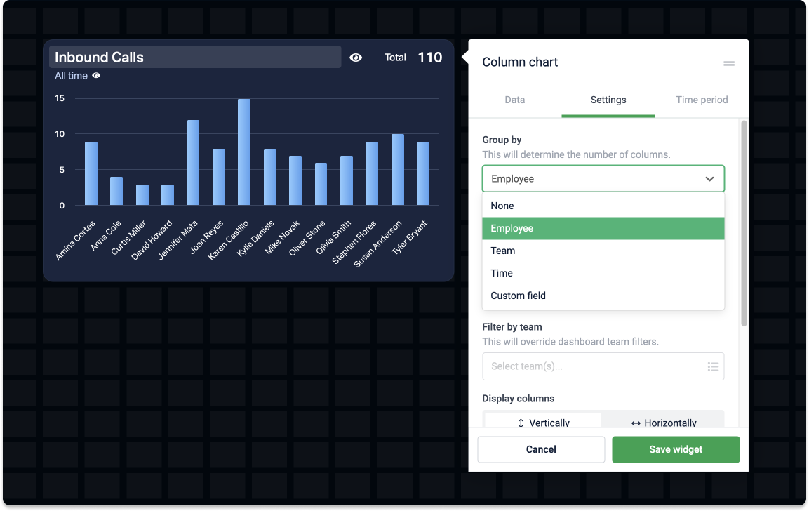
You can group data by employees, teams, and sometimes time and custom fields. Say you have a formula that counts the Number of Opportunities in your data source. Here are some examples of how you could group the data:
-
Group by employee on a table widget and see how many opportunities each created.
-
Group by custom field on a donut chart – choose a field from your data source, such as Stage, and see how many opportunities you have in each stage.
-
Group by team on a leaderboard – the widget will show, in descending order, how many opportunities got created by each team.
Here's an overview of widgets and their grouping options:
| One group | Employee | Team | Time | Custom field | |
|---|---|---|---|---|---|
| Table widget | 🚫 | ✅ | ✅ | ✅ | ✅ |
| Line chart | ✅ | ✅ | ✅ | 🚫 | ✅ |
| Area chart | ✅ | ✅ | ✅ | 🚫 | ✅ |
| Column chart | ✅ | ✅ | ✅ | ✅ | ✅ |
| Donut chart | ✅ | ✅ | ✅ | ✅ | ✅ |
| Leaderboard | 🚫 | ✅ | ✅ | 🚫 | 🚫 |
| Timeline | no grouping |
Group by custom fields
Group your metrics by a specific field in your data source.
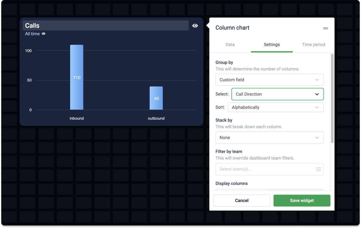
Say you have a formula that counts the number of calls. You could group this data by other fields from the data source the formula is based on, such as:
-
Call direction (incoming and outgoing)
-
Status (done, answered, initial)
-
Number country (US, FR, DK), and more.
Widgets that support grouping by custom fields are table, line chart, area chart, column chart, and donut chart widgets.
If your formula calculates data from multiple data sources and you choose to group by a custom field, Plecto will only show data relevant to that custom field.