 Sign in
Widgets in Reports
Plecto Reports offer 8 highly customizable widgets
Create your Plecto reports using 8 different widgets designed specifically for our reports. Each widget is highly customizable to allow you to extract all the necessary information relevant to your organization and display your KPIs in a clear way.
Column chart
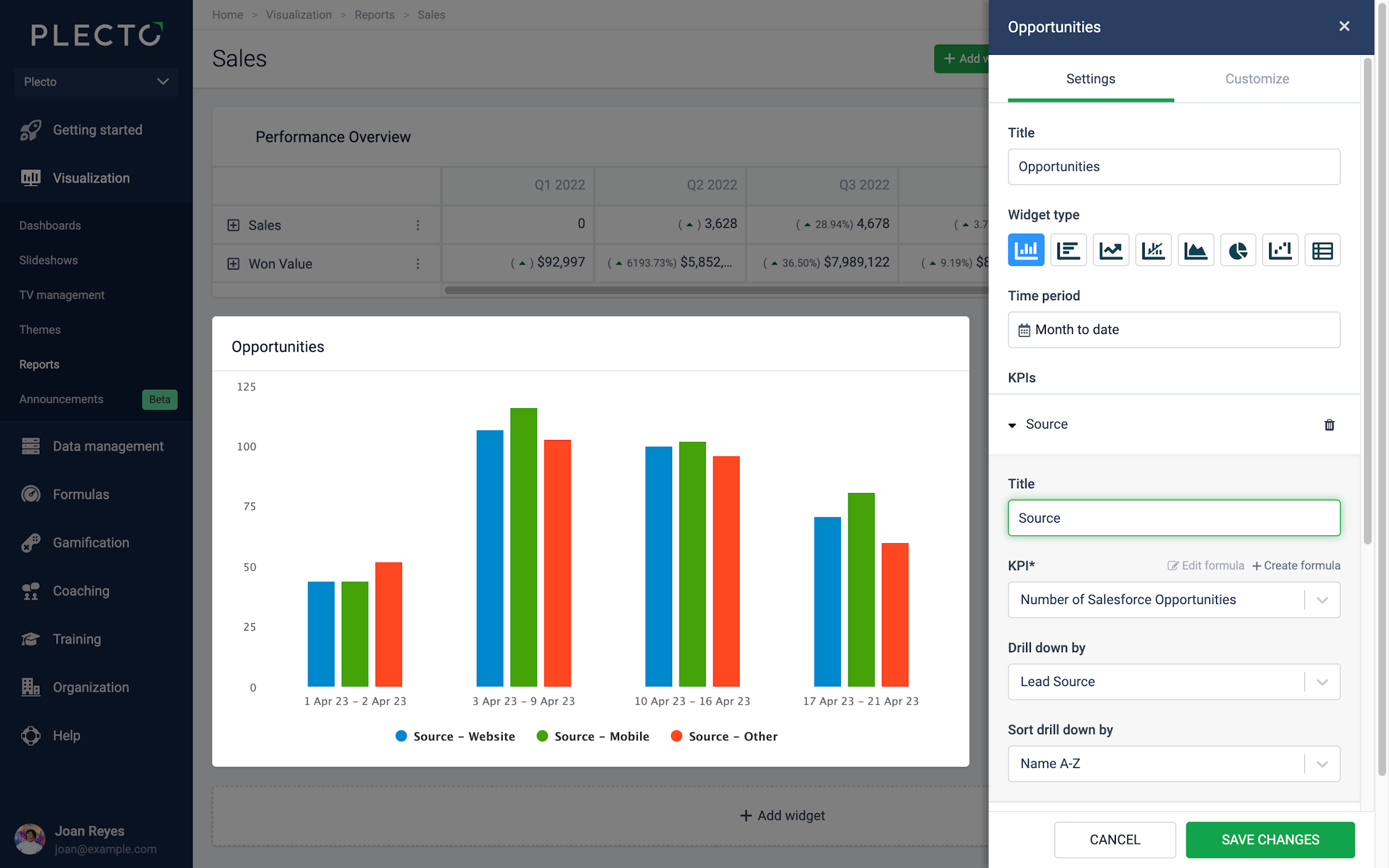
The column chart can hold up to 20 KPIs on a single widget. Add an existing formula, edit it, or create a new formula right from the settings menu.
You can drill down your metrics by specific parameters, based on the fields available in your data source that the formulas are built on.
For example, if you display the number of all sales deals, you can drill the data down by stage to see how many deals are open, lost, won, etc.
Tips!
-
Click on the legends on the widget to hide or show columns.
-
Click on the data points on the widget to see details from the displayed KPIs.
Group by Time or KPIs
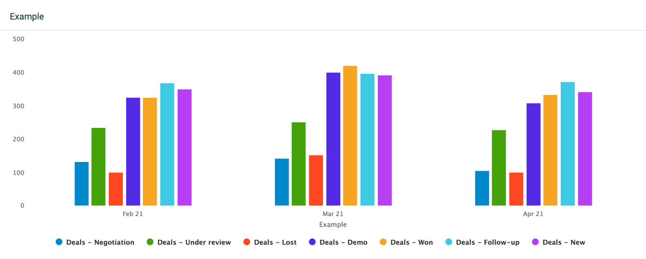
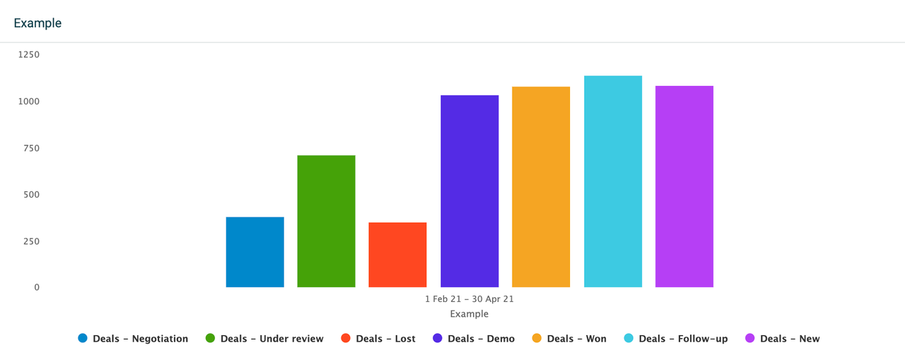
The column chart allows you to group data by Time or by KPIs.
-
Time: Display all selected KPIs on a timely basis, depending on the selected time period. For example, if you look at data from the previous 3 months, the widget will allow you to select between a daily, weekly, or monthly grouping. If you look at data from the current year, the widget will allow you to group data monthly, quarterly, or annually.
-
KPIs: Look at one column per KPI, or if you have selected any drilldowns - one column per drilldown. The widget will display as many columns as the number of KPIs or drilldowns you have added to it. Each column will then show accumulated data for the selected time period.
Compare to another time period
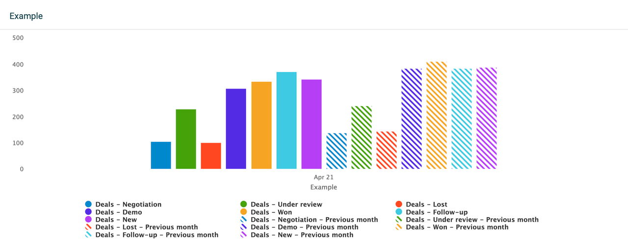
Compare your data to a different time period on a column chart. The comparing options depend on the selected time period and the selected grouping (group by) method.
For example, if you set the time period to the current month and group by monthly data, you can then compare your data to the previous month or the same month last year.
Alternatively, if you set the time period to the current month and group by weekly data, you can compare the data to the previous week or the same week last month. This structure applies to all the available time period options.
Filter data by
These filtering options are common for all widgets:
-
If you want to see all data, select Filter data by > All.
-
If you want to see data from specific teams or employees, select either the Teams or Employees option and add the teams or employees from the list.
Customize X and Y axes
You can customize the horizontal and vertical axes as well as the chart style. When editing, go to the Customize section in the upper-right corner. From there, you can add titles to your axes, change the position of the vertical axis, stack the columns, and more.
To remove an axis title, simply delete the text from the title field.
Bar chart
The bar chart is very similar to the column chart. It can hold up to 20 KPIs on a single widget. Add an existing formula, edit it, or create a new formula right from the settings menu.
You can also choose to drill down your metrics by specific parameters, based on the fields available in your data source that the formulas are built on. For example, if you display the number of all sales deals, you can drill the data down by stage to see how many deals are open, lost, won, etc.
Tips!
-
Click on the legends on the widget to hide or show bars.
-
Click on the data points on the widget to see details from the displayed KPIs.
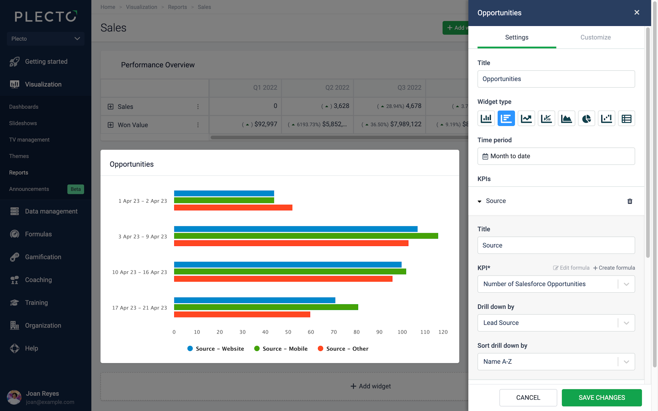
Group by Time or KPIs
The bar chart allows you to group data by Time or by KPIs:
-
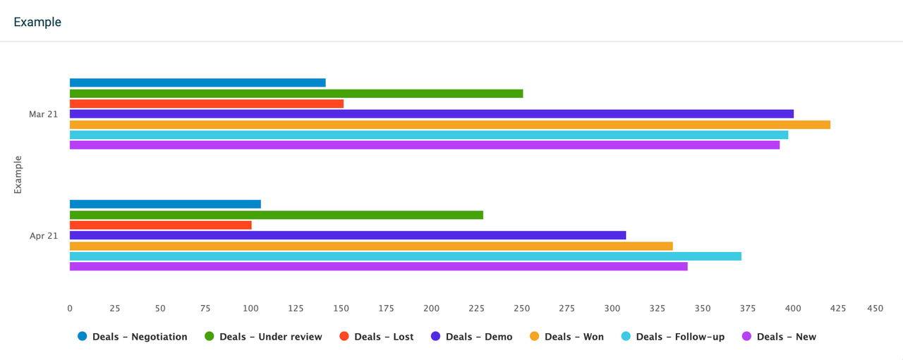
Time: Display all selected KPIs on a timely basis, depending on the selected time period. For example, if you look at data from the previous 2 months, the widget will allow you to select between a daily, weekly, or monthly grouping. If you look at data from the current year, the widget will allow you to group data monthly, quarterly, or annually.
-
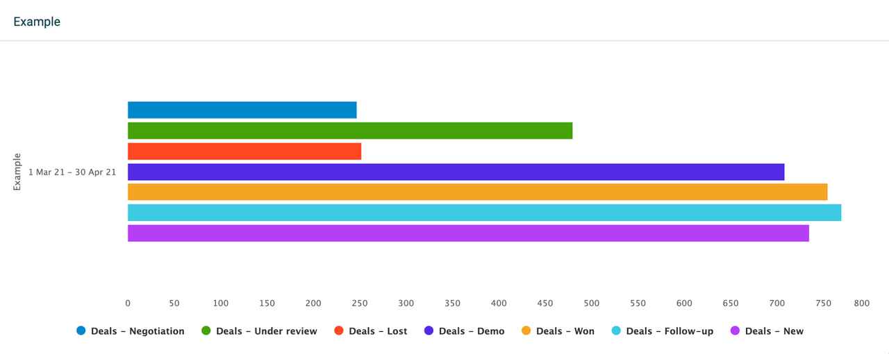
KPIs: Look at one bar per KPI, or one bar per drilldown if you have selected any drilldowns. The widget will display as many bars as the number of KPIs or drilldowns you have added to it. Each bar will then show accumulated data for the selected time period.
Compare to another time period
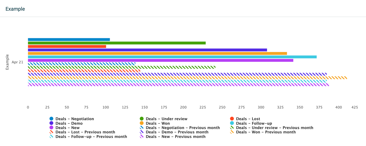
You can compare your data to a different time period on a bar chart. The comparing options depend on the selected time period and the selected grouping (group by) method.
For example, if you set the time period to the current month and group by monthly data, you can then compare your data to the previous month or the same month last year.
Alternatively, if you set the time period to the current month and group by weekly data, you can compare the data to the previous week or the same week last month. This structure applies to all the available time period options.
Filter data by
These filtering options are common for all widgets:
-
If you want to see all data, select Filter data by > All.
-
If you want to see data from specific teams or employees, select either the Teams or Employees option and add the teams or employees from the list.
Customize X and Y axes
You can customize the horizontal and vertical axes as well as the chart style. When editing, go to the Customize section in the upper-right corner. From there, you can add titles to your axes, change the position of the vertical axis, stack the columns, and more.
To remove an axis title, simply delete the text from the title field.
Line chart
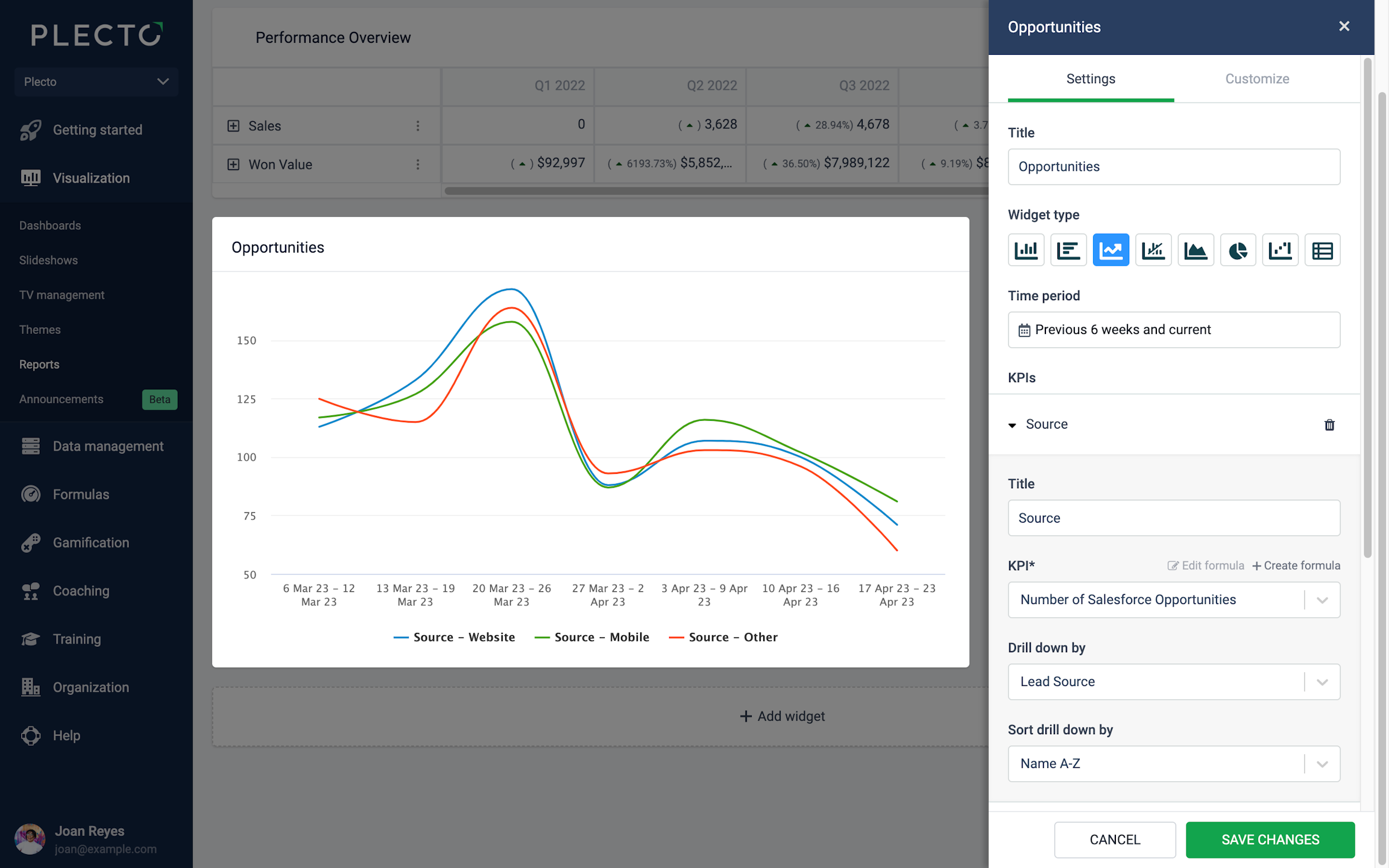
Line charts are a great way to display your KPIs over a period of time. Combine several KPIs in one chart, compare data to different time periods, or use other custom settings.
The line chart allows adding up to 20 KPIs. Add an existing formula, edit it, or create a new formula right from the widget settings menu. You can also choose to drill down your metrics by specific parameters, based on the fields available in your data source that the formulas are built on.
For example, if you display the number of all leads, you can drill the data down by employee to see how many leads each employee has acquired over the selected time period.
Tips!
-
Click on the legends on the widget to hide or show lines.
-
Click on the data points on the widget to see details from the displayed KPIs.
Group by Time
The line chart allows you to group data by time. Grouping by time will display all selected KPIs on a timely basis, depending on the selected time period.
For example, if you look at data from the previous 3 months, the widget will allow you to select between a daily, weekly, or monthly grouping. If you look at data from the current year, the widget will allow you to group data monthly, quarterly, or annually.
Compare to another time period
You can compare your data to a different time period on a line chart. The comparing options depend on the selected time period and the selected grouping (group by) method.
For example, if you set the time period to the current month and group by daily data, you can then compare your data to the previous day or the same day last week, month, or year.
Alternatively, if you set the time period to the current year and group by monthly data, you can compare the data to the previous month or the same month last year. This structure applies to all the available time period options.
Filter data by
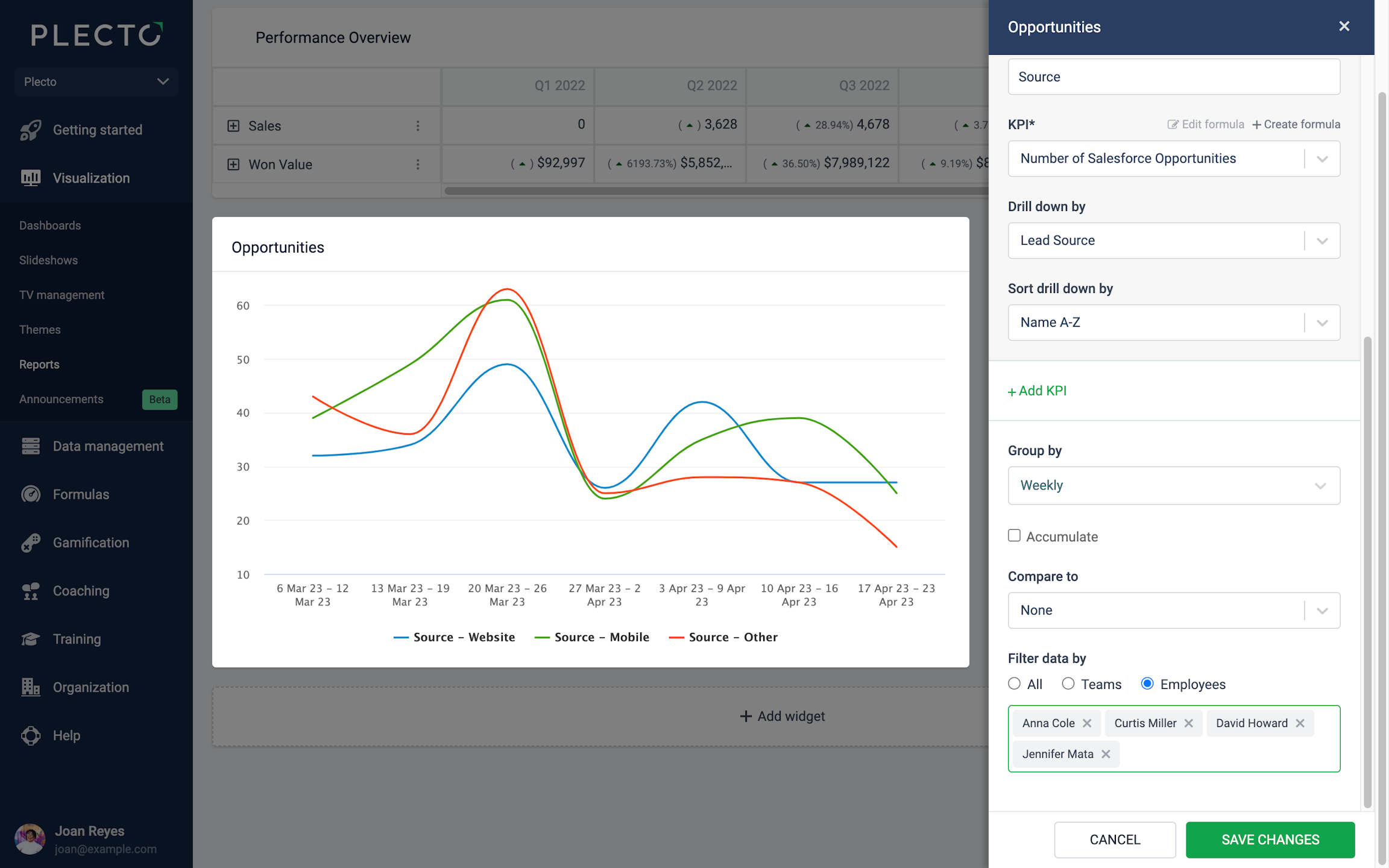
If you add or drill down several KPIs on a line chart, it can become difficult to read the data. To improve the overview of your line chart, you can select to filter the data.
-
If you want to see all data, select Filter data by > All.
-
If you want to see data from specific teams or employees, select either the Teams or Employees option and add the teams or employees from the list.
Customize X and Y axes
You can customize the horizontal and vertical axes as well as the chart style. When editing, go to the Customize section in the upper-right corner. From there, you can add titles to your axes, change the position of the vertical axis, stack the columns, and more.
To remove an axis title, simply delete the text from the title field.
Combo chart
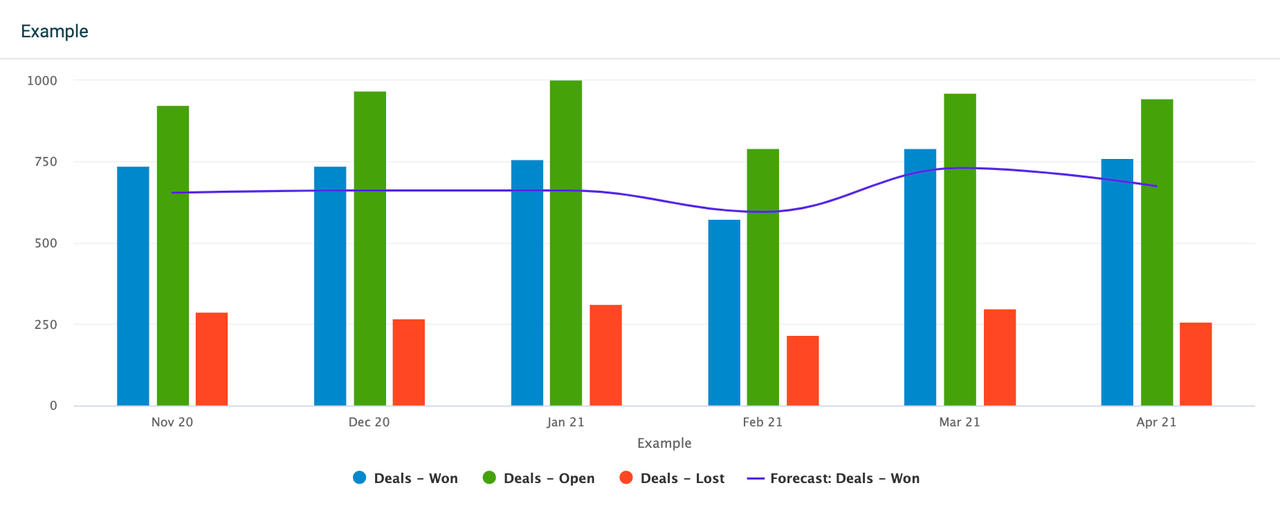
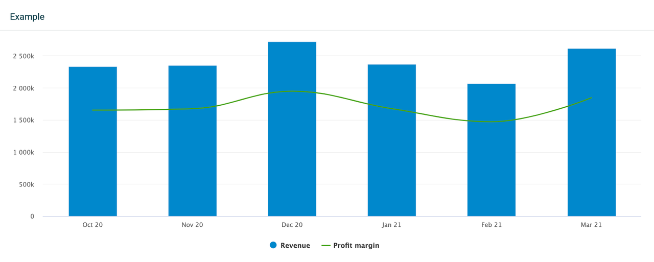
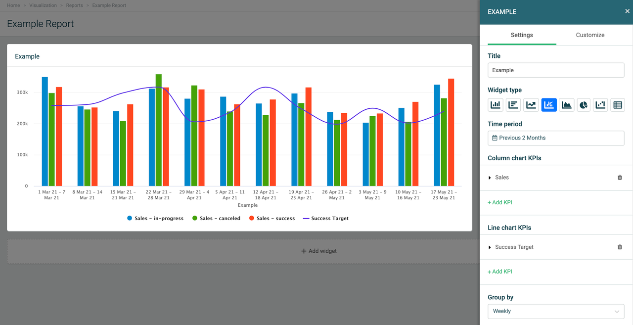
The combo chart is a combination of column and line charts. It allows you to display different types of data in one widget. The combo chart can be useful when you want to see, for example, the actual values of your data in comparison to a target value, revenue in comparison to the profit margin, or others.
Data and KPIs
The combo chart settings have two defined KPI fields - one for the column chart and one for the line chart. Add your KPIs (formulas) under either field, depending on how you want your data to be displayed.
The combo chart can hold up to 20 KPIs on a single widget. Add an existing formula, edit it, or create a new formula right from the settings menu.
You can drill down your metrics by specific parameters, based on the fields available in your data source that the formulas are built on. For example, if you display the number of all sales deals, you can drill the data down by stage to see how many deals are open, lost, won, etc.
The combo chart currently can't show both the decimal and percentage values on the same widget. If you're looking to display, for example, a profit margin on a line chart, we suggest using a formula that outputs decimal values.
Group by Time
The combo chart allows you to group data by time. Grouping by time will display all selected KPIs on a timely basis, depending on the selected time period.
For example, if you look at data from the previous 2 months, the widget will allow you to select between a daily, weekly, or monthly grouping. If you look at data from the current year, the widget will allow you to group data monthly, quarterly, or annually.
Compare to another time period
You can compare your data to a different time period on a combo chart. The comparing options depend on the selected time period and the selected grouping (group by) method.
For example, if you set the time period to the current month and group by monthly data, you can then compare your data to the previous month or the same month last year.
Alternatively, if you set the time period to the current month and group by weekly data, you can compare the data to the previous week or the same week last month. This structure applies to all the available time period options.
Filter data by
These filtering options are common for all widgets:
-
If you want to see all data, select Filter data by > All.
-
If you want to see data from specific teams or employees, select either the Teams or Employees option and add the teams or employees from the list.
Customize your Combo chart
The combo chart offers plenty of customization options. When editing, go to the Customize section in the upper-right corner. From there you can adjust settings for the horizontal and vertical axes, legends, as well as individual settings for both the column and line charts.
Area chart
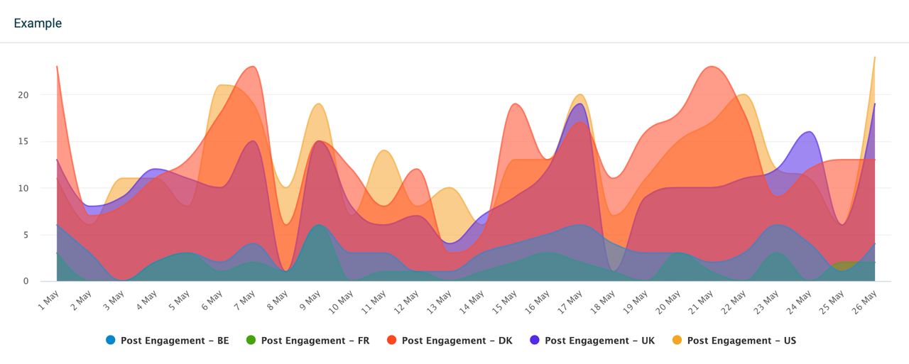
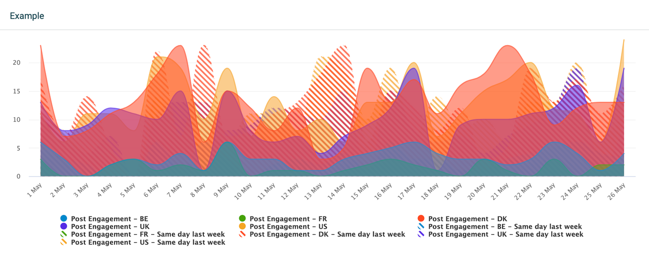
The area chart allows adding up to 20 KPIs. Add an existing formula, edit it, or create a new formula right from the widget settings menu. You can also choose to drill down your metrics by specific parameters, based on the fields available in your data source that the formulas are built on.
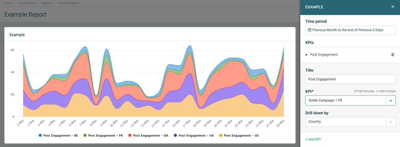
For example, if you organize a marketing campaign and want to display the number of all post engagements of your social media post, you can drill the data down by country to see how many have interacted with your content and from which country.
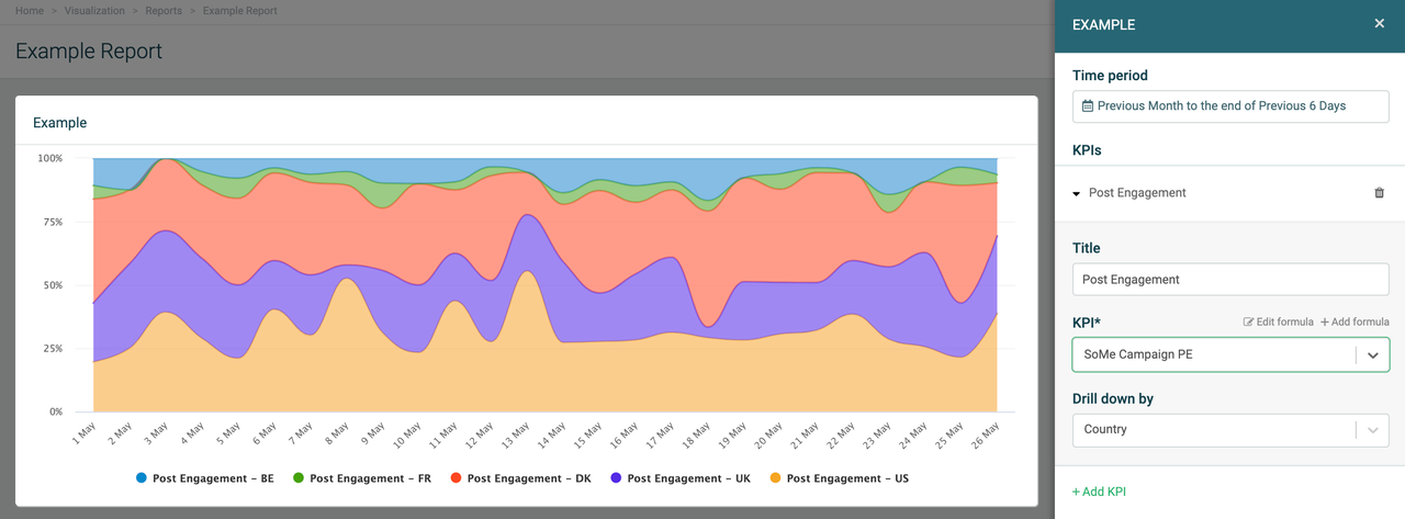
You can also stack the KPIs or drilldowns to see the cumulative, total number of interactions while seeing segments of each country's input or use a 100% stacked area chart.
Tips!
-
Click on the legends on the widget to hide or show areas.
-
Click on the data points on the widget to see details from the displayed KPIs.
Group by Time
The area chart allows you to group data by time. Grouping by time will display all selected KPIs on a timely basis, depending on the selected time period.
For example, if you look at data from the previous 3 months, the widget will allow you to select between a daily, weekly, or monthly grouping. If you look at data from the current year, the widget will allow you to group data monthly, quarterly, or annually.
Compare to another time period
For example, if you set the time period to the current month and group by daily data, you can then compare your data to the previous day or the same day last week, month, or year.
Alternatively, if you set the time period to the current year and group by monthly data, you can compare the data to the previous month or the same month last year. This structure applies to all the available time period options.
Filter data by
If you add or drill down several KPIs on an area chart, it can become difficult to read the data. To improve the overview of your area chart, you can select to filter the data.
-
If you want to see all data, select Filter data by > All.
-
If you want to see data from specific teams or employees, select either the Teams or Employees option and add the teams or employees from the list.
Customize
Customize your area chart. When editing, go to the “Customize” section in the upper-right corner.
From there, you can add titles to your area chart axes, change the position of the vertical axis, adjust the chart style including stacking, line style, weight, or legend position. Enable data labels or show a trendline to gain a precise overview of your KPIs.
Pie chart
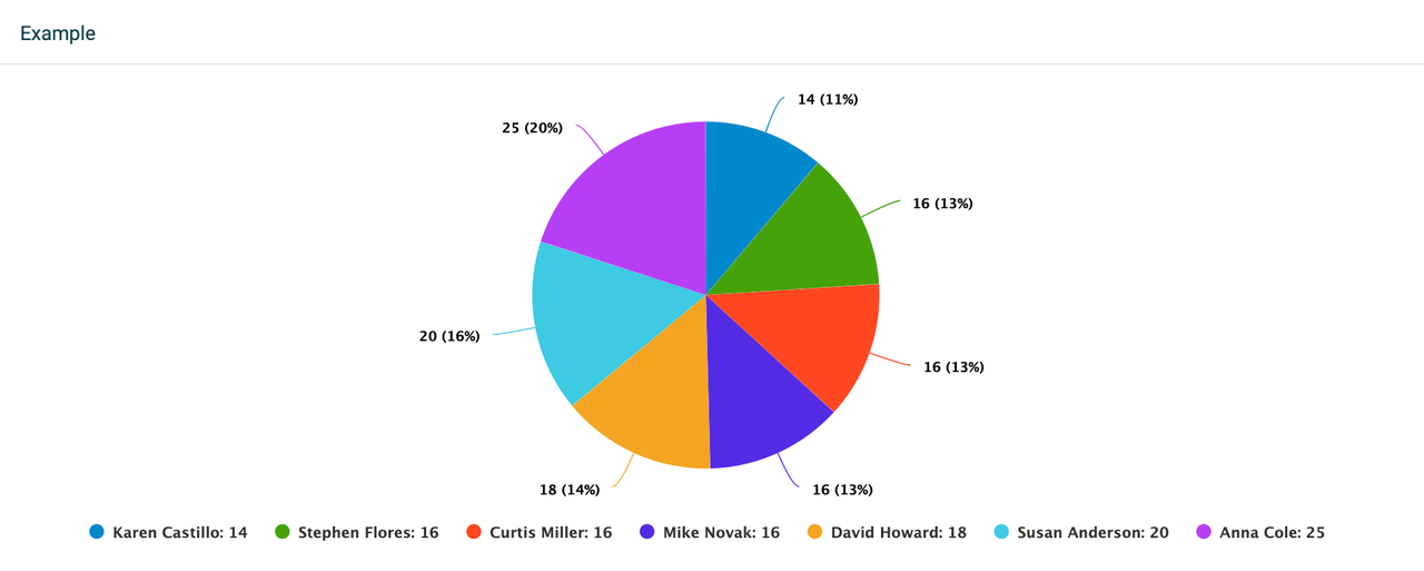
The pie chart allows adding up to 20 KPIs. Add an existing formula, edit it, or create a new formula right from the widget settings menu. You can also choose to drill down your metrics by specific parameters, based on the fields available in your data source that the formulas are built on.
For example, if you display the number of support cases for the current month, you can drill the data down by medium to see how many cases were treated over different communication channels, or by employee to see the number of cases completed by each support agent.
Tips!
-
Click on the legends on the widget to hide or show segments.
-
Click on the data points on the widget to see details from the displayed KPIs.
Group by Time or KPIs
The pie chart allows you to group data by Time or by KPIs:
-
Time: This grouping option is available when one KPI with no drilldowns is added to the chart. It will then enable different grouping periods, depending on the selected time period. For example, if you look at data from the previous month, the widget will allow you to select between a daily, weekly, or monthly grouping. If you look at data from the current year, the widget will allow you to group data monthly, quarterly, or annually.
Click Customize in the top-right corner to sort the legends in your pie chart.
-
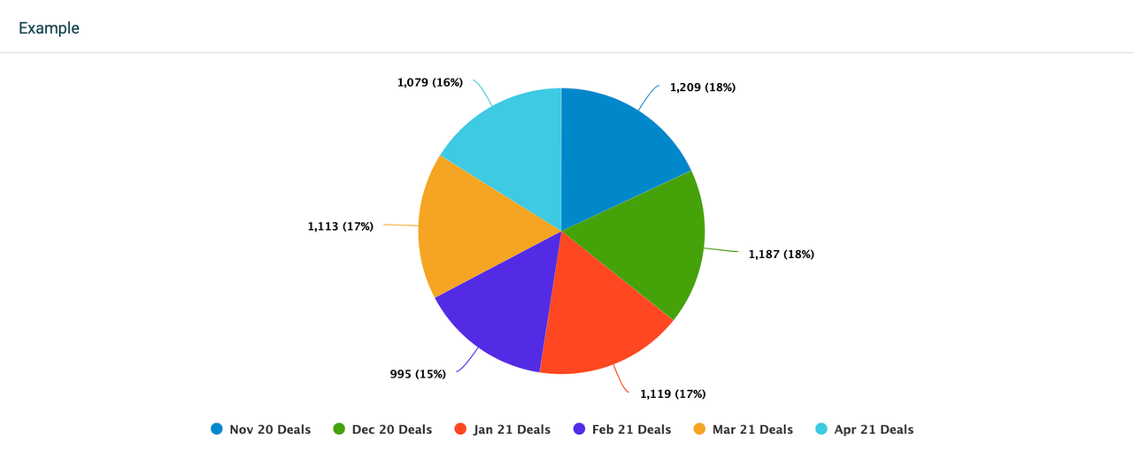
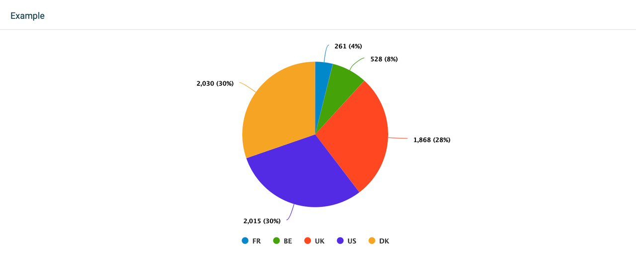
KPIs: Grouping by KPIs enables you to look at one segment per KPI, or if you have selected any drilldowns - one segment per drilldown. The widget will display as many segments as the number of KPIs or drilldowns you have added to it.
Filter data by
These filtering options are common for all widgets:
-
If you want to see all data, select Filter data by > All.
-
If you want to see data from specific teams or employees, select either the Teams or Employees option and add the teams or employees from the list.
Customize
Feel free to customize your chart. When editing, go to the Customize section in the upper-right corner. From there, you can add data labels, sort, adjust legend settings, or turn your pie into a donut! 🍩
Waterfall chart
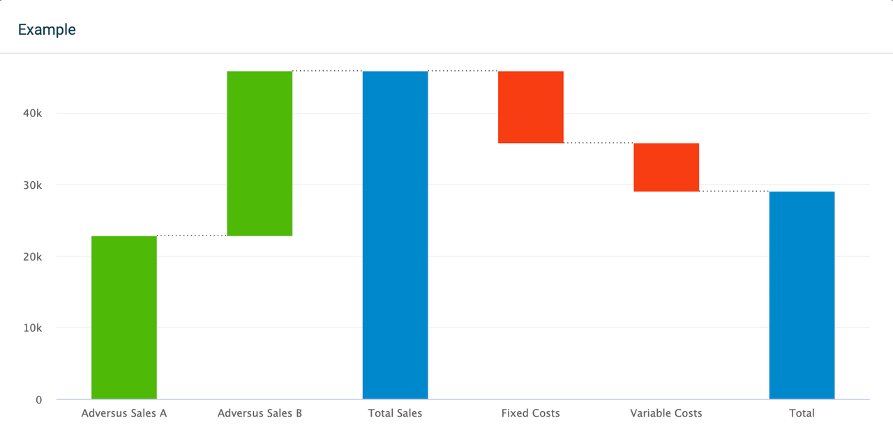
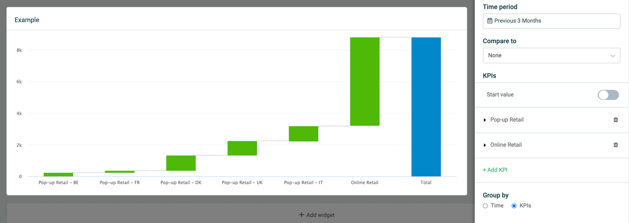
Track changes in your KPIs and look at your revenue, budget, net profit, or other data with a waterfall chart. The waterfall chart is useful for understanding how a starting value develops into an end value through a sequence of positive or negative changes. The waterfall chart in Plecto is highly customizable and offers many configuration options.
Data and KPIs
There are several ways you can visualize data on a waterfall chart. Add up to 20 KPIs, set a start value, add target formulas, intermediate sums, or drill down your metrics on each KPI by specific parameters. The parameters are based on the fields available in your data source that the formulas are built on.
You can add, edit and create new formulas right from the widget settings.
The waterfall chart will show a running total as positive or negative values are added to your data.
-
To observe deviations in your data with positive or negative values, you need to compare your KPIs to either another time period or a target KPI. This will allow you to see direct comparisons between the current data and your targets/past data.
-
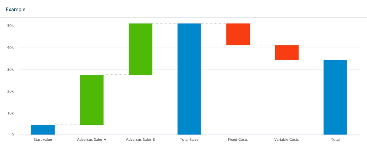
You can also enable a start value in the form of a KPI that the other KPIs will be measured up against.
Read more about the start value and comparing options in the sections below.
**
Tip!
**
If you want a KPI to output a negative value, for example, -500, you can multiply the formula by -1 in the formula editor. This can be useful if you want to subtract KPI values in your waterfall chart without having to add a start value or compare the KPI to another time period or a target KPI.
Start value
Add a start value to your waterfall chart which will create a new Start value column on the left side of the chart. The start value represents one formula that the other KPIs are measured up against.
Decide if you want to display the start value from the same time period or a previous period:
-
Selecting the same time period allows you to look at current values. For example, Yearly Budget compared to Actual Revenue.
-
Selecting a previous period allows you to look at the same values for both the current and past periods. For example, Revenue This Year compared to Last Year.
Intermediate sum
See subtotals and get a good overview of your data with intermediate sums.
-
Click Edit in widget's top-right corner.
-
Scroll down to the section Intermediate sum.
-
Click Add intermediate sum, then select Position after > [KPI of your choice].
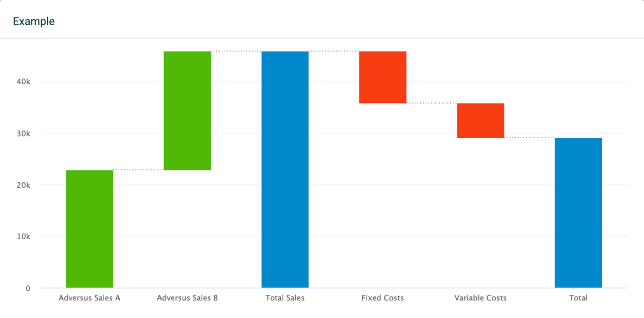
It will insert an intermediate sum column in the chart and display the sum of the KPIs to its left. This can be very useful when displaying gross vs. net values, EBITDA, quarterly overviews, etc.
You can add several intermediate sums to the chart. Each intermediate sum will display data from the KPIs standing on their left side, and they will take into consideration only the KPIs that are standing between the intermediate sums.
Compare to another time period
Compare to none
This option allows you to drill down your metrics for each added KPI, but you will not be able to add a target KPI.
Compare to another time period
The comparing options will depend on your selected time period. For example, if you display data for the current month, you'll be able to compare data to the same month last year. If you display data for the current week, the widget will allow you to compare data to the same week last month, etc.
Compare to a target KPI
If selected, it will add a column called Start value on the left side of the chart and require selecting a target formula for every single KPI that has been added to the waterfall chart. The column will then display a sum of all the selected targets.
You can also rename the start value column to match your needs. Expand the Start value field and enter a new title.
Group by Time or KPIs
The waterfall chart allows you to group data by Time or KPIs.
-
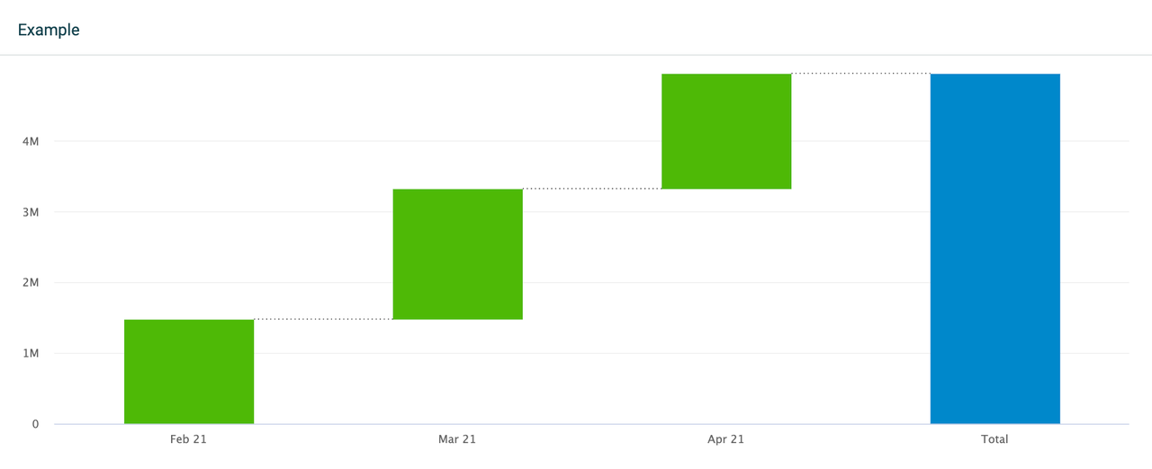
Time: Display your selected KPIs on a timely basis, depending on the selected time period. For example, if you look at data from the previous 3 months, the widget will allow you to select between a daily, weekly, or monthly grouping. If you look at data from the current year, the widget will allow you to group data monthly, quarterly, or annually. If your chart contains multiple KPIs, they will be stacked.
If you add more than one KPI to the widget and group your data by time, the drilldown option will be disabled for all added KPIs. Alternatively, if you only have one KPI on the widget that is grouped by time, you can still drill down the data.
-
KPIs: Look at one column per KPI, or if you have selected any drilldowns - one column per drilldown. The widget will display as many columns as the number of KPIs or drilldowns you have added to it. Grouping data by KPIs allows you to select drilldowns for each of the added KPIs.
If you're comparing data to a Target KPI, then grouping is disabled. The widget will automatically display your data grouped by KPIs.
Filter data by
These filtering options are common for all widgets:
-
If you want to see all data, select Filter data by > All.
-
If you want to see data from specific teams or employees, select either the Teams or Employees option and add the teams or employees from the list.
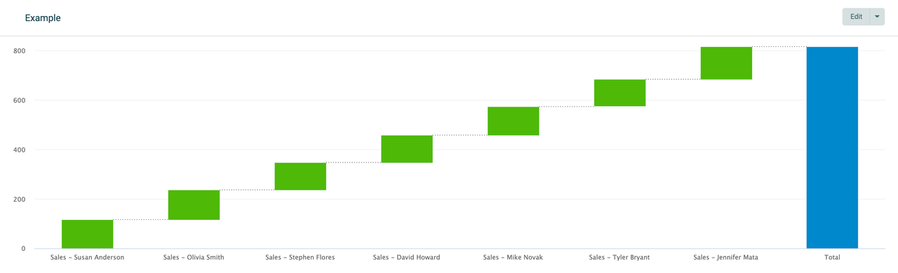
Table widget in Reports
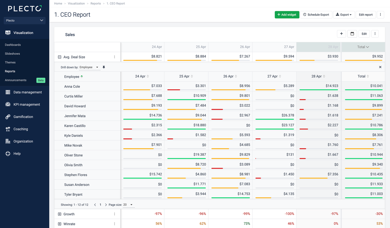
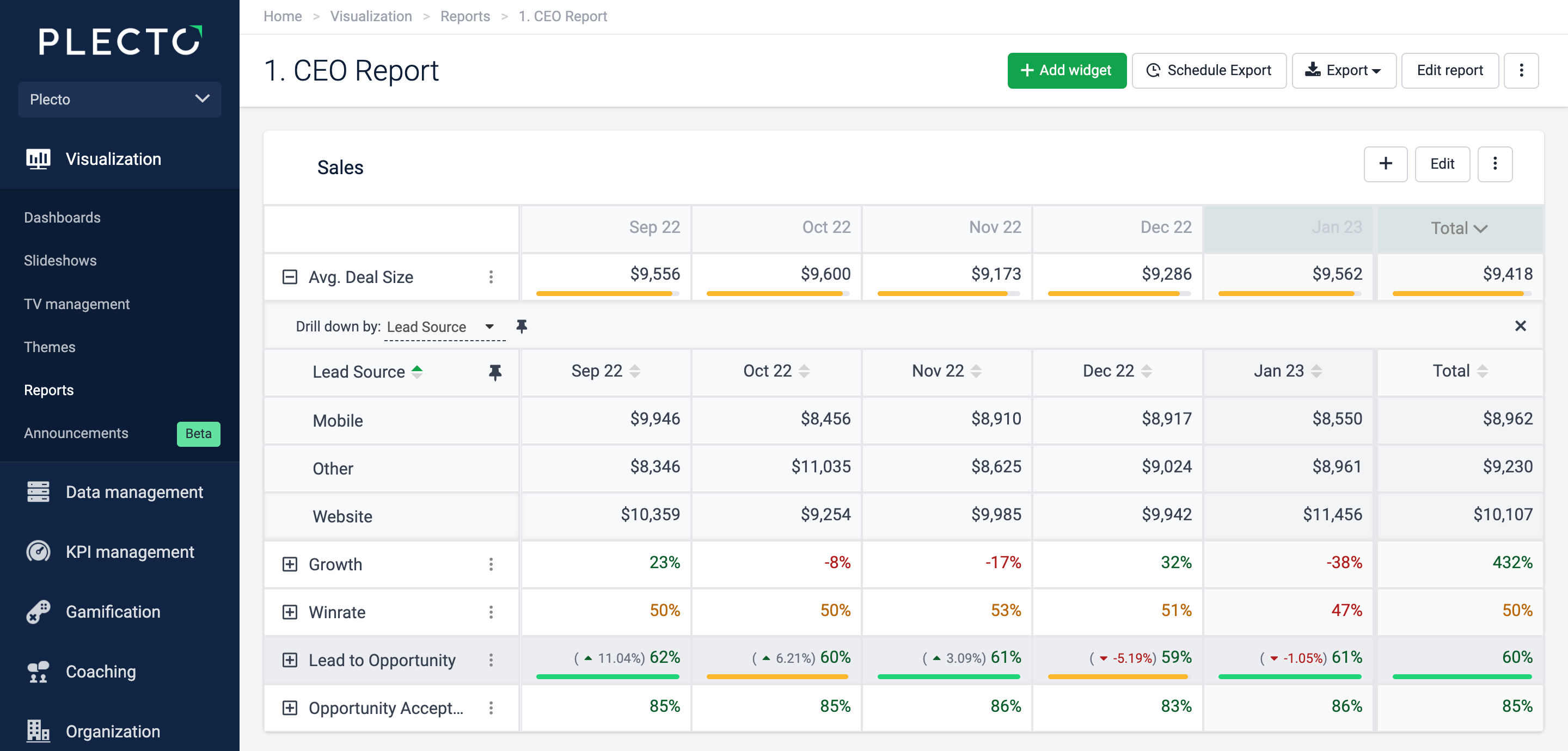
The table widget is the most commonly-known reporting tool in Plecto. It can hold up to 20 KPIs on a single widget. When you add a table widget, you can add and edit an existing formula or create a new formula right in the widget settings.
Each KPI you add to the widget is displayed in a separate row on your table. You can add up to 20 KPIs to the same table. You can also add target formulas and compare your data to a different time period.
-
Target: If you add a target formula, you will see the progress directly in the report.
-
Compare to: Compare your KPI to a different time period.
-
Drill down by: Expand your KPI and see the data by employees or other fields from the data source your KPI is based on. For example, if you display the number of all sales deals, you can drill the data down by stage to see how many deals are open, lost, won, etc.
-
Highlight this row: Make the row stand out by highlighting it in light gray color.
-
Include as a unique slide in exports: When exporting to PowerPoint (.pptx), the KPIs with this option enabled will be shown as individual column charts on separate slides.
Group by Time
The table widget allows grouping data by time. Grouping by time will display all selected KPIs on a timely basis, depending on the selected time period.
For example, if you look at data from the previous 3 months, the widget will allow you to select between a daily, weekly, or monthly grouping. If you look at data from the current year, the widget will allow you to group data monthly, quarterly, or annually.
Filter data by
These filtering options are common for all widgets:
-
If you want to see all data, select Filter data by > All.
-
If you want to see data from specific teams or employees, select either the Teams or Employees option and add the teams or employees from the list.
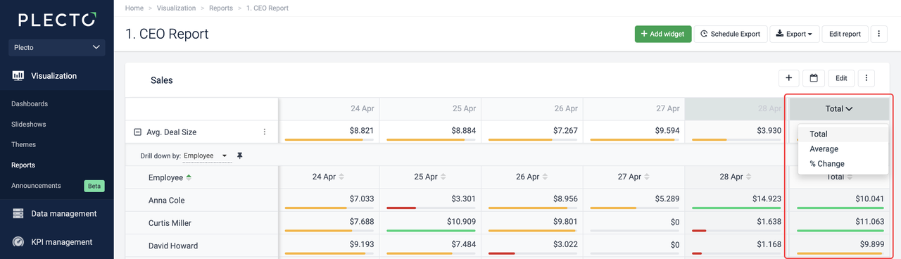
Summary column
-
Total shows the total value of the formula for the entire period. Here, Plecto uses the total value of the formula, not the accumulated sum of the columns.
-
Average shows the total value of the entire period divided by the number of columns in the report. This will use the total value for the formula and not the accumulated sum of the columns.
-
Change shows the percentage change from the first column of the selected time period to the last.
Enable Freeze summary column to keep the column in a fixed position on the table widget.
General widget settings in Reports
Create your Plecto reports using 8 different widgets designed specifically for our reports. Each widget is highly customizable to allow you to extract all the necessary information relevant to your organization and display your KPIs in a clear way.
Widgets use the same formulas and data as elsewhere in Plecto, which makes them easy to set up, and they will be automatically updated whenever your data changes.
Widget type
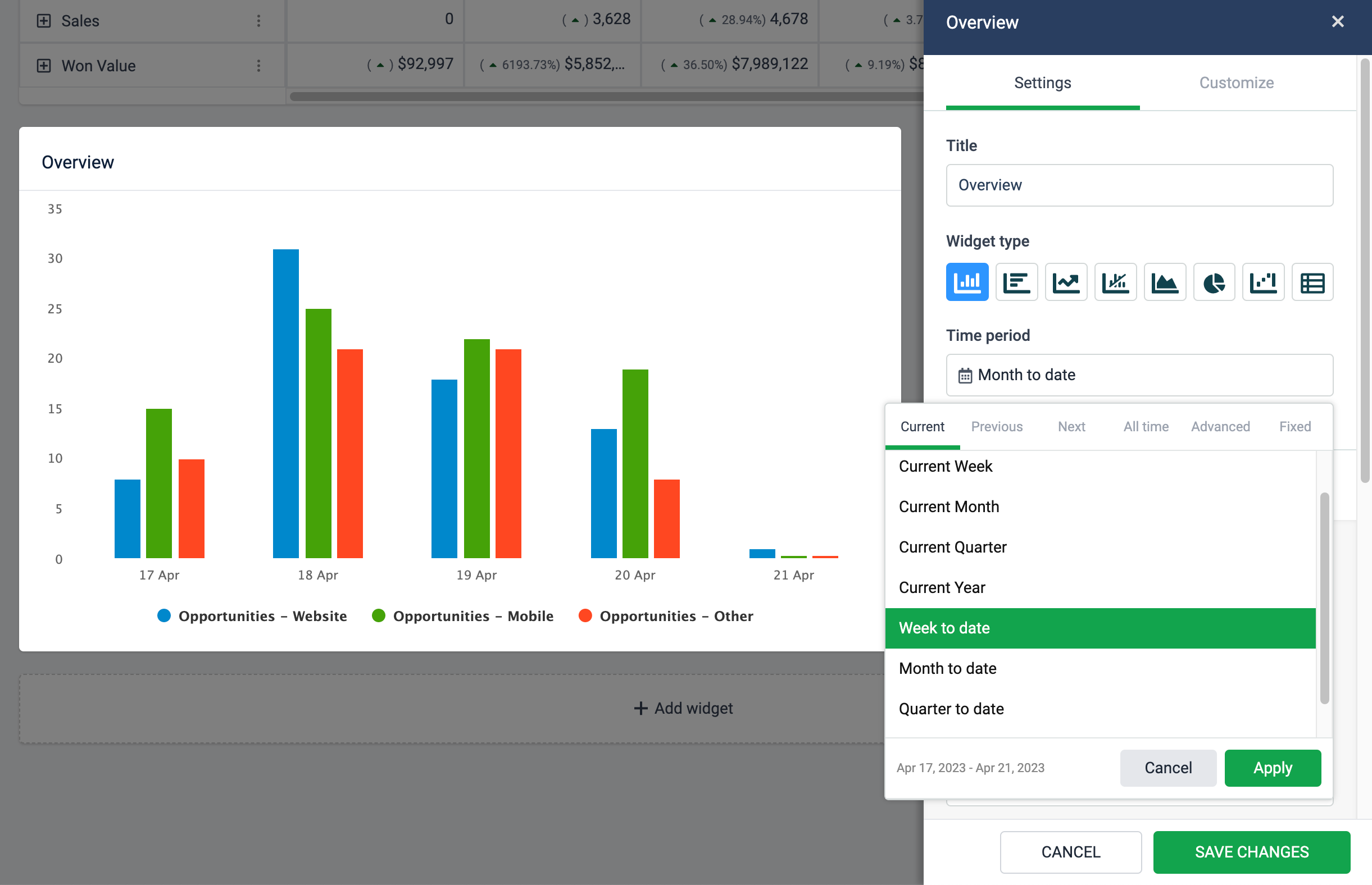
There are eight different widgets in reports. Plecto allows you to switch between and change the widget type even after you have added it to the report.
This allows you to adjust the visual representation of your KPIs without having to create new widgets and select all the settings again.

Time period
Choose to look at data from the current month, previous 3 years, all-time, between two custom dates, or other. You can select a different time period for each widget on the report.
The time period picker also displays a date preview so that you always get a clear overview of what time period is shown on the widget.
KPIs and Data
Add KPIs (formulas) to your widgets under the setting section called “KPIs.” Each widget allows you to add up to 20 KPIs.
You can also choose to drill down your metrics by specific parameters, based on the fields available in your data source that the formulas are built on.
For example, if you display the number of all sales deals on a pie chart, you can drill the data down by status to see how many deals are lost or won.
Group by
All widgets support grouping data by time. Some widgets allow you to choose between grouping by Time or KPIs, namely, Column, Bar, Area, Pie, and Waterfall widgets.
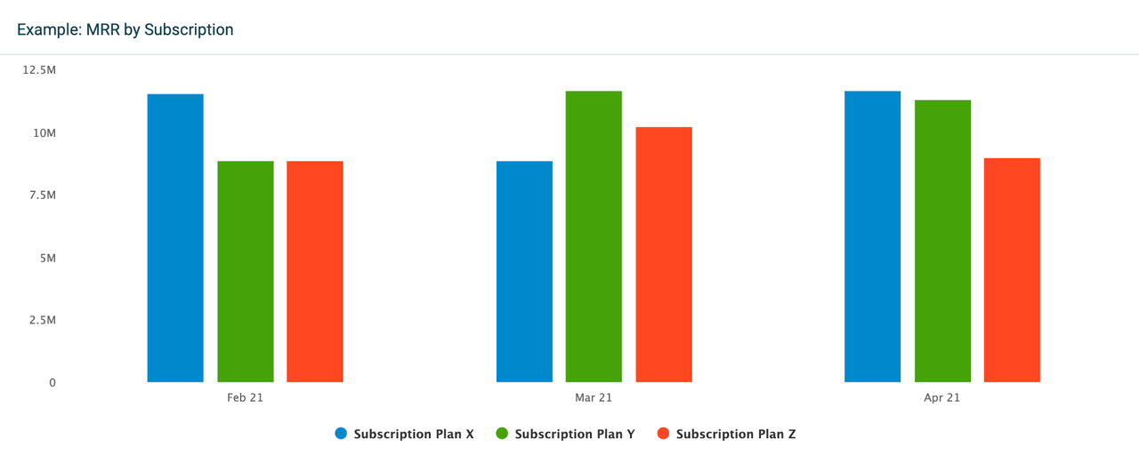
The difference is that grouping data by time will display all selected KPIs on a timely basis. For example, if you have selected a time period that displays data from the previous 3 months, the widget will show separate KPI columns for each month. This grouping option gives an overview of your KPIs over time.
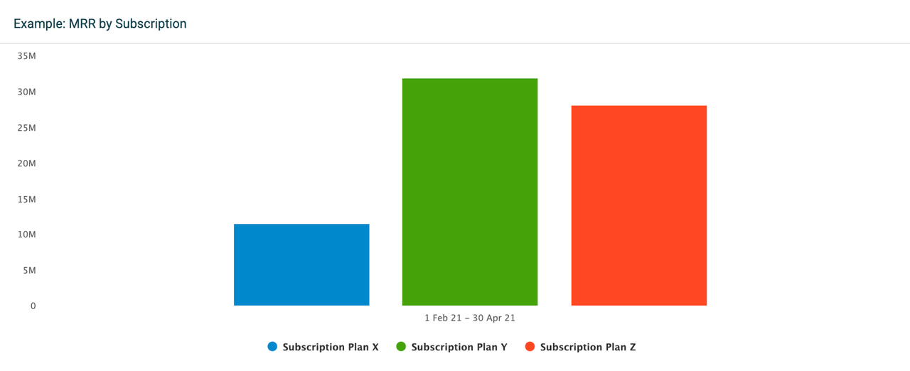
If you select to group data by KPIs, the widget will display only one column per KPI. The column will then show accumulated data for the selected time period, in this case for the previous 3 months.
Compare to
Compare your KPIs to other time periods or, in some cases, a target KPI. All widgets support comparing data to another time period.
Waterfall chart and Table widget allow comparing data to a target KPI. Select Compare to > Target KPI for the waterfall chart or add targets to individual KPIs on the table widget.
Filter data by
These filtering options are common for all widgets:
-
If you want to see all data, select Filter data by > All.
-
If you want to see data from specific teams or employees, select either the Teams or Employees option and add the teams or employees from the list.