 Sign in

SaaS KPI dashboard software
The best SaaS KPI dashboard software: 9 tools compared for MRR and leadership reporting
Nine ways to put MRR, churn and pipeline on a live dashboard: subscription-analytics tools such as ChartMogul, Baremetrics and Paddle, Stripe's own reporting, and KPI dashboard tools such as Plecto, Geckoboard, Databox, Klipfolio and Power BI, compared on MRR maths, data sources, TV screens and leadership reports.
What is the best SaaS KPI dashboard software?
Written by Plecto. Competitor details reflect each vendor's public documentation in November 2026; check their sites for current plans and prices.
The best SaaS KPI dashboard software depends on the job. Subscription-analytics tools (ChartMogul, Baremetrics, Paddle) go deepest on MRR movements, cohorts and churn. KPI dashboard tools (Plecto, Geckoboard, Databox) put billing, CRM and support numbers on live screens and in leadership reports.
This guide compares SaaS KPI dashboard software for finance, RevOps and leadership teams. It is not a list of SaaS metric formulas: for those, read the 10 SaaS KPIs worth tracking, and for layouts see our SaaS dashboard examples. The quick verdict:
- ChartMogul, Baremetrics or Paddle (ProfitWell Metrics) if finance or RevOps needs real subscription maths: MRR movements, cohorts, churn analysis and, in some of them, benchmarks.
- Stripe Billing analytics if all your revenue runs through Stripe and you want MRR, churn and retention inside the Dashboard you already use.
- Plecto if you want live KPI screens that combine billing data with CRM and support data, with targets, TV slideshows, scheduled leadership reports and gamification that moves the team behind the numbers. It connects to 150+ systems.
- Geckoboard or Databox if you want a simpler KPI screen or a flexible metrics view across sources.
- Power BI or Klipfolio if an analyst will model the data and build the reports.
Plecto is a performance management platform, not a subscription-analytics engine. It does not compute MRR movements from Stripe subscriptions and it does not publish SaaS benchmarks. Many SaaS teams pair a subscription-analytics tool for the finance view with Plecto for the live team and leadership view.
SaaS KPI dashboard software at a glance
How nine tools differ on MRR maths, data sources, live screens and leadership reporting.
| Tool | Best for | MRR and subscription maths | Billing, CRM and support data | Live screens and TV | Scheduled leadership reports | Team motivation and targets |
|---|---|---|---|---|---|---|
| Plecto | Live KPI screens that combine billing, CRM and support data | Billing KPIs built as formulas; Chargebee imports Subscriptions; Stripe has no Subscriptions data type | Stripe (beta), Chargebee, HubSpot, Salesforce, Pipedrive, Zendesk and 150+ more | Live dashboards, TV app and slideshows | Excel or PowerPoint exports, scheduled hourly to monthly by email | Targets per KPI, contests, achievements, notifications |
| ChartMogul | Subscription analytics for finance and RevOps | MRR movements, cohorts, churn, 90-day ARR forecast | Billing sources such as Stripe and QuickBooks; also combines lead and product usage data | Web app; TV display not described | Not described on its homepage | Not its focus; has a built-in CRM with sequences and tasks |
| Baremetrics | Stripe-first subscription analytics with benchmarks | Subscription metrics, forecasting, cancellation insights | Stripe, Chargebee, Recurly, Paddle, QuickBooks, Xero and more | Control Center dashboard | Email reports listed as a feature | Goals tracking |
| Paddle (ProfitWell Metrics) | Free subscription metrics with peer benchmarks | MRR, churn, upgrades, downgrades, LTV, cohorts | Stripe, Chargebee, Braintree, Zuora, Recurly; works with HubSpot, Zendesk, Intercom | Not described | Custom metric alerts | Customer health scores |
| Stripe Billing analytics | MRR and churn for Stripe-only revenue | MRR growth, churn, cohort retention, LTV, trials | Stripe data only | Inside the Stripe Dashboard | CSV exports and prebuilt reports | Not its focus |
| Geckoboard | Simple live KPI screens | For Stripe MRR, its help center recommends ChartMogul, Baremetrics or ProfitWell | 90+ integrations including HubSpot and Salesforce | Built for office TVs; Slack and Teams | Snapshots and reports by email | Goals on metrics |
| Databox | Flexible metrics across sources | 20 MRR dashboard templates fed by tools such as Stripe, ChartMogul and ProfitWell | 130+ tools, spreadsheets, databases and APIs | TV display not described on the SaaS page | Reports sent on a schedule | Goals and OKRs |
| Klipfolio | Custom dashboards built by analysts | You build the calculations | Hundreds of services and APIs | Live dashboards; TV not described on its homepage | Reports scheduled to inboxes | Not its focus |
| Power BI | Modeled analysis across the whole company | You build the measures | Connectors or a data warehouse | Not its focus | Scheduled data refresh | Not its focus |
How we evaluated these tools
We picked the SaaS KPI dashboard software that top search results and AI assistants most often name for this job, then checked each claim on the vendor's own site or documentation. We compared them on six questions that matter to a SaaS operator:
- MRR depth: does it calculate MRR movements, churn and cohorts, or do you build them?
- Data sources: can billing, CRM and support data sit on one screen?
- Freshness: is the number on the wall current?
- Visibility: does it work on a TV, in Slack or in a leadership report?
- Motivation: does it give teams targets and rewards, or only charts?
- Setup: how much work before the first useful dashboard?
We list no competitor prices. Where a vendor's page does not say something, the table says so instead of guessing.
The best SaaS KPI dashboard software, reviewed
1. Plecto: SaaS KPI dashboard software for live screens and team motivation
Plecto is a performance management platform that turns business data into real-time KPI dashboards, contests and coaching that motivate teams. For SaaS it is the layer that puts billing, pipeline and support numbers on one live screen, against your own targets.

- Best for: SaaS teams that want leadership, sales, customer success and support to see the same live numbers, and managers who want those numbers to drive behavior.
- Strengths: data from billing, CRM and support on one dashboard. The Stripe integration updates charges, customers, disputes, invoices, payment intents and refunds instantly through webhooks and every 15 minutes. The Chargebee integration imports Subscriptions, Invoices, Customers, Credit Notes and more. Each KPI can have a target, and notifications and contests keep the team engaged.
- Limits: the Stripe integration is in beta and has no Subscriptions data type, so Plecto does not calculate MRR movements, churn MRR or cohorts straight from Stripe subscriptions. It does not publish benchmark data. Revenue KPIs are built as formulas, which takes some setup.
- Pricing: see pricing. 14-day free trial, no credit card required.
- More: the SaaS dashboard page, dashboards for subscription businesses and our recurring revenue guide.
2. ChartMogul: subscription analytics for finance and RevOps
ChartMogul is a subscription revenue analytics platform. It is the stronger choice when the question is how MRR moved and why.
- Best for: finance and RevOps teams that need accurate MRR movements, cohorts and churn analysis.
- Strengths: ChartMogul's site describes MRR breakdowns into new, expansion, contraction, churn and reactivation, cohort analysis of logo and net revenue retention, a 90-day ARR forecast, and support for tiered, usage-based and multi-currency billing. It names Stripe and QuickBooks as billing sources.
- Limits: its homepage does not describe TV screens, scheduled reports or benchmarks. It is an analytics tool for the finance view, so team targets and live floor screens sit elsewhere.
- Pricing: see the vendor's pricing page.
- Plecto alongside: keep ChartMogul as the source of subscription truth and put the headline numbers on a Plecto screen with targets.
3. Baremetrics: Stripe-first subscription analytics
Baremetrics is a subscription analytics platform with a focus on Stripe.
- Best for: founders and finance leads who want subscription metrics, forecasting and peer comparison with little setup.
- Strengths: its homepage describes a Control Center dashboard, Smart Dashboards, financial forecasting, cancellation insights, goals and benchmarking against other companies. It lists integrations with Stripe, Chargebee, Recurly, Paddle, QuickBooks, Xero and others.
- Limits: the homepage does not describe TV slideshows, scheduled leadership reports or gamification.
- Pricing: see the vendor's pricing page.
4. Paddle (ProfitWell Metrics): free subscription metrics with benchmarks
ProfitWell Metrics is Paddle's subscription analytics software for SaaS companies.
- Best for: teams that want MRR, churn and LTV reporting plus peer benchmarks without a separate budget line.
- Strengths: the product page describes MRR, churn, upgrades and downgrades, LTV and cohort analysis, benchmarks against 30,000 subscription and SaaS companies, churn alerts and one-click connections to Stripe, Chargebee, Braintree, Zuora and Recurly. It says the product is free.
- Limits: it is a metrics product, not a team-facing KPI screen. TV display and gamification are not described.
- Pricing: the vendor states it is free; check the product page for current terms.
5. Stripe Billing analytics: built into the Dashboard
Stripe Billing analytics is the reporting inside the Stripe Dashboard for subscription revenue.
- Best for: companies that bill only through Stripe and want MRR, churn and retention without another tool.
- Strengths: Stripe's documentation describes MRR growth, churned revenue, cohort retention, ARPU, LTV, trial conversion, filtering by product or price, CSV exports, prebuilt reports such as customer MRR changes, and benchmarking against similar businesses on Stripe.
- Limits: it covers Stripe data only, so CRM, pipeline and support numbers live elsewhere. It is a reporting area, not a wall display or a motivation tool.
- Pricing: see Stripe's pricing page.
- Plecto alongside: Plecto's Stripe integration shows invoices, charges, refunds and disputes live, next to CRM data.
6. Geckoboard: simple live KPI screens
Geckoboard is KPI dashboard software that shows live business data on TVs, Slack and Microsoft Teams.
- Best for: small teams that want a few live numbers on an office TV with little setup.
- Strengths: it lists 90+ integrations including HubSpot and Salesforce, goals on metrics, and snapshots and reports delivered by email.
- Limits: for Stripe MRR, its help center recommends connecting Stripe to ProfitWell, ChartMogul or Baremetrics, because subscription metrics are complex to calculate. It lists goals but no contests or coaching.
- Pricing: check Geckoboard's pricing page.
- Compare: Plecto vs Geckoboard
7. Databox: flexible metrics across sources
Databox is a business analytics tool that combines metrics from many sources into dashboards and scheduled reports.
- Best for: teams that want SaaS revenue metrics next to marketing and sales data in one reporting view.
- Strengths: its SaaS page lists a category of 20 MRR dashboard templates and data from Stripe, HubSpot, QuickBooks, ChartMogul and ProfitWell, among 130+ connected tools. Dashboards can be combined into one report and sent on a schedule.
- Limits: it does not describe TV display on the SaaS page, and contests and leaderboards are not its focus. Sync frequency depends on plan, so check the vendor's pricing page.
- Pricing: check Databox's pricing page.
- Compare: Plecto vs Databox
8. Klipfolio: custom dashboards for analysts
Klipfolio offers Klips dashboards and the PowerMetrics analytics product for teams that build their own metrics.
- Best for: analysts who want to model custom SaaS metrics and share dashboards.
- Strengths: its site describes connections to hundreds of services and APIs, automated data retrieval, and reports scheduled to land in users' inboxes.
- Limits: SaaS dashboards are examples, not a prebuilt product, so someone has to build the MRR logic. TV display and benchmarks are not described on its homepage.
- Pricing: see the vendor's pricing page.
- Compare: Plecto vs Klipfolio and Klipfolio alternatives.
9. Power BI: deep analysis across the company
Power BI is Microsoft's business intelligence platform for modeling data and building reports.
- Best for: BI teams that want billing, product and CRM data joined in one governed model.
- Strengths: deep modeling, custom measures and a large report ecosystem.
- Limits: import-mode models refresh on a schedule, up to 8 times a day on shared capacity and up to 48 on Premium, PPU or Fabric capacity. It needs modelling work for SaaS metrics and is not built for a team-facing TV with targets and contests.
- Pricing: see Microsoft's Power BI pricing page.
- Compare: Plecto vs Power BI
Which SaaS KPIs belong on the dashboard?
Whichever tool you choose, start with a short set that covers revenue, retention and growth. The 10 SaaS KPIs worth tracking post has formulas for each; here are the ones most leadership dashboards open with:
Monthly recurring revenue (MRR)
The predictable revenue you expect each month, and the first number leadership asks for.
Annual recurring revenue (ARR)
The yearly view of recurring revenue, used for targets and board reporting.
Customer acquisition cost
What it costs to win a customer. Read it next to lifetime value in the LTV:CAC ratio guide.
Revenue growth rate
How fast revenue grows from one period to the next, ideally shown against a target.
Best SaaS KPI dashboard tools for executive reporting
For executive reporting, SaaS KPI dashboard software has to answer one question quickly: are we on track? That favors a short set of KPIs with targets, a clear trend and a refresh cadence people trust.
- For the board and finance: ChartMogul, Baremetrics, Paddle and Stripe Billing analytics give the audited-feeling MRR bridge: new, expansion, contraction and churn.
- For the leadership team: Plecto, Geckoboard and Databox show those headline numbers next to pipeline, support and team activity, with targets.
- For a custom view: Power BI and Klipfolio, if an analyst owns the model.
Plecto's executive dashboard page shows example layouts and KPIs. The dashboard below mixes MRR, churn, ARPA and CAC:LTV with growth against target, the pattern most leadership screens follow.

Tools for building weekly KPI dashboards for leadership
A weekly leadership review usually needs two things: a live screen for the room and a report that arrives without anyone building it. In Plecto you can export a report as Excel or PowerPoint, or schedule hourly, daily, weekly or monthly exports that arrive by email. Databox sends scheduled reports, Klipfolio schedules reports to inboxes, and Geckoboard sends snapshots and reports by email.
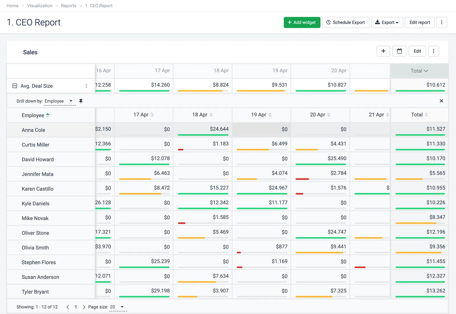
For the numbers themselves, decide who owns each KPI and what the target is before you schedule anything. A weekly report with no targets is a list of numbers, not a decision tool.
How to track SaaS KPIs across Stripe and CRM data
The numbers behind SaaS KPIs live in several systems: billing in Stripe or Chargebee, pipeline in HubSpot, Salesforce or Pipedrive, tickets in Zendesk. Subscription-analytics tools are strongest on the billing side. Plecto's strength as SaaS KPI dashboard software is putting those sources on one screen.
With the Stripe integration, Plecto tracks billing activity live: paid and open invoices, invoice value, new charges, refunds by reason, disputes, fees and new customers. Invoices can be split by billing reason, so new-subscription invoices, renewals and plan changes are visible. The integration is in beta (see what beta features are) and has no Subscriptions data type, so revenue KPIs are built as formulas on those fields. If you need MRR movements, use a subscription-analytics tool or the Chargebee integration, which imports Subscriptions. Our Stripe dashboard guide shows an example, and the HubSpot and Salesforce integrations bring in pipeline.
Software for tracking and broadcasting SaaS KPIs
Broadcasting means the number is visible without anyone opening a tab, and only some SaaS KPI dashboard software is built for it. Plecto has a TV app and slideshows, so a rotating set of dashboards can run on an office screen; see the TV dashboards guide. Geckoboard is also built for office TVs and shares to Slack and Microsoft Teams. Subscription-analytics tools and Power BI are mainly viewed in the browser.
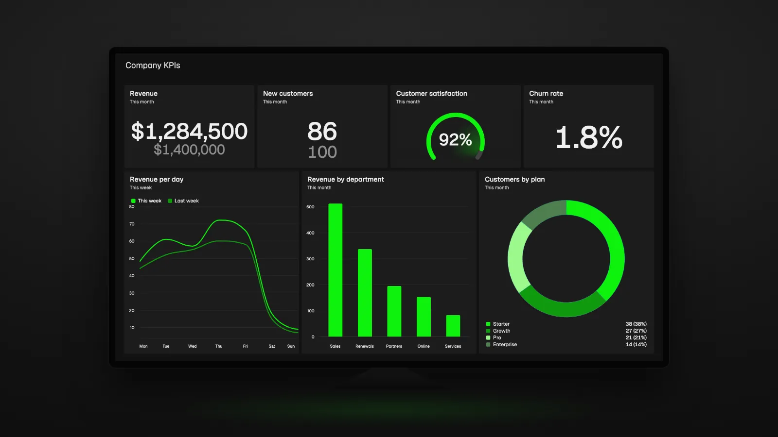
Live dashboards and SaaS KPI benchmarks
SaaS KPI benchmarks come from tools that see many companies' data. Per their own sites, Paddle's ProfitWell Metrics compares you against 30,000 subscription and SaaS companies, Baremetrics offers benchmarking against other companies, and Stripe lets you benchmark against similar businesses on Stripe. Plecto does not publish benchmark data. What it does is show your numbers live against your own targets, with gauges and target lines, so everyone sees how far from the goal they are today.
Which tool fits your use case?
Subscription maths and live team screens are different jobs.
| Use case | What to look for | Tools to shortlist |
|---|---|---|
| MRR movements, cohorts and churn analysis | Subscription maths out of the box | ChartMogul, Baremetrics, Paddle, Stripe Billing analytics |
| SaaS KPI benchmarks | Peer data from many companies | Paddle (ProfitWell Metrics), Baremetrics, Stripe |
| Executive reporting | Few KPIs, targets, trend | Plecto (executive dashboard), Geckoboard, Databox |
| Weekly leadership report by email | Scheduled exports | Plecto (reports), Databox, Klipfolio |
| Billing, CRM and support on one live screen | Many integrations, targets | Plecto, Geckoboard, Databox |
| KPIs on office TVs | TV app or slideshows | Plecto, Geckoboard |
| Motivating sales and CS teams on the numbers | Contests, achievements, notifications | Plecto |
| Company-wide modeled analysis | Governed model, custom measures | Power BI, Klipfolio |
How to choose SaaS KPI dashboard software
- Name the job. Subscription analysis, live team screen or leadership report: the job decides which SaaS KPI dashboard software fits.
- List your systems. Billing, CRM, support. Check each vendor's integration list, and the Plecto integrations list if you shortlist Plecto.
- Check MRR depth. If you need MRR movements or cohorts, confirm the tool calculates them rather than leaving you to build formulas.
- Decide who looks at it. Finance in a browser, or the whole team on a TV and phone.
- Decide if you need motivation. If teams influence the numbers, targets and gamification belong in the tool.
- Run a trial on your own data. Connect one source and build one dashboard before you commit. See the wider KPI dashboard software guide for more criteria.
SaaS KPI dashboard FAQ
For MRR metrics, ChartMogul, Baremetrics, Paddle's ProfitWell Metrics and Stripe Billing analytics calculate MRR movements and churn. For live KPI screens that put MRR next to pipeline and support data, use Plecto, Geckoboard or Databox. Many teams combine one of each: a subscription tool for finance and a KPI dashboard for leadership.
ChartMogul, Baremetrics and ProfitWell Metrics specialize in SaaS subscription metrics. Databox offers MRR dashboard templates fed by tools such as Stripe and ChartMogul. Plecto has a SaaS dashboard setup that combines billing, CRM and support data with targets and scheduled reports. Power BI and Klipfolio are general tools you configure for SaaS.
It depends on who manages the KPIs. Finance teams usually want a subscription-analytics tool. Leaders and team managers want SaaS KPI dashboard software with targets, live screens and reports. Plecto adds contests, achievements and notifications so teams act on the numbers, and connects to 150+ systems. See KPI dashboard software.
Subscription-analytics tools such as ChartMogul, Baremetrics and ProfitWell Metrics connect to your billing system and calculate MRR, churn and retention automatically. Stripe Billing analytics does the same for Stripe. KPI tools such as Plecto refresh from integrations: Stripe data updates instantly via webhooks and every 15 minutes, though Stripe is in beta.
Plecto connects Stripe (beta) with HubSpot, Salesforce or Pipedrive on one live dashboard. Databox lists Stripe and HubSpot among its data sources, and Geckoboard lists HubSpot and Salesforce. For MRR movements from Stripe subscriptions, add ChartMogul, Baremetrics or Stripe Billing analytics. See the Plecto Stripe integration.
Benchmarks come from tools with many customers' data. Paddle says ProfitWell Metrics compares you against 30,000 subscription and SaaS companies, Baremetrics lists benchmarking, and Stripe offers benchmarking against similar businesses on Stripe. Plecto does not publish benchmarks, but shows your KPIs live against targets you set.
Plecto lets you export a report as Excel or PowerPoint and schedule hourly, daily, weekly or monthly exports by email, with the live dashboard on a TV for the meeting. Databox and Klipfolio also schedule reports to inboxes. Set a target on every KPI so the weekly report shows progress, not only totals.
Plecto and Geckoboard are built for broadcasting. Plecto has a TV app and slideshows that rotate dashboards on office screens, and Geckoboard targets TVs, Slack and Microsoft Teams. Subscription-analytics tools and Power BI are mainly viewed in a browser. See the TV dashboards guide.
No. The Plecto Stripe integration is in beta and has no Subscriptions data type, so it does not calculate MRR movements, churn MRR or cohorts from Stripe subscriptions. It tracks invoices, charges, refunds, disputes and fees live, and the Chargebee integration imports Subscriptions. For full MRR maths, pair Plecto with a subscription-analytics tool.
If all revenue runs through Stripe and finance is the only audience, it may be. It covers MRR growth, churn, retention and LTV, but only Stripe data and only inside the Stripe Dashboard. Add a KPI dashboard such as Plecto when you need CRM and support data, targets, TV screens or scheduled leadership reports.
Try Plecto free for 14 days.
No credit card required.